Or so they say. Financial institutions have long been seen as faceless entities,but lately everyone from major credit card companies to online banks like Chime have tried to change their image by communicating a friendlier, more human approach. Virgin Money UK is the latest (and perhaps most successful) to follow that trend.
[Image: courtesy Pentagram]The newbrand identity, crafted by Pentagram partners Luke Powell, Jody Hudson-Powell, and Domenic Lippa, aimed to bring a human touch to Virgin Money UK that would help it stand out from other major banks. It follows a more than $2 billionmergerbetween Virgin Money and Clydesdale and Yorkshire Bank Group (CYBG) last year, which created the sixth-largest bank in the U.K. with 6 million customers and more than $92 billion in lending,according toBankrate.
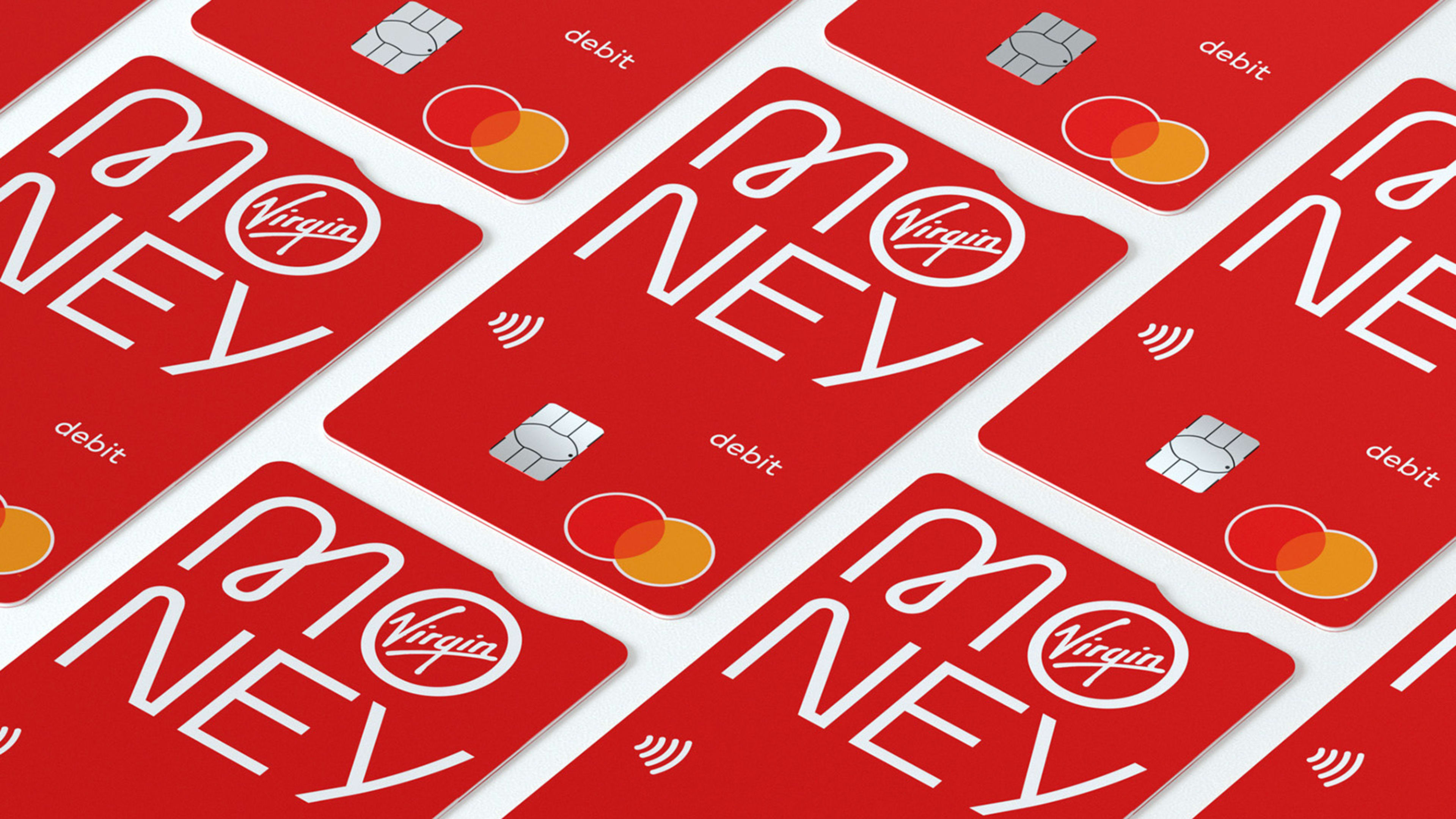
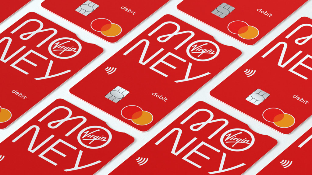
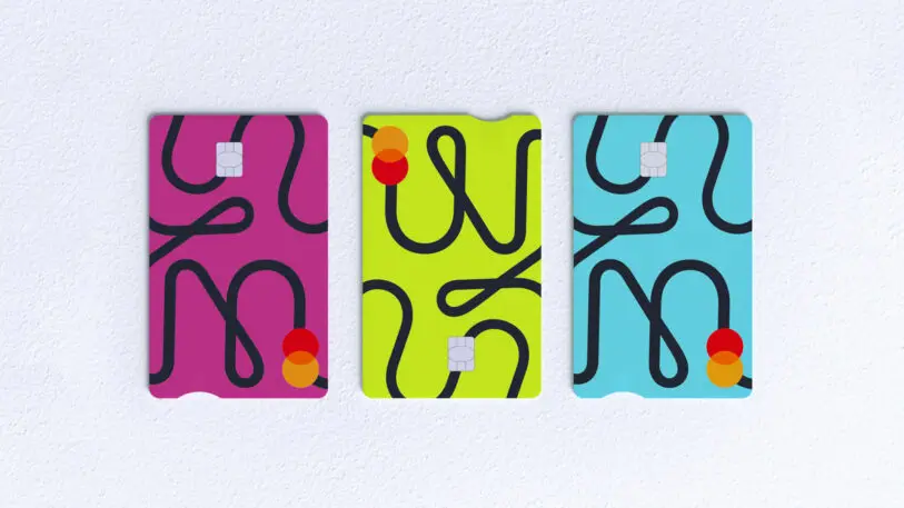
[Image: courtesy Pentagram]The expressive new branding fits well within the Virgin corporate group, led by British billionaire Richard Branson. The branding uses the trademark Virgin red as its primary color, with secondary colors in lime green, magenta, and robin’s egg blue. “We worked really closely and collaboratively with the core Virgin brand team,” Hudson-Powell says. Pentagram’s goal was to “create a new brand for the group that brings to life the spirit and energy that you expect from Virgin, but within a banking context.”
The result is a stark divergence from the staid and assertive all-caps sans serifs of banks like Chase or American Express. Looping lines and bright colors give Virgin Money UK personality. “Money plays such a pivotal role in our lives, and having a large bank that actually wants to be approached is a positive thing,” Hudson-Powell says.
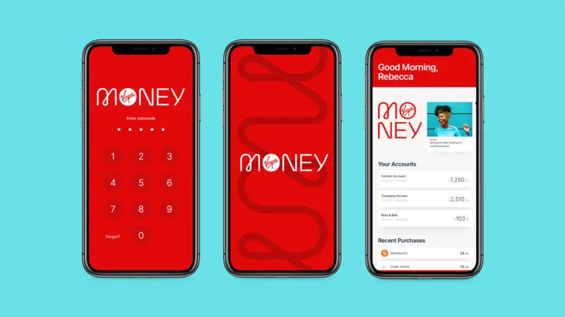
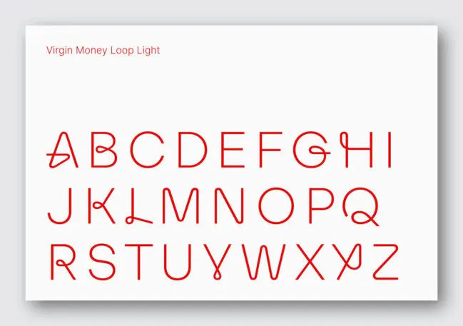
[Image: courtesy Pentagram]The design feature that really stands out is the brand’s typeface. The two variations—Virgin Money Sans and Virgin Money Loop—were created by type designer Luke Prowse. Sans is the more straightforward of the two and will appear with Virgin Money Business products and cards. Loop is adaptable and a lot of fun: Inner and outer apexes (like the points in a V or L) appear as groovy looped curves. The Loop typeface will be used on debit cards, the website, app, and merch.
All in all, the type’s asymmetric and surprising curvatures become a motif for the bank’s visual identity, anchoring the brand in a way that reads as contemporary, approachable, and accessible to the everyday banking customer—even if the bank itself is a corporate behemoth.
Recognize your brand’s excellence by applying to this year’s Brands That Matter Awards before the early-rate deadline, May 3.
ABOUT THE AUTHOR
Lilly Smith is an associate editor of Co.Design. She was previously the editor of Design Observer, and a contributing writer to AIGA Eye on Design.More