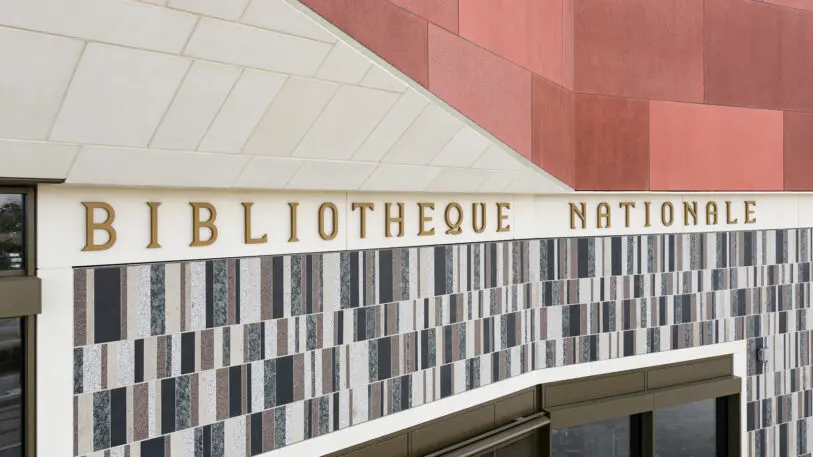
It’s easy to think of a library as a dusty repository of the past. But new signage at the National Library of Luxembourg is a beautiful reminder that libraries—from the books in the stacks to the events they have on-site—are always changing.
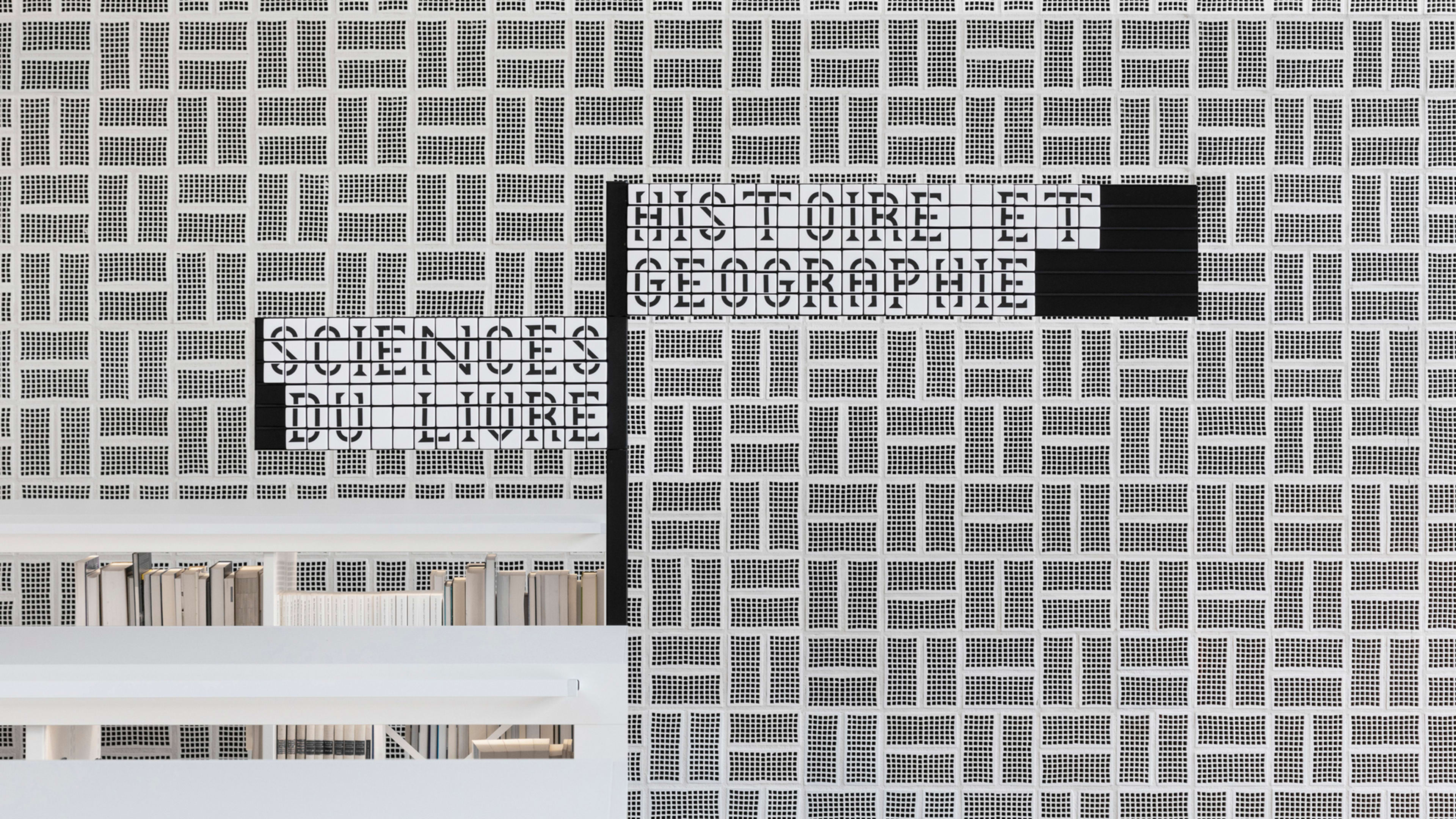
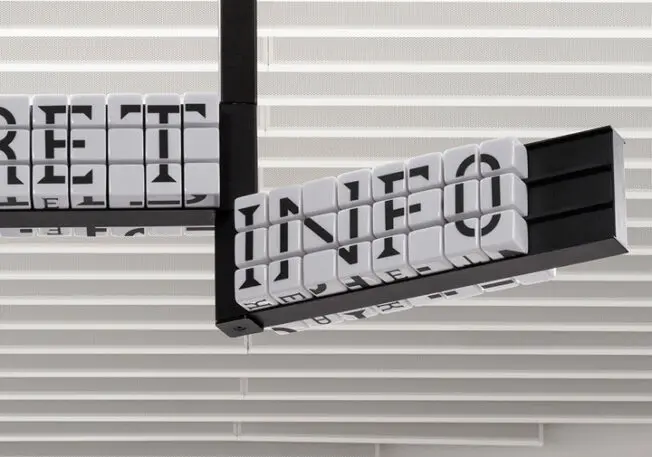
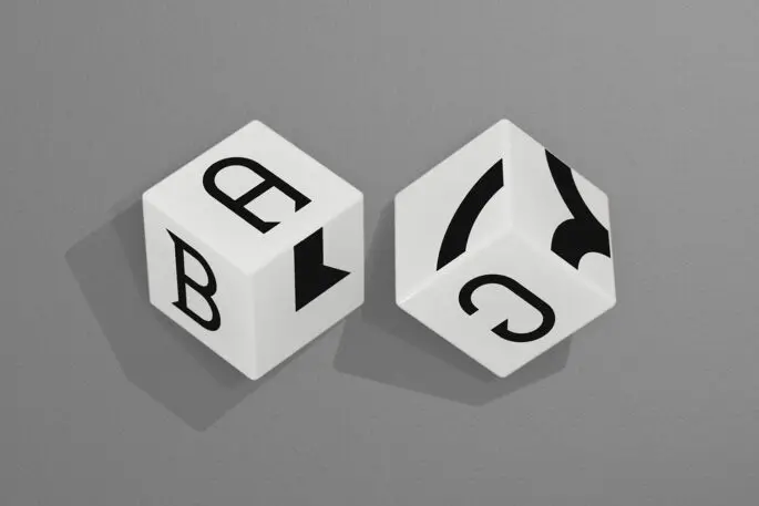
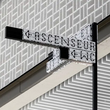
[Image: courtesy Pentagram]Pentagram partner Sascha Lobe and his team designed a wayfinding system for the library with a custom typeface called Bibliothèque that has sharp, angled serifs that nod to the library’s strong architectural angles. (The building was designed by Bolles+Wilson.) The Pentagram team then applied those custom letters to 25,000 interchangeable resin cubes. Individual letters or parts of letters are printed on each face of a cube, so cubes can be placed in rows to form words, or cubes with letter fragments can be stacked to create letters at a large scale. They’re then placed on blank wayfinding infrastructure that has a small lip to hold them up. The resulting system is similar to a beautifully considered mega game of Scrabble, and can easily be adapted to meet the needs of the community it serves.
[Photo: courtesy Pentagram]This is a clever way to accommodate the changing role of libraries in communities. With the help of major architectural firms likeSnøhetta,RDHA,MSR Design, and more, the design of libraries has started to shift in response to their multipurpose use as community centers. Pentagram’s graphic system is in service to that.
“There are so many activities that can run in parallel at any given point in time,” Lobe says. “We see the architectural branding as a glue that holds up the BnL [Bibliothèque nationale du Luxembourg] as a meeting point for different communities, lending it a poignant identity and gravitas.” And a clever solution for a practical problem: signage that’s always in flux.
[Photo: courtesy Pentagram]While all the cubes are the same size, the black letters printed on them come in four weights and three sizes: letters set to the size of the cube itself for close to midrange distances; large characters the size of a few cubes for reading at a distance; and an even smaller font size for shelving systems. There are red and black blocks used occasionally to give a sense of visual hierarchy, too, by emphasizing a header like the floor you’re on with a contrasting color.
[Photo: courtesy Pentagram]Of course, designing a custom typeface in 2D is challenging in and of itself, and its 3D end application introduced new problems. “The challenge was to develop modules that could be added to larger sizes, yet still look crisp no matter the size,” Lobe says. “That, of course, is a much more complex design process because a lot of testing is necessary. It’s a back-and-forth process until all the right parts finally fit into place.”
[Photo: courtesy Pentagram]So if an adaptable signage system is so important, why not install screens that can be updated with a click of a mouse rather than produce tens of thousands of interchangeable resin blocks? The library needed a concept that would work on a big scale for signage, and on a teeny one within its shelving systems. Installing that many screens could be more hassle than it’s worth. “Devising a smart solution that would lend a unique identity to the space was also essential,” Lobe says, “as was designing a playful piece of art.”
Recognize your brand’s excellence by applying to this year’s Brands That Matter Awards before the early-rate deadline, May 3.
ABOUT THE AUTHOR
Lilly Smith is an associate editor of Co.Design. She was previously the editor of Design Observer, and a contributing writer to AIGA Eye on Design.More