
Nearly six months after the coronavirus was declared a global pandemic, data tracking around new infections and death rates remains a crucial element of combating the public health crisis. No shortage of real-time tracking tools already exists, but many are overly busy, cumbersome, and too bogged down by bells and whistles to be useful for the average person.
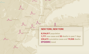
Not so with Esri’s latest COVID-19 tracking app. The interactive map and dashboard, called CovidPulse, uses simple lines and bar graphs to give you an up-to-date snapshot on trends in your city, town, or state. The muted peach-colored background and squiggly red lines are refreshingly simple, letting you quickly assess new case counts, weekly averages, and even when the biggest jump in cases took place.
Zoom in to see trends at the county level and pull back to see them at the state level. Esri says the tool is updated daily, and it uses data from the John Hopkins University. Now you have no excuse to not know what’s happening in your area right now.
Check out the tool here.
Recognize your brand’s excellence by applying to this year’s Brands That Matter Awards before the early-rate deadline, May 3.