


Next Thursday, the 2020 Virtual March on Washington kicks off. The march falls on the anniversary of the historic 1963 march, where Martin Luther King Jr. delivered his “I have a dream” speech at a crucial juncture in the fight for civil rights. Now, the event is updated for the constraints of 2020: Viewers can take part in nearly all the programming—from keynotes speeches and calls to action to the march itself, via live stream—from the comfort and safety of their computer.
The shift to a virtual protest created a new branding challenge for the NAACP, which planned the event. How do you capture the physicality and energy of an in-person march when most people will experience it through a screen? Ida Woldemichael, associate director at design agency Wide Eye, developed the branding along with founder Ben Ostrower and their team. They filled that gap by drawing on the march’s rich visual history, including hand-stenciled protest signs, and adapted it for a virtual era. Top of mind, Woldemichael says, was “the idea of recreating the dream.”
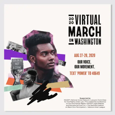
Woldemichael responded by tapping the visuals of past protests to create a distinctly 21st-century brand. The website‘s typeface, Bayard, was designed by Tré Seals and directly inspired by the hand-stenciled signs of the original march. (The name comes from Bayard Rustin, an organizer of the 1963 movement.) When you see the sans serif typeface in all caps, the letters have slightly different weights, with a roundness to the caps of the C and bowl (that’s the top part) of the R particular to 1960s lettering. The type treatment also reads well on screens. On the march’s website, the clean type is set against a contrasting background, creating a sense of immediacy that extends to the wordmark (also set in Bayard).
[Image: courtesy Wide Eye/Ida Woldemichael]The branding was clearly developed with an eye toward how people might consume the protest’s content. Woldemichael adapted phrases from 20th-century icons, like John Lewis and Barack Obama, and made them into shareable graphics and Zoom backgrounds. (She knows a thing or two about creating slogans that catch on, having thought of the “I’m with Her” phrase the Clinton campaign used in 2016).
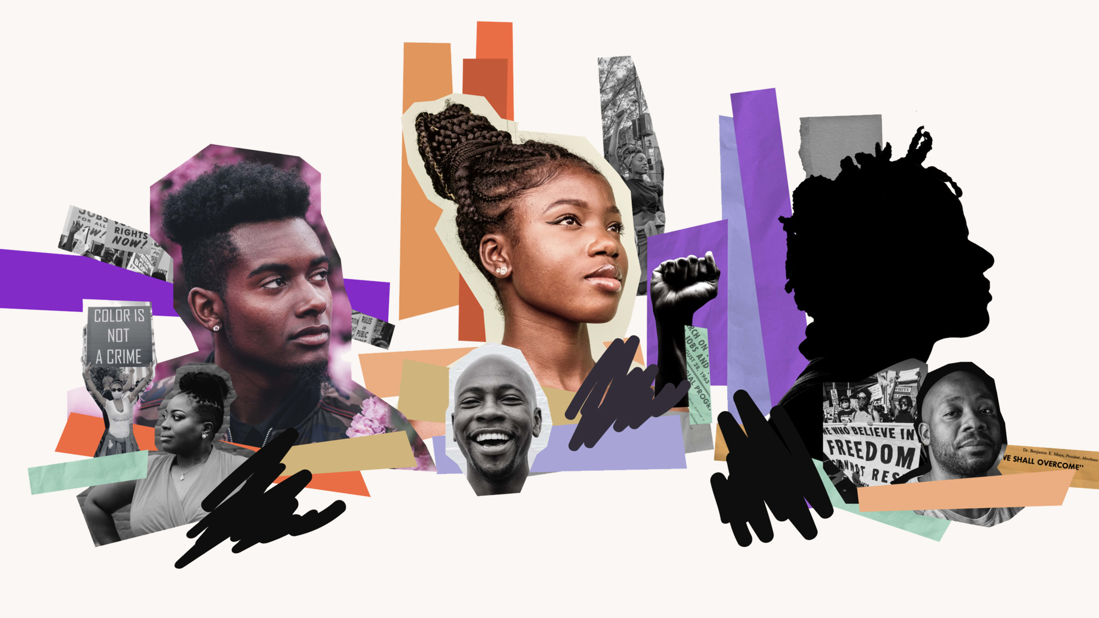
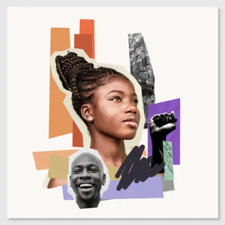
Photo collages are another anchor of the brand. Each collage features a Black person at center with an optimistic upward gaze, surrounded by supporting images of Black Lives Matter protestors in black and white. The result is an ad hoc, unfussy, elegantly optimistic visual, with strips of regal colors like purple and gold in a nod to Dr. King. “There’s a huge past to the march. But we’re not trying to be only nostalgic. The fight for Black lives is still a conversation that is being had,” says Woldemichael. “The collage is in respect of that—moving an image from the past to the future.”
Recognize your brand’s excellence by applying to this year’s Brands That Matter Awards before the early-rate deadline, May 3.