Mark the year: 2020. That was the year when Apple decided to crowdsource its design.
At Apple’s largest event of the year, the Worldwide Developers Conference (WWDC) this week, the company revealed all sorts of big news. An iPhone can now translate French and unlock a BMW. Your Homekit doorbell can now identify who is standing at your porch—and beam that to your Apple TV. Perhaps most importantly, Macbooks and iPhones will soon have the same chips inside, as Apple has started transitioning its computers to its own silicon instead of Intel’s.
Yet with all these new capabilities, Apple is inching away from the very design thesis upon which Steve Jobs founded the company: that technology should be reduced to its most essential components in order to reach the largest number of users. But Apple has found, as it has scaled to nearly every corner of the earth, that one size doesn’t fit all.
And so Apple is giving users the ability to design their own interfaces. The irony is that Apple could have used this exact moment to unify its design and devices all over again. Instead, it’s handing that responsibility to every customer—and frankly, it’s a job most of us can’t possibly do as well as Apple.
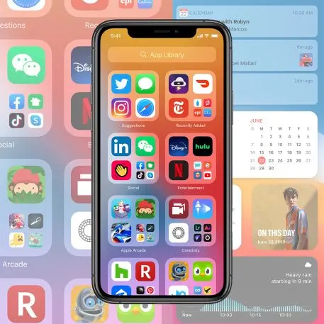
What got crowdsourced?
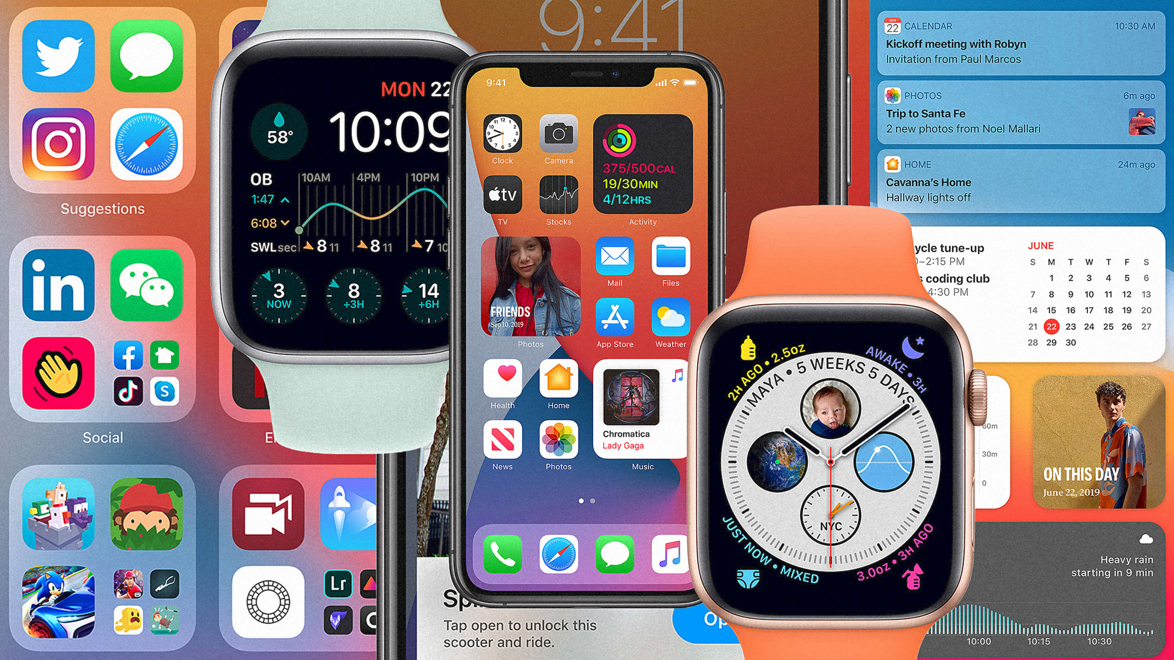
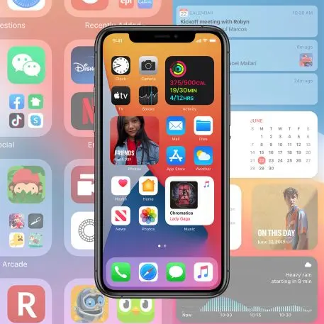
Two new features demonstrate the shift to crowdsourcing.
On iOS, you’ll now be able to drag widgets of various sizes and shapes into your app screens. That means you might have a weather report taking up a quarter of your main screen, then have app icons to Facebook, Mail, and whatever else taking up the rest. Or you can give the whole top of your screen over to Apple’s own predictive algorithms, and ask it to guess which widget you’ll want to see most at any time during the day. Or you can let Apple group together your apps into categories to keep them straight. Or you can do none of this! Just leave your 50 pages of apps as they’ve always been!
Of course, we’ve always been able to customize some aspects of the Apple experience. You can drag apps to a different screen, set up custom wallpapers, or have Siri call you by a nickname. But these newer updates affect the core functionality of Apple products, not just the window dressing.
What’s wrong with that?
For power users, this is all great news. The people who know the most about technology often want the most control over their technology. They ask, “Why can’t I put my weather report where I want it on my phone?” And that question is perfectly valid. Why, in the era of touchscreens, do we have artificial limitations on what is possible with pixels?
But that’s not Apple’s style. Apple has always fetishized simplicity, for better or worse, using clear design to simplify absurdly complex technology. It made computers intuitive to use with visual icons and a mouse; music fun to navigate with a list and a jogwheel; and smartphones convenient by organizing digital information into bite-size apps. Mantras like “it just works” are at the core of Apple design, and it’s a big reason why many of us buy its products—not just one time, but again and again. iPhone users are some of the most brand-loyal customers in the world.
But the problem with maintaining this approach is that Apple is a lot more than a technology company. It’s also a health company, and an entertainment company, and a photography company, and a home goods company. Apple keeps adding more products—physical and digital—to scale to both consumer expectations and its insane market projections. In 2020, Apple became the first company to hit a $1.5 trillion market valuation. It’s one thing to invest in a one-size-fits-all design approach when you’re selling a music player, or a computer. It’s another when you invest in wearables that connect to smartphones that connect to countless services on the internet.
It’s easy to see the business case behind Apple’s original design ethos. If you buy an iPhone and it’s lovely to use, you’re tempted to buy Air Pods or a Macbook, too. And with every purchase, Apple sweetens the deal: The more products you have, the more they fit together, the smoother your digital life. It’s Apple’s greatest design strength, but it’s also its greatest weakness at this stage in the company’s maturity: Any one customer probably won’t own all of Apple’s products. So while they are designed to be interoperable, they cannot be perfectly interdependent, stacking into one flawlessly constructed system. This is one reason why Google makes such a fascinating design adversary to Apple: Its search, email, calendar, and so many other products are available freely to everyone, and so these products flow into one another mindlessly. Even if consumers did all own a complete portfolio of Apple products, they wouldn’t all use these products the same way. One person buys an Apple Watch for fall detection. Another person buys it to track their runs. And so on.
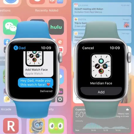
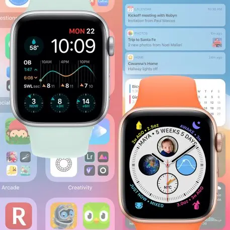
In response, rather than building one perfect experience between its devices, Apple has punted many of the design challenges that it faces. Instead of determining which widgets, if any, should be on your iPhone when you pick it up to cut through the noise of your apps, Apple is asking you to do that job. Instead of figuring out what your Apple Watch should convey at a glance, Apple suggests that maybe a developer or friend can answer that question better than it can. Simplicity is dead. Long live customization.
The irony is that we are finally at the point where Apple can unify its interfaces more than it has in decades. Apple announced that its upcoming computers will run the same chips that are inside its iPhones and iPads—and that will allow Macbooks to run iPhone apps natively for the first time. With the ostensibly same hardware powering all of its devices, Apple is really just selling iPhones wrapped up in Macbook and iMac casing. It doesn’t have to distinguish mobile and desktop OSs anymore! There is no technological barrier to Apple declaring to the world, “This is how things should run!”
This is the moment that many Apple pundits have been waiting for, when Apple might be able to present one interface to unify them all, with the same apps, gestures, and more connecting it all. In this world, Apple products might feel more like a service, agnostic of the device you are on, and always just there with what you need, how you need it, when you need it.
And it was at this moment that Apple declared that it didn’t really know how it should design the world after all. Maybe such a global design problem is too great for any one company to manage, or maybe Apple wants its product lines to feel distinct so we keep buying into them. In any case, Apple is not creating the perfect interface of tomorrow: It’s just providing the tools for you to do that job yourself.
Recognize your brand’s excellence by applying to this year’s Brands That Matter Awards before the early-rate deadline, May 3.