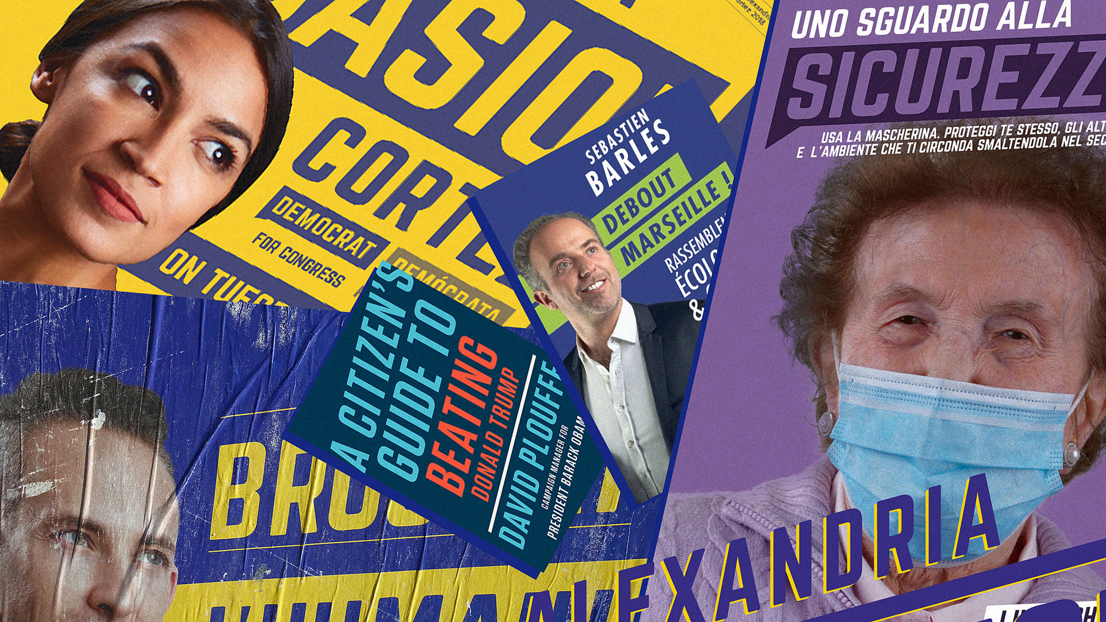
When Alexandria Ocasio-Cortez won her race in 2018, she didn’t just usher in a new wave of progressive politics—she introduced a design trend that has become increasingly ubiquitous.
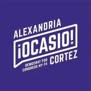
[Image: Tandem Design NYC]Ocasio-Cortez’s campaigngraphics were striking because they broke from the typical political brand clichés. They used purple and yellow rather than the standard red and blue, they employed all-caps sheared and rotated type, and they featured her now iconic profile shot. In the two years since Ocasio-Cortez was elected, she’s become a torchbearer for progressive Democrats—and now a slew of them have followed her lead when it comes to branding, too.
[Image: Tandem Design NYC]I wasn’t the only one to notice the trend. People have been sending design samples to the team atTandem, the studio behind Ocasio-Cortez’s 2018 campaign branding. There’ve been so many that they started a dedicated Slack channel to keep track of them—more than 20 different global examples so far. Scott Starrett, the cofounder and principal of Tandem, notes that they certainly weren’t the first to use rotated, sheared type (“there is really no novelty in the world of design”), but something about the combination of details and timing made it resonate like it hadn’t before.
In addition to the treatment they applied to Norwester, the campaign’s primary typeface, the brand identity uses speech bubbles to create a visual conversation, with the secondary text in Spanish. The speech bubble also creates a frame for “Ocasio,” emphasizing her name over other text on the page. The yellow accents could be considered “the fourth color in the American color palette,” says Starrett, who explains that red, white, and blue are often accompanied by brass or gold. And then there’s that now-famous portrait of Ocasio-Cortez looking up with a three-quarters gaze. It was inspired by a Cesar Chavez stamp, but the upward tilt of the head has the shorthand effect of conveying an aspirational optimism rare in politics, according to Starrett.
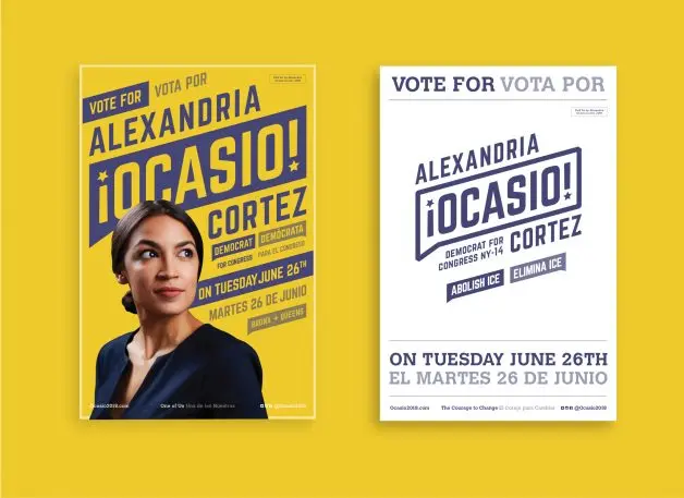
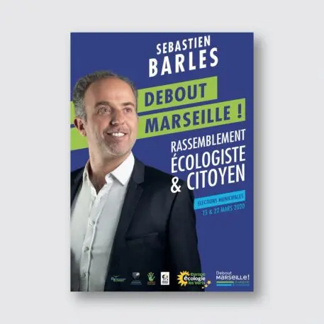
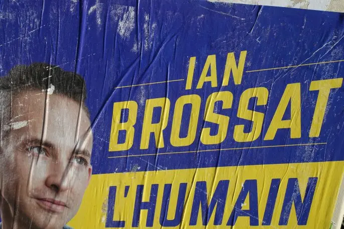
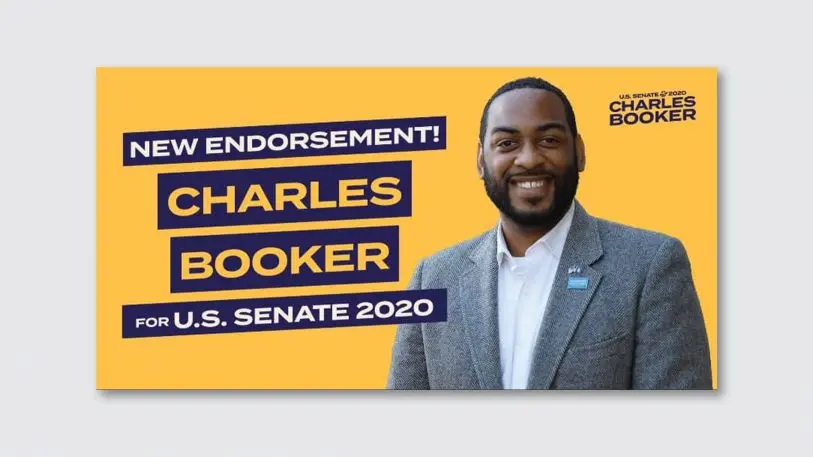
[Image: Sébastien Barles Campaign/Yahoo News France]These design details are now present in campaign identities across the world. Ian Brossat, the deputy mayor of Paris and a member of the French Communist Party, is closest to acarbon copy, utilizing the AOC trifecta of dark background and yellow, rotated type, and that upward-looking gaze. Sebastien Barles, also from France,used similar elements, though he mixed things up with green (he ran as a member of the Greens party after all).Carrie Harper, a candidate running in North Wales, employed speech bubbles and rotated type.[Photo: Flickr user Guilhem Vellut]Here in the U.S., it’s a clear trend among first-time congressional candidates with progressive policy positions. Isiah James (NY-9) employed anupward gazefor his portrait, along with the AOC type treatment against a bright yellow background. The“I” in Isiahappears to be a direct riff on the inverted exclamation point in AOC’s original branding, which also uses a star as its punctuation.Charles Booker, a progressive running for the Democratic nomination for Kentucky’s Senate race, has campaign branding that’s reminiscent of AOC’s, as doesMondaire Jones, who won his primary race in New York’s 16th congressional district. Meanwhile,Michael Blake, who ran for the Democratic nomination in New York’s 15th district, seemed to draw inspiration from his New York neighbor (though his branding firm claimed they were unaware of the similarities). Ocasio-Cortez didn’t respond to a request for comment about the candidates who’ve taken a page from her branding book, but she did launch aPACin support of progressive candidates back in February, and has endorsed Booker and Jones.
advertisement
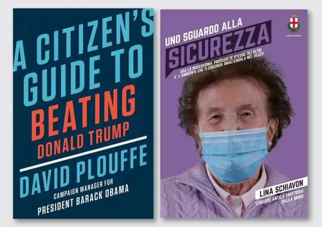
[Image: Booker for Kentucky]The type treatment has also found its way onto everything frombook coverstoItalian PSAsabout wearing masks. (Its use in that context stumped Starrett a bit, although he theorized that perhaps they were trying to signal “collective action. The idea that we all need to work on something together is at the root of the congresswoman’s brand.”)
[Images: Penguin Random House, Comune di Padova]One thing is clear—a look that used to signify a single candidate now has a bigger story to tell. It’s come to represent a political point of view. “My friend sent me [an example of similar branding] and said our studio had created a language for grassroots candidates,” says Starrett. “That I think was the kindest and best way to look at it, that we played a role in creating a shorthand for what I would consider an atypical candidate—people who are deciding to run that traditionally didn’t feel invited into the process.”
Starrett notes that some similarities could be chance, and says he has no intention of thwarting the production of look-alikes. “That’s the thing we’re most proud to have contributed to—inviting more voices into the process of civic engagement,” says Starrett. There’s that old cliché—imitation is the sincerest form of flattery. No matter what happens to these candidates in November, one thing is clear: Progressives consider the AOC brand a winning ticket.
Recognize your brand’s excellence by applying to this year’s Brands That Matter Awards before the early-rate deadline, May 3.
ABOUT THE AUTHOR
Lilly Smith is an associate editor of Co.Design. She was previously the editor of Design Observer, and a contributing writer to AIGA Eye on Design.More