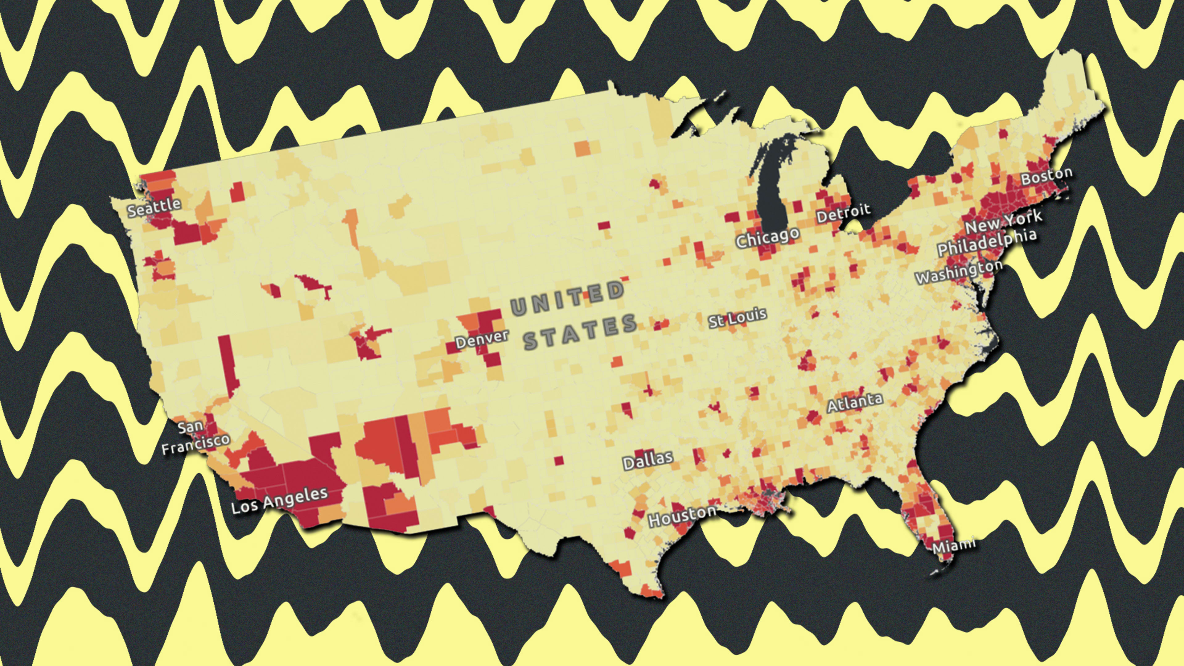
From the earliest days of the coronavirus outbreak, Johns Hopkins University has been one of the go-to sources for global case counts, data visualizations, tracking tools, and other statistics. What’s especially useful about its COVID-19 dashboard and associated maps is that they keep getting better as new contextual data is added.
The latest iteration of JHU’s map of the United States has just been updated with a wealth of county-level public health data to help local governments and medial professionals better understand how the coronavirus pandemic is impacting their area. The map, powered by software from spatial analytics firm Esri, now includes the following data, all searchable by county:
- Density of the outbreak and its effect on counties
- Localized stay-at-home policies and effective date
- County-level confirmed cases and deaths compared to the state levels of each
- State-level testing data
- Race and ethnicity data for each county
- Poverty rate for each county
- Health insurance by type for each county
- Number of residents per county in the highest risk age category 65+
- Hospital capacity data, baselines of licensed beds, staffed beds, and ICU beds
All of this information appears in addition to the coronavirus case counts, death counts, fatality rates, and confirmed cases by population.
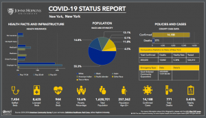
To find this additional demographic and health data for a specific county, you can use the zoom tool on the map or just search for a specific city or zip code. A window will appear next to the county, and within that window, you can find an information panel. Double click the information panel to see a close-up look at the county’s “Status Report,” which includes a breakdown of the data and infographics. It looks like this:
Recognize your brand’s excellence by applying to this year’s Brands That Matter Awards before the early-rate deadline, May 3.