As a professor of visual communications, I can’t help but notice all the images of COVID-19 that have been circulating. You’ve probably seen some version of it: a ball with distinctive spikes that vary in style–from triangular bursts to rounded knobs.
It’s become both an icon–a simplified representation that people instantly recognize–and a symbol for the terrifying and wildly contagious virus that has put the world on hold. I’ve been thinking about what the icon and its variations communicate–and what that says about how we’re all grappling with this strange, uncertain time.
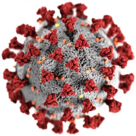
Probably the most well-known image of the coronavirus is the three-dimensional digital representation created by medical illustrators Alissa Eckert and Dan Higgins for the Centers for Disease Control. The image resembles the actual virus as it appears under a microscope. The red protruding clumps–called S proteins–are what the virus uses to enter and attach to the cell. They also create the effect of a halo, or corona, around the virus. After latching onto human cells, these red spikes cause the virus and cell membranes to fuse together. Spikes on the new coronavirus can be up to 20 times more likely to bind to human cells than the spikes from the 2002 SARS coronavirus.
Since this image first emerged in January, hundreds of others inspired by it have proliferated.
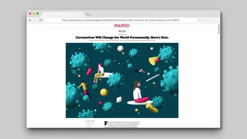
Take an illustration by the graphic design team DAQ for a Politico article. The virus particles are blue and placid–cartoonish, almost, with rounded spikes. They look like they would be soft to the touch.
And in a somewhat playful commentary of the virus’s extension into all aspects of our lives, illustrator Ricardo Tomàs created an image of the virus out of a crossword puzzle and posted it on Instagram on March 20.
https://www.instagram.com/p/B98twOTBS8W/
Where more ominous images have emerged, action is a key component of the messaging. The March 23 New Yorker cover by Christoph Niemann replaces the spikes with a set of dominoes. The figure in the center will either get crushed by falling dominoes–or will push them out from the center to cause them to fall away from him.
"Critical Mass" my cover for today's @NewYorker pic.twitter.com/4VQ121Dnxa
— Christoph Niemann (@abstractsunday) March 16, 2020
The virus, the image seems to be saying, will either destroy us or be destroyed. In another New Yorker illustration by Niemann, the proteins are depicted as deadly spikes that need to be fended off.
The Quest for a Pandemic Pill https://t.co/5XY8qUKBMa via @NewYorker
— Andrew Vazzano (@AVRBNY) April 6, 2020
The themes present in all of these images–calm, reassurance, and danger–seem to speak to the ambiguity and fear surrounding the virus, as well as the efforts to combat it. Though we don’t have a vaccine, panicking accomplishes little–hence the lack of alarmist imagery. Patience is important; cures and treatments will take time. But we don’t need to feel helpless: Action can save lives, whether it’s scientists developing antiviral drugs or regular citizens following guidelines for social distancing and personal hygiene. These are science-based approaches, and perhaps that’s why there’s a modicum of reassurance in an icon that was inspired by a microscope in a lab.
Colette Gaiter is a professor in the Department of Art & Design at the University of Delaware. This article is republished from The Conversation under a Creative Commons license. Read the original article.
Recognize your brand’s excellence by applying to this year’s Brands That Matter Awards before the early-rate deadline, May 3.
