
In New York City and other areas heavily impacted by the coronavirus pandemic, hospitals and healthcare systems are already becoming overwhelmed, and that scenario is likely to play out in cities and towns across the country as COVID-19 spreads.
How prepared is your town for an influx of cases? A new interactive dashboard from spatial analytics company Esri might give you an idea. Mixing real-time coronavirus case counts with a wealth of local health and population statistics, the tool is meant to offer “impact planning” insights down to the county level. It’s part of Esri’s ongoing effort to provide helpful data to healthcare workers and the general population during the pandemic.
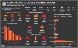
The planning tool includes detailed county-by-county statistics about vulnerable populations, in addition to hospital bed and ICU capacity. The bed capacity data is sourced from a company called Definitive Healthcare, and is especially useful in determining hospital preparedness at the local level.
“People have been doing a lot with that dataset to try to plan for the next weeks and months,” Este Geraghty, Esri’s chief medical officer, tells me. “It would be better if the curve was flattening, but in the current situation, they’re going to need all those beds and figure out how to divert.”
Esri’s tool is searchable, so you can look up any county in the country, and you can click on the graphics for more detailed insights.
Check out the full dashboard here.
Recognize your brand’s excellence by applying to this year’s Brands That Matter Awards before the early-rate deadline, May 3.
