Like many memes, I can’t recall the first time I saw it. Maybe it was a public health worker in my sphere. Maybe it was a science geek. Maybe it was just a concerned citizen.
But in a time when people around the world are searching for answers, Flatten the Curve has become the defining graphic of the COVID-19 pandemic. (Where the term “flatten the curve” first came from is less clear). The idea is simple: Taking steps like washing your hands or staying home if you’re sick can slow down new cases of illness, so that the finite resources of our healthcare system can handle a more steady flow of sick patients rather than a sudden deluge.
https://twitter.com/SiouxsieW/status/1237275231783284736
With roots that trace as far back as a 2007 paper published by the CDC, the core scheme of Flatten the Curve is an idea that’s been repeatedly remixed by health experts to reach its final, clearest form, proposed by New Zealand microbiologist Siouxsie Wiles and drawn by illustrator Toby Morris. It’s a cartoon gif that appears to be a silly webcomic, but instead, it toggles between two potential futures for our healthcare system.
In the first, a man dismissively says “whatever, it’s just like a cold or flu,” and above him, we see a large spike in the number of coronavirus cases, peaking well above a dotted line conveying healthcare capacity. Then it toggles to another perspective, a woman washing her hands saying, “don’t panic but be careful,” and we see the number of cases smoothed to a long, low hill that doesn’t overwhelm our hospital system.
Since first being shared on March 8, the gif has made 4.5 million impressions on Twitter and been shared across broadcast media. And after being translated into Czech, Italian, Spanish, and Welsh by volunteers, a coder developed an automated system to translate the comic into any language.
“This is my favorite dataviz about the coronavirus,” Mauro Martino, founder of the Visual AI Lab at IBM research, tells us over email. “The message is altruistic: we must help sick people who need to be hospitalized.”
“It’s just this perfect [example of] what you want with design. You want something that’s so engaging that people can really get the concept,” says Wiles of the image. But she’s also the first to clarify, “I guess I can take almost no credit.”
The origin
The first instance of Flatten the Curve can be found in a paper called Interim pre-pandemic planning guidance: community strategy for pandemic influenza mitigation in the United States: early, targeted, layered use of nonpharmaceutical interventions, and no, it doesn’t exactly roll off the tongue. Published in 2007 by the CDC, the paper was a preview to a pandemic like COVID-19, and it suggested simple interventions like social distancing and keeping kids home from school in order to slow the spread of a disease so that the healthcare system could keep up.

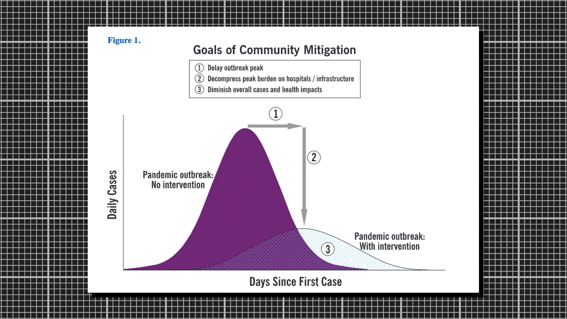
On page 18, a graphic appears called Goals of Community Mitigation. No one I’ve talked to at the CDC can remember who made it, but the image is the root of Flatten the Curve as it appears today. Rendered in purple, it presents those two familiar curves with three numbered goals: 1. Delay outbreak peak 2. Decompress peak burden on hospitals/infrastructure 3. Diminish overall cases and health impacts. These curves don’t appear to be rooted in hard, literal data. Rather, they are illustrative of the exponential spread of pandemics, and how we might impact their speed of growth. In 2017, when the paper was updated, the graphic lost its 1, 2, 3 numbering scheme. In 2020, the graph’s colors were changed from purple to blue and orange. Otherwise, it remained mostly unchanged.
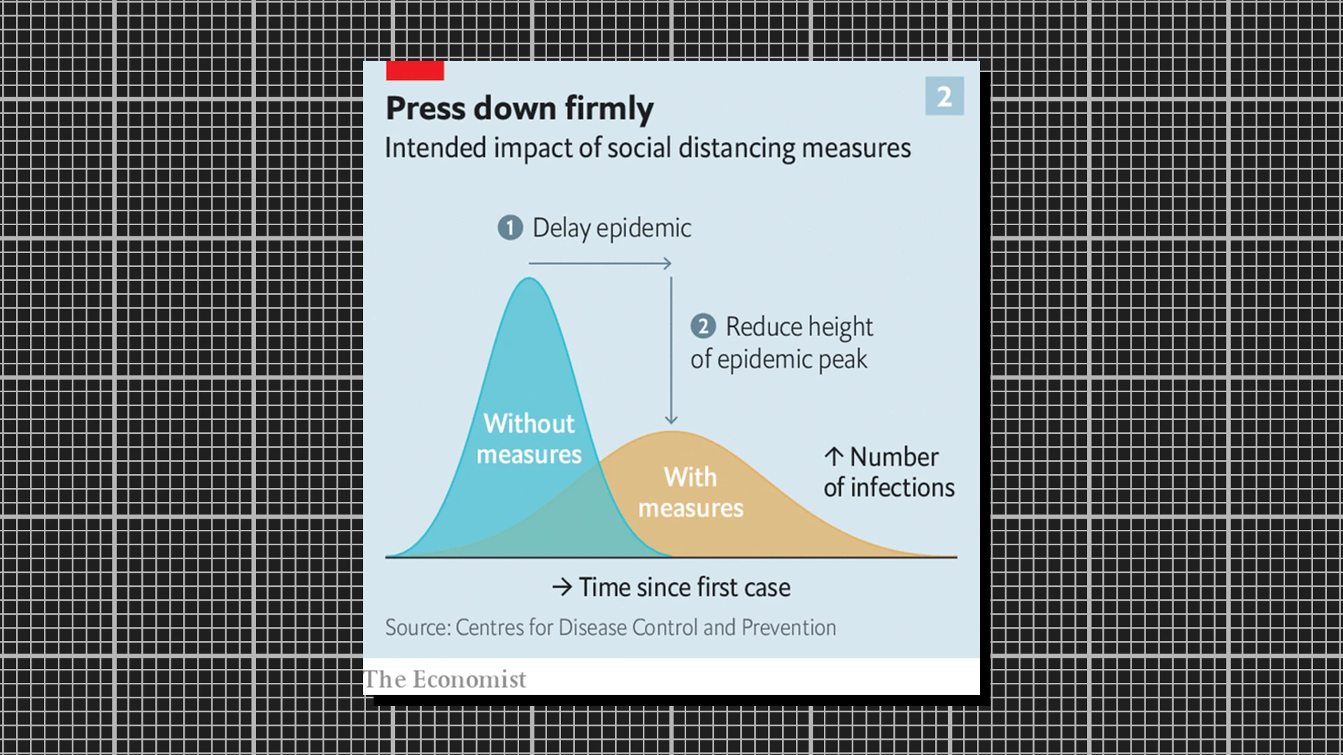
“I thought it was a beautifully clear and simple illustration of an important concept, but I had no idea that it would end up causing such a stir on Twitter and elsewhere,” says Rosamund Pearce, a data visualization journalist at The Economist. Pearce first heard about the graphic from her colleague Slavea Chankova, and she decided to rebuild it for a piece the pair was working on about COVID-19 for The Economist.

Pearce made some updates. She tuned the colors to those of her publication. She also changed the labeling scheme a bit to assist colorblind readers. But mostly, she kept the graphic as close as she could to the original in terms of shape, because as a journalist, she didn’t want to editorialize the work of scientists.
“The difficulty with these diagrams is showing uncertainty. Even though it’s a diagram of a concept and not a model from real data, it’s easy for people to interpret it as a precise prediction, as it looks like a chart and we’re used to charts being precise,” says Pearce. “Once you’ve drawn these shapes, they look authoritative, even if they’re intended to be illustrative. That’s why I keep as close to the CDC’s as I could.”
That said, Pearce is a big fan of what happened to the graphic next—when people doubled down on the image’s fuzzy math in the interest of clear communication and public health.
The line
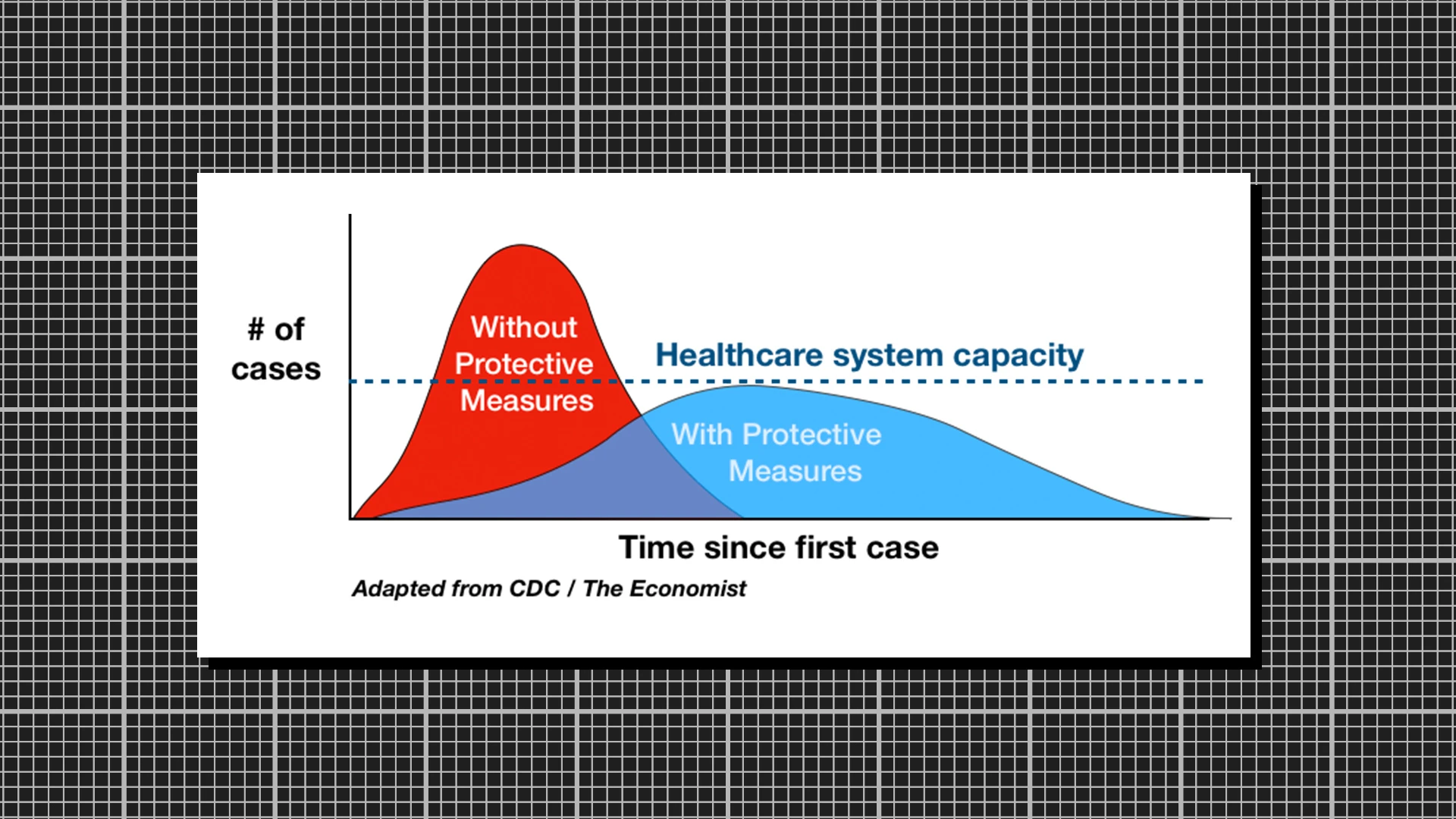
Drew Harris, an assistant professor at the Thomas Jefferson University College of Population Health, was staying with his wife and daughter at an Airbnb in Oregon, when he came across the graphic in The Economist, as first reported by the New York Times. It was immediately familiar because he, himself, had used it a decade earlier in his work as a pandemic preparedness trainer. Working under a grant from U.S. Health Resources, Harris visited hospitals and talked to healthcare workers about the importance of preparing for the worst.
In that work, he often referenced the original CDC pandemic graphic, which he had remade in a simple way.

“I added an extra line to it,” says Harris. “Apparently, that made all of the difference.” That extra line was the dotted “healthcare system capacity” line. And to be clear, it was fully a theoretical invention. There is no telling whether, even with the proper amount of handwashing, we won’t overload our healthcare system with any given unique pandemic. He didn’t count beds or respirators. He just drew the line.
“I needed to prepare content and curriculum for people, and explain to them why I was doing this,” says Harris. “Not everyone got it! So I came up with this graphic that seems to explain it better.”
While Harris couldn’t find his original graphic after reading the Economist, he loaded his laptop, late at night, and opened Photoshop to recreate it. But he grew too frustrated with the software, so he gave up and loaded Keynote. He had to freehand a lot of the graphic on his trackpad, so the curves weren’t crisp. His daughter mocked its lack of polish. And he shared it on Twitter anyway.
Important to remember that #Covid-19 epidemic control measures may only delay cases, not prevent. However, this helps limit surge and gives hospitals time to prepare and manage. It's the difference between finding an ICU bed & ventilator or being treated in the parking lot tent. pic.twitter.com/VOyfBcLMus
— Drew A. Harris (@drewaharris) February 28, 2020
The image went viral. Flatten the Curve became a meme, with websites dedicated to the phrase, which would make Harris proud but also a bit annoyed he didn’t draw the graph better. So he went back and rebuilt it with dummy data a few days later.
“I think the line for healthcare capacity is a brilliant—if speculative—addition,” says Pearce. “It’s not something we could have added ourselves [at The Economist] without a source, as the vertical position of the line is up for debate, but it’s great that it’s sparked so much discussion online.”
“I’m not a graphic designer by training, clearly,” says Harris. “But they’ll tell you sometimes that a simple message is better. Academics will tend to pile on all the dimensions because they can look at it and understand it, because they don’t realize that normal people may not be able to grasp all the nuances.”
The cartoon
Pearce breathed new life into the CDC graphic. Then Harris added an anchor, a single line, that articulated its significance. But it was Dr. Siouxsie Wiles who took the final step: She demonstrated the possibility that everyday people really could make a meaningful difference in slowing the spread of COVID-19. To do this, she transformed the graphic into two futures, each caused by a mentality: ignore it or take precautions. Wiles transformed the graphic into the perfect response to the polarized nature of COVID-19 across social media, in which people were either in full prep mode or far too skeptical that the pandemic was even real.
New Zealand is a small country, Wiles explains, and as a result, her background as a microbiologist has made her the de facto translator of COVID-19 for her local media. As both a research scientist and an active health educator, she planned to write a story about the importance of flattening the curve for New Zealand media site The Spinoff.
“I started seeing [Harris’s] version of that graph going around—and it’s such an important concept—but the visualizations that I’d seen…they didn’t convert it, I don’t want to say well enough, but to the right audience,” says Wiles. “It wasn’t really clear to most people what that actually meant.”
[Image: Dr Siouxsie Wiles, et al.]For her story on COVID-19, she requested some illustration work, which was picked up by Toby Morris. She sent Morris a copy of Harris’s Flatten the Curve graphic, but she had a suggestion: “I wanted to show these two attitudes. If we had this attitude, this will happen. And if we have this attitude, this will happen. I wanted those two things. I said it would be awesome if we could toggle between the two like some kind of gif.”
“Honestly, it wasn’t that complicated to do, and I kind of don’t feel a massive amount creative ownership over it. The idea was coming from Siouxsie, and the graph was adapted from previous versions,” says Morris.
Aside from applying his cartoon style to the illustration, Morris did make a few creative decisions. He removed the red and blue color scheme of Harris’s work, worried about the political connotations at play. And he added the two characters, an ignorant man and an informed woman, to represent each mentality. On that point, Morris and Wiles have taken some flack on social media. Is it saying that men are dunces? Or that women are worrywarts?
“I thought that might happen,” says Morris, who can chuckle the criticism off. “It was a quick gut decision as I was working on it, and it did occur to me people might comment on that, but then I also figured they’d comment either way—it’d be weird if it was two men, weird if it was two women, weird if it was the other way around too, I think. I thought people might think I was stereotyping, but it felt like the best option in the moment.”
The other complaint that the pair has been hearing is that the illustration is just an illustration, that it’s not hard math that’s capturing the COVID-19 epidemic. But of course, the original CDC graph was only conceptual, too. Harris’s remake was conceptual. And yes, this cartoon is also conceptual.
“It’s funny there are a lot of people criticizing it, saying…’your areas aren’t scientifically correct!'” says Wiles. “The scientist bit of me is like, ‘I know it’s not perfect, but that’s on purpose!'”
Recognize your brand’s excellence by applying to this year’s Brands That Matter Awards before the early-rate deadline, May 3.