It’s no secret that we’ve entered what many are calling the “post-truth” era, with myriad instances of deep fakes, misinformation campaigns, and outright lies popping up, gaining viral traction, and ultimately shaping the decision-making of millions—all too often driven by prominent individuals who will here go unnamed. One of the biggest web design trends of 2020 will be designing truth.
Social media’s slow march toward trustworthiness
The major social media platforms have each come out with policies—and in some cases, designs—to account for this flourishing of untruths.
Facebook has decided that it simply won’t intervene with political untruths. To support its stance, the platform has cited everything from the First Amendment to the FCC’s similar stance on political advertising on the TV, conveniently forgetting that it is neither a) the government (the one that’s actually restricted from censorship by freedom of speech) nor b) the increasingly anachronistic technology that is television.
Facebook has been (apparently) trying to combat fake news on its platform since 2015, doing so in classic Silicon Valley iterative design style. It first tried to encourage individual users to flag content as “false news”—an odd half-borrowing from President Trump—then by marking some stories as “disputed,” which, according to what it called “academic” research, backfired by reinforcing some users’ belief in the content. Then, most recently, it was by overlaying the content with a straightforward notice reading: False Information/ Checked by independent fact-checkers. The overlay also provides a prominent CTA to view the fact-checkers’s findings, as well as a secondary button to go ahead and view the false content. At present, there’s still no plan to flag paid political posts as false.
One thing to note is that Facebook started trying to remedy sharing of false information only after it was shared—the original poster was given no alerts to the fact that the content they wanted to share was disputed. The company has amended this in subsequent designs to be more proactive in alerting the original sharer, but it’s still intriguing that the notifications focus on the fact that there’s “additional reporting” on the content.
This strategy focuses on encouraging what we call “curiosity clicks.” This encourages engagement with the information, but that’s also its flaw: You have to care enough that there’s “additional reporting” to click through. As a content designer, I have to wonder if it wouldn’t be more effective to name the fact-checkers and pull a significant quote on the content. Snopes, for example, does a great job of highlighting what the specific claim is and giving it a straightforward “true” or “false” (with a range of fuzziness between) rating.
Twitter has taken a rather more straightforward (and cheerworthy) stance of simply not allowing political advertising on its platform. Though as many people have commented, it’s just not that easy. All kinds of misinformation “earns” its way into our feeds daily, a reality that Twitter seems to have done little to nothing to address.
We’ve made the decision to stop all political advertising on Twitter globally. We believe political message reach should be earned, not bought. Why? A few reasons…🧵
— jack (@jack) October 30, 2019
In the end, what really matters here is not so much what the major platforms are doing to bring clarity and trustworthiness to their platforms, but what designers might do to bring more of that into their own work.
Here are a few thoughts on doing that:
Label more prominently and clearly
In a 2016 report on a Stanford study of students’ ability to determine the veracity of information found online, the Wall Street Journal found that, “Some 82% of middle-schoolers couldn’t distinguish between an ad labeled ‘sponsored content’ and a real news story on a website, according to a Stanford University study of 7,804 students from middle school through college.”
Much of the “optimization” of ad formats like “sponsored content” has gone into, well, hiding the fact that they’re ads. Just look at the name: “sponsored content.” On a content-driven site, that simply implies that the content was “sponsored” by someone, much as race car drivers are sponsored by various corporations.
The reality, of course, is that these are ads, even if they’re not as direct as banners. And we should label them as such.
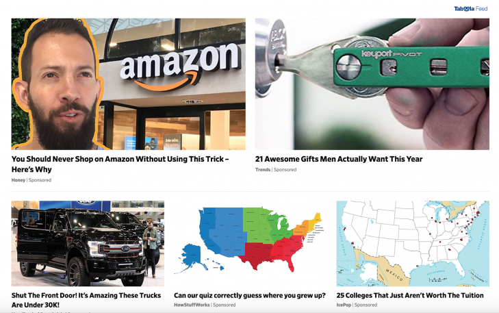
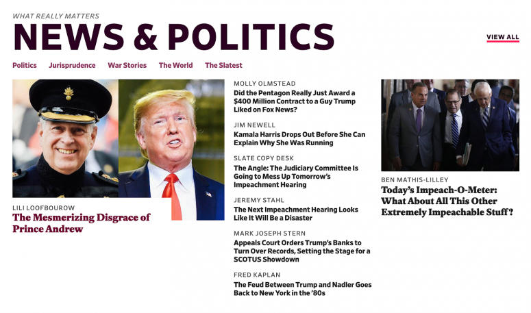
And it’s not just language that could be clearer. Design work could use some improvements, too. Just look at the screenshot above (taken on Dec 3, 2019). Every single story in that shot is a piece of sponsored content, hosted on a different website, but seamlessly integrated into Slate’s own home page.
The title font for the native news articles and the sponsored stories is the same. But note what’s quite different: the font size and location of the “author.” In the native stories, the author’s name is set reasonably large, above the title. You definitely still see the title first, but the author name cries out for your attention in these real stories.
The sponsored posts, on the other hand? The “author”—or brand, actually—is set much smaller. The fact that the “author” is listed as a brand, rather than as an individual writing for the brand, is telling as well: While we have someone to follow up with (or blame or praise) for real reporting, the sponsored stories are attributed to faceless brands.
Perhaps even more significantly: note that the real articles are practically emblazoned with a category title (e.g., News & Politics). The sponsored stories? Lacking that prominent header.
Make sources more obvious
In the world of journalism, you’ll often hear the mantra “consider the source,” which is not something most students do these days, according to the study: “Many students judged the credibility of newsy tweets based on how much detail they contained or whether a large photo was attached, rather than on the source.”
And while that maxim is stressed to young and aspiring journos as a core practice, it could also help designers help the rest of the world. What if, for example, every organization’s Twitter profile included a link to their Wikipedia page, or a Google search of their name? What if publications featured an about page that clarified their political stance, history, management, and funding sources? One better: What if they linked to independent commentators on the publication?
These, of course, are just ideas—if nothing else, it prompts us to consider more deeply how we might encourage readers to act more like journalists and consider their sources in a more objective manner.
But we can also consider carefully the criteria young students are using to evaluate credibility, and encourage social media teams to make updates information-dense, and pair them with large, engaging graphics.
Finally, and to bring this closer home for web designers crafting publishing experiences: consider making authors and their credentials more obvious. This can not only boost your site’s credibility and give readers a point of contact, but also arm readers to better evaluate your authors’ content. A thoughtfully curated list of contributors then becomes a marketing asset, akin to the list of blurbs on every mass-market book cover.
Use “related content” to provide context and contrast
Related content—a familiar content pattern often appearing in the middle or at the end of blog posts and news articles, often under a heading like “You might also like . . .”—gives designers a powerful tool for adding easily accessible nuance to a reader’s understanding of a topic. It does so by ensuring two things:
- That opinion pieces are contextualized by the stories they comment on, or by contrasting opinions
- That news stories get additional color through the opinion pieces through the pieces that comment on them
Using related content to provide extra context on fact- and opinion-based pieces helps work against readers’ supposed preference for “bite-size” information. Bite-size data helps us quickly get a basic understanding of issues in a world fraught with issues—but it also means that we often lack a nuanced understanding of said issues.
When we rely solely on our favorite “influencers'” hot takes on Twitter, we start to look a lot like a pitchfork-and-torch wielding mob, all too ready to take one charismatic voice for the font of truth. But the more that content creators and designers can point readers to extra information and contrasting opinions, the more we can encourage nuanced understandings that rely more on information and reason than on emotion.
- Label content types clearly to help readers create a mental model of your content and better distinguish between organic and promotional materials
- Contextualize and promote sources so readers know where content comes from and can better evaluate its credibility
- Use related content to add context and promote nuanced understandings of topics
All the above said, it’s worth remembering that misinformation isn’t a fixed target, a fact captured beautifully by Tom Rosenstiel, director of the American Press Institute and senior fellow at the Brookings Institution:
Whatever changes platform companies make, and whatever innovations fact checkers and other journalists put in place, those who want to deceive will adapt to them. Misinformation is not like a plumbing problem you fix. It is a social condition, like crime, that you must constantly monitor and adjust to. Since as far back as the era of radio and before, as Winston Churchill said, ‘A lie can go around the world before the truth gets its pants on.’
Which is to say: if you want to play a role in fighting misinformation in 2020, prepare for the long haul, and be ready to update your strategies as the information landscape continues to change.
John Moore Williams is director of content strategy at Webflow. Follow him on Twitter.
This article was adapted with permission from the author. For more web design trends, go here.
Recognize your brand’s excellence by applying to this year’s Brands That Matter Awards before the early-rate deadline, May 3.