


Now these are some assets I can get behind.
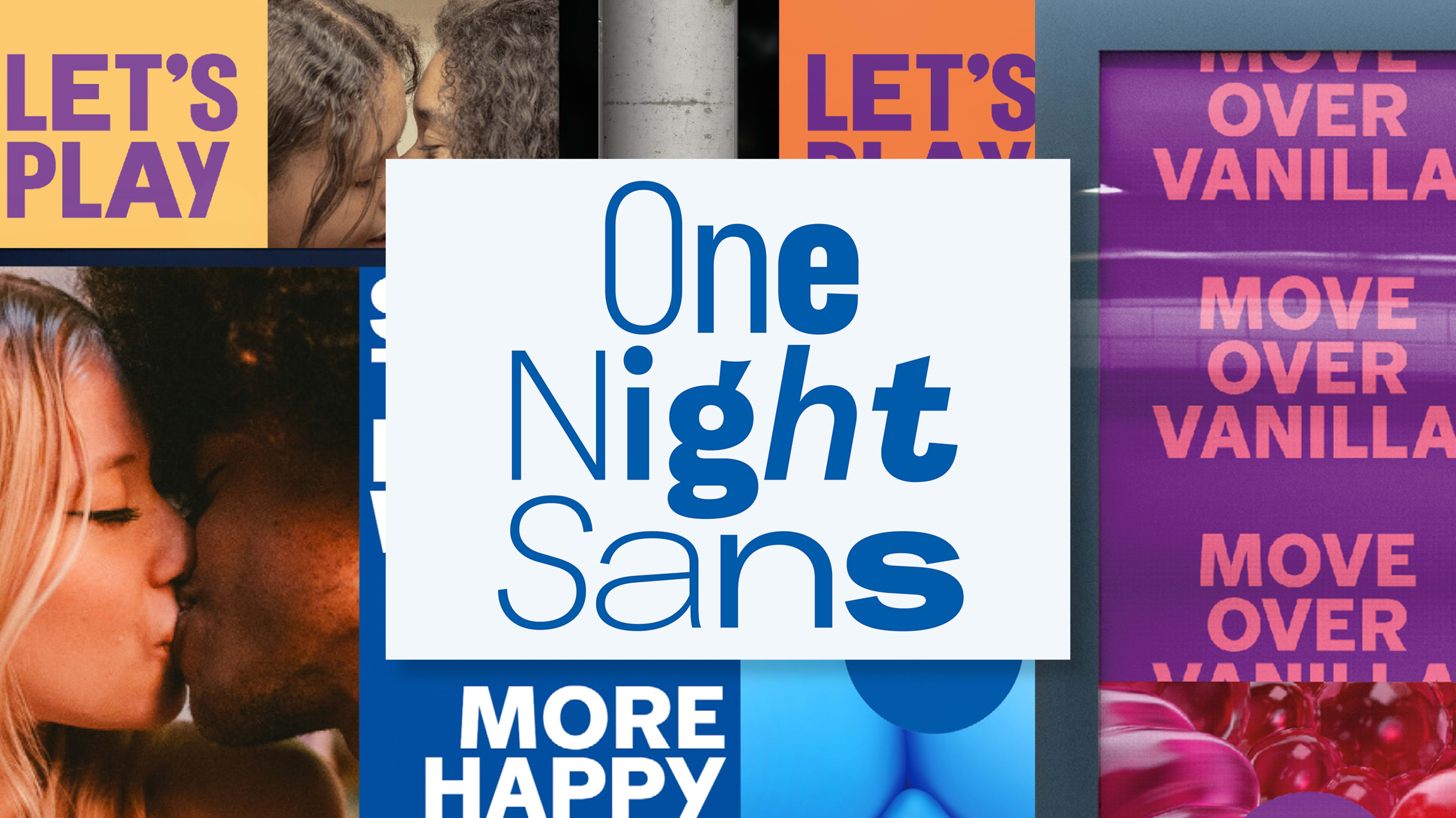
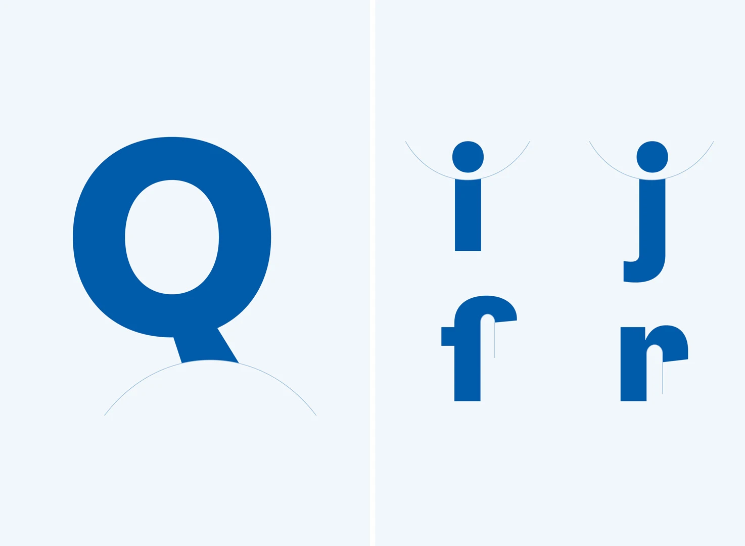
British condom brand Durex just released a new typeface. Aptly called One Night Sans, it’s part of a new visual identity created by London-based creative agency Havas London. The typeface, designed by British type foundry Colophon, is a thin sans serif that primarily uses an assertive all-cap set in a bright cobalt blue. (There’s also a white knockout version.)
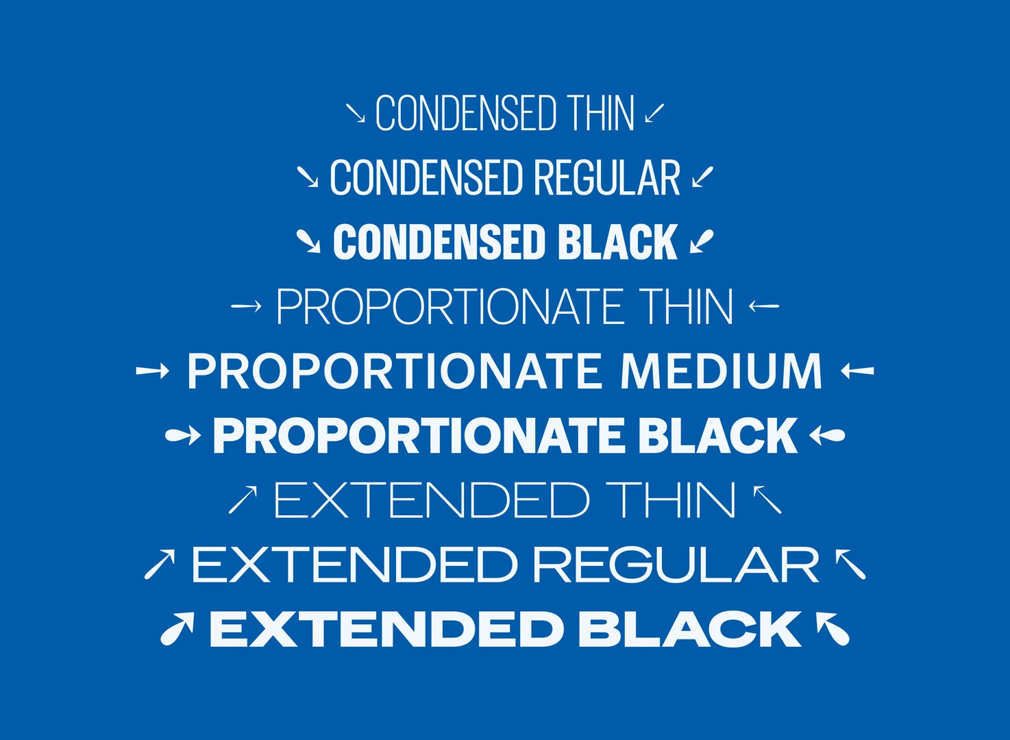
When the text plays with the nine different type classes and weights within the family, ranging from condensed to extended and thin to black, it gets fun: variable set weights give sentences a physical shape and emphasize key words in text-heavy visuals. Colophon made the typeface referential to the overall identity by using the same curve of the Durex “lozenge” shape that acts as a border for the logomark to round off ascenders and descenders. We see you, Colophon. Maybe throw in an italic to spice the text up a bit? Cheeky.
Elliot Harris, RB global executive creative director at Havas, said in a statement that Durex’s influence might make this the “most important piece of work we ever do,” as the larger rebrand takes aim at common misconceptions about sex. It was informed by Durex’s 2017 Global Sex Survey, which indicated an “underlying sexual anxiousness, driven primarily by unrealistic representations of sex throughout culture.”
As for the custom type: It’s part of a larger movement by big companies and organizations—including Apple, Google, Coca-Cola, and even the U.S. government—to commission their own typefaces. There are so many channels that a brand has to live on these days. For an identity to be successful, it has to be recognizable with or without the presence of a logo mark. That’s where a typeface comes into play.
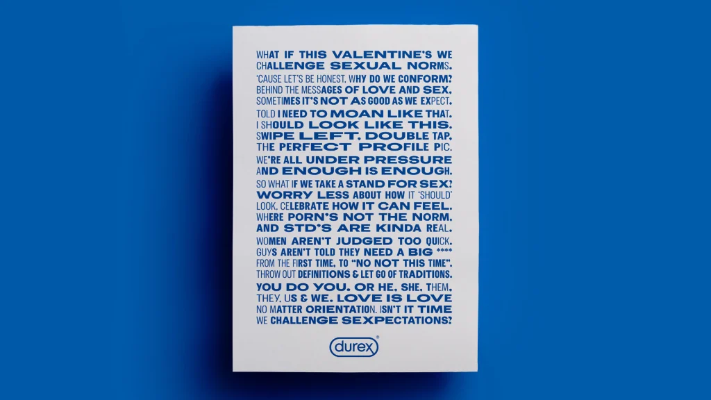
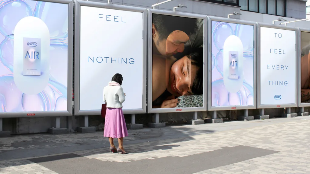
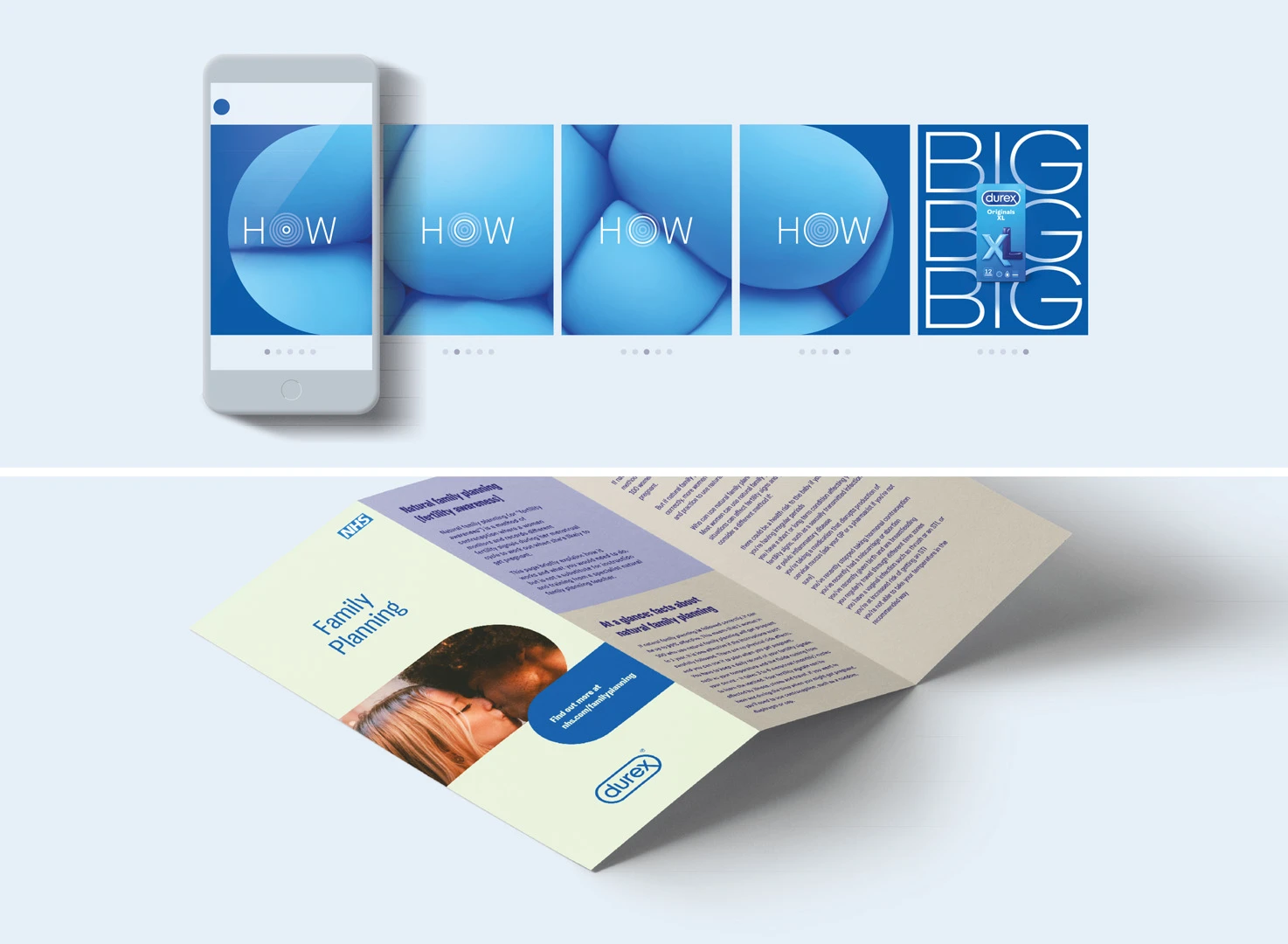
The Durex typeface has to be especially easy to use. That’s because One Night Sans will be used across media, whether for the company’s own commercial use on subway and print ads of varying scales, on packaging, or as small text in informational sex health pamphlets as part of the brand’s partnership with Britain’s National Health Service (NHS). One Night Sans just has that je ne sais quoi that makes you look twice.
Recognize your brand’s excellence by applying to this year’s Brands That Matter Awards before the early-rate deadline, May 3.