We’ve all been there. You need to charge your phone, and go to plug a USB cable into its charging block. But in what ends up being a comedy of errors, you fumble around trying to get the USB plug to fit into the port. You have a 50/50 chance of getting it right. With those odds, you might as well close your eyes and try it.
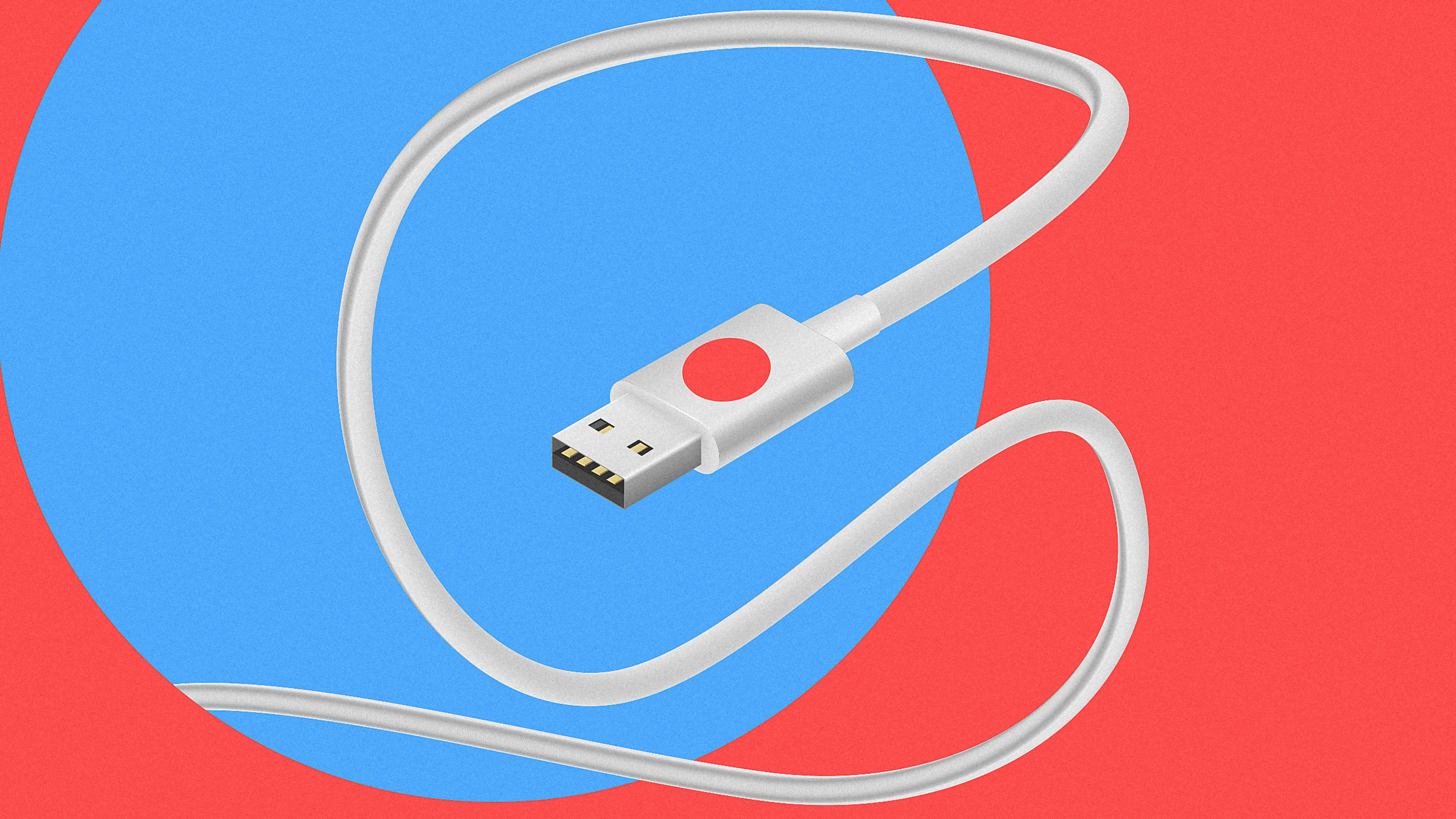
That’s because the current design doesn’t offer any visual indication of how the port and the plug correspond together. Ji Lee, a communication designer at Facebook, has an idea for solving this design flaw, and it’s ridiculously simple. Put a visual cue, like an icon, or in this case, a red dot sticker, on the coordinating faces of the USB port and the plug. Take a look:
This will probably make you think, “Why didn’t I think of that?” Let’s just collectively agree that we all wish someone would’ve thought of this a lot sooner. Lee made all our lives a little better by following that golden design rule KISS: Keep it simple, stupid. Apple? Microsoft? Want to pick this one up?
Recognize your brand’s excellence by applying to this year’s Brands That Matter Awards before the early-rate deadline, May 3.
