


We’ve heard a lot about the polarization of politics and the media over the past few years. And some households might have their preference of the top three cable news channels—Fox News, MSNBC, and CNN. But one broadcaster has more reach than any of them: PBS.
According to a September 2018 Nielsen report, 215 million people, or 83% of all U.S. television households, watch PBS via “traditional television.” The network reaches 89% of non-internet homes, 82% of lower-income homes, and 78% of rural homes. Its demographics reflect that of the overall U.S. population in regard to race, ethnicity, education, income, and geography. And PBS was ranked the most trusted institution among contenders that included courts of law, cable and broadcast tv, newspapers, digital media, and more, according to a 2019 report by Marketing & Research Resources.
[Image: courtesy PBS]Though the broadcaster had near universality in American homes, it was in need of a rebrand as it continued to expand into the digital world. That became the design challenge for Connie Birdsall, global creative director, and Bogdan Geana, partner, of creative consultancy Lippincott, who developed the new brand identity for PBS, along with Shelby Hawker, senior partner, and Emily Guilmette, partner. How do you develop a brand that stands out and still appeals to everyone?
While Birdsall felt the logo developed by Chermayeff & Geismar & Haviv in 2009 “had a lot of strength,” the mark—and the system surrounding it—was ready for a 2019 reevaluation. For Don Wilcox, vice president of multiplatform marketing and content at PBS, the previous look had a “broadcast sensibility” that didn’t translate well across platforms. “We are working in a multiplatform world and we need to change our practice. It’s incredibly important for us to show up consistently and legibly, whether on a handheld device or flat screen.”
[Image: courtesy PBS]So Birdsall and her team went back to the mark to determine how to adapt it for the digital age. When looking at the new logo itself, you’ll notice only slight alterations. But they made all the difference when it comes to brand cohesion and direction.
The team wanted the mark to be quickly identifiable as users switch across platforms. So they first turned to adopting a consistent, proprietary color, which had to convey PBS’s standing as a “thoughtful and thought-provoking media leader,” and the trust it has established with viewers. The team landed on a vibrant, brighter blue to differentiate from any unwanted political affiliation (including the Democratic Party), and that brought a bit of the unexpected. This is a rebrand, after all.
To bring the “flip-phone brand” into an “iPhone world,” as Wilcox describes it, Birdsall and her team made changes to the design of the mark itself as well: They simplified and enlarged the typography, scaled up the size of the head inside the circle, then scaled the type to equal the height of the head, so the two design elements read as one unit together. There was another small change, too: The team tilted the nose up slightly, so the head gazes upward, toward a “beacon of thoughtfulness.”
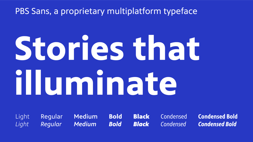
Clean design was also important in creating a sense of universality, even when PBS programming, like its audience, is diverse. “By adopting that flat design and a less invasive design approach to how we make our brand seem, it lets the content do the heavy lifting,” says Wilcox. Whether a viewer is engaging with science, news, or drama, content is at the forefront; the branding was there as a buttress to storytelling. A “crisp, clear, and consistent” typeface met their objectives for legibility across platforms. All together, these new design principles create a cohesive system that’s easy for local member stations to use. “For the PBS brand to flourish, we need to have the brand appear as often as possible,” says Birdsall.
But PBS can’t mandate changes to member stations like a traditional broadcast network, and according to Wilcox, its 330+ local stations don’t have to use the logo in the presentation of their station identity. So, adoption of the new brand identity became, as Wilcox describes it, “a process of attraction.” PBS consulted extensively with stations across the country in regard to the direction a new brand system would take. According to Wilcox, when they synthesized all that information, the stations saw the same opportunities as his team: They need to do “a better job of reflecting the PBS that already exists. We’re not changing who we are.” According to Wilcox, around 70% of PBS’s more than 330 member stations have agreed to adopt the new system. The ease of use and simplicity of design was a key factor.
“We want to be there for every American, regardless of background, age, or geography—whether you’re getting us with rabbit ears in the Blue Ridge Mountains or an optic connection in Austin,” says Wilcox. The aim, as has ever been the aim of PBS, is universal appeal. The new challenge for the identity and the broadcaster will be meeting viewers where they are appearing more and more: in the digital realm. And PBS is focusing on digital—the PBS Digital Studios network of shows now has 20 million subscribers—and it will continue to do so as broadcast continues its demise. PBS hopes the continuity of the new brand identity will help it meet the needs of future viewership. Just like the face of the new brand mark, it, too, is forward-looking.
Recognize your brand’s excellence by applying to this year’s Brands That Matter Awards before the early-rate deadline, May 3.
