
Tonight’s Democratic debate will feature a whopping 11 different candidates, all vying to be the Democratic nominee for president in 2020. There are already plenty of breakdowns on their policies. But what’s been missing from the conversation, in our humble opinion, is a superficial—perhaps even petty—breakdown of their branding. Which of the candidates has the best logo? And which has the worst?
We enlisted the four cofounders of The Center for American Politics and Design, a burgeoning research group that tracks political graphics and investigates their impact, comprised of artists and designers who’ve launched major apps, developed brand identities, and more. On the side, they all have a passion for understanding how design impacts the democratic process. Each cofounder individually scored each candidate’s logo on a scale of 1-5, then they tallied up the votes and created the list you see here.
The Center cofounder, Susan Merriam—who I must say was a very good sport about offending so many potential presidents—walked us through their choices.

11. Andrew Yang
Most of the Democratic candidates avoid red in their logos—perhaps they don’t want to look too Republican. Yet for Yang, it’s the primary color, swooping in like a flag on the “Y.” The Center’s experts were not fans. “Yang’s logo came across as . . . [an] outsider trying to be part of the club,” says Merriam. “When you look at the array of logos, you see other candidates try to define and differentiate themselves, so their logos look less traditional in some ways.” The experts saw Yang’s approach as a bad copy of conventional red, white, and blue political branding. They also thought the design lacked technique.
“Technically, the stripes on the Y are not great,” she says. “It’s small, not nice in proportion.” Or as another Center cofounder, Will Denton, put it, “It feels like it was made with an old word processor.” Burn.
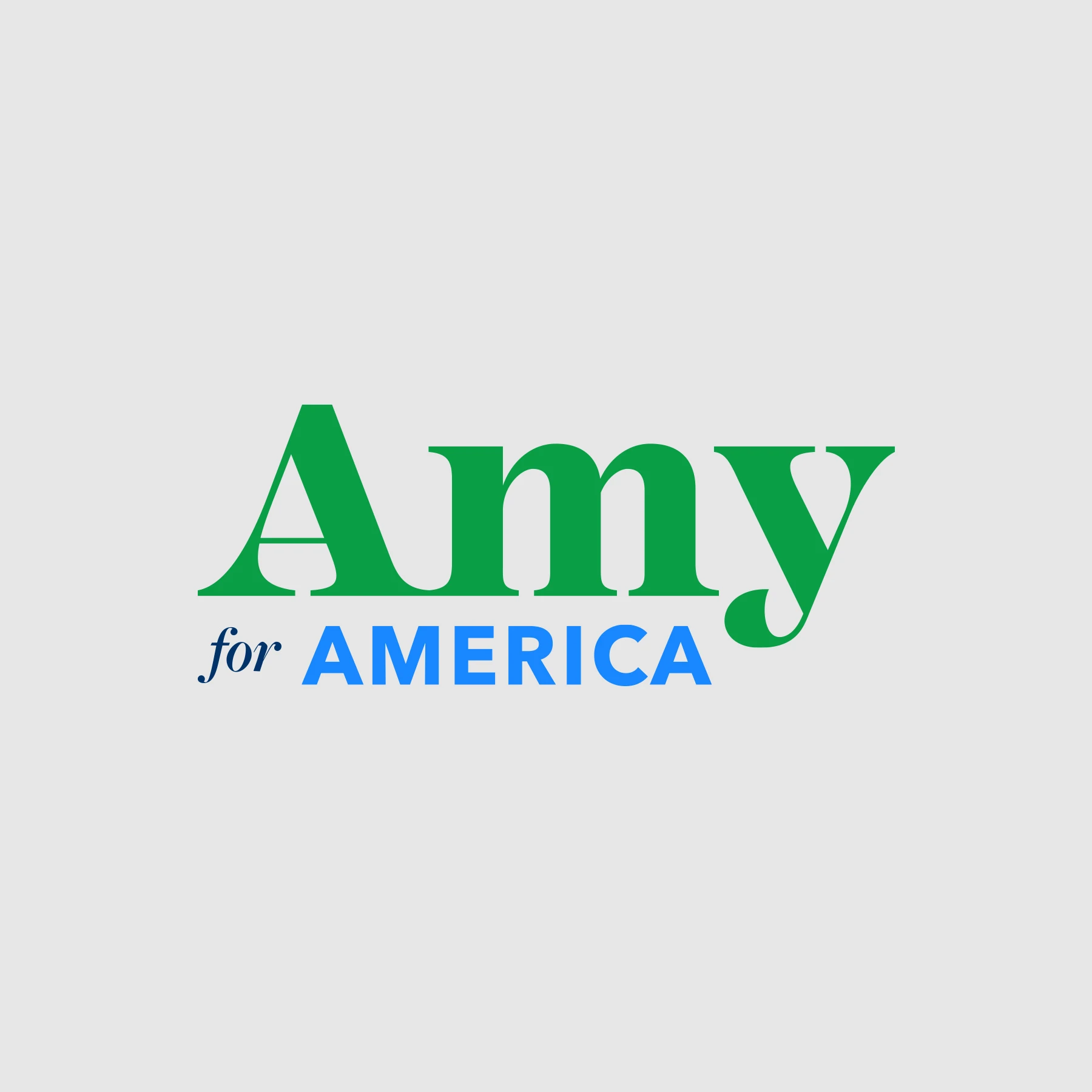
10. Amy Klobuchar
Amy. Amy. Amy. We’re not being informal. That’s Klobuchar’s logo, which scales “Amy” really big followed by “for America” really small.
Strategically, the first name presidential logo seems to be on trend; you’ll see a lot more in the coming candidates. It may be another way to communicate that these candidates are unconventional, unlike past campaigns that used last names alone. “It was ‘Bush and ‘Gore.’ You did not see ‘George’ and ‘Al,'” Merriam laughs. Times are changing now, however. If Bush and Gore ran today, they very well might have framed themselves as George and Al.
That said, our judges didn’t like “Amy’s” logo.
The “Amy” itself is fine; Merriam calls its high-contrast serif typeface “interesting.” The problem is more its mix of other typefaces, and their arrangement. “‘For America’ doesn’t seem well aligned—the ‘for’ isn’t aligned with anything!” says Merriam.
“So you’re saying Pentagram didn’t create this logo?” I ask. “Pentagram would not have made that logo,” she laughs. “I guarantee!”

9. Julián Castro
Castro’s logo is his first name, rendered in deep blue, wrapped inside a box, and highlighted with a sharp, periwinkle accent mark—the same blue used for his last name at the bottom of the image. It’s sharp. Clean. Allow me to say, on a personal note, that I think this is a very competent logo. So why is it No. 9?
“I think from a technical standpoint, it is very adequate. It’s well balanced, and the accent is nice detail,” says Merriam. “But one thing that came up was it almost felt like a default brand in a way.”
Indeed, it feels like he could be a presidential candidate, or he could be a bank, or maybe he could be a line of direct-to-consumer vitamins. This is a bit strange, because Castro has a whole other side if you look at his merchandising. Merriam points to his buttons that read “Adios Trump!” in confident, catchy hand lettering. It seems that Castro’s merchandise is willing to take risks, but his primary campaign logo is extremely reserved.

8. Tom Steyer
“TOM two-oh two-oh.” That’s the approach of Steyer, the latest entrant in the Democratic primaries. “TOM” is blue. “20 20” is orange. This informal presentation is the visual equivalent of when an employee interprets business casual as being a tank top and cut-off shorts, and the manager has to call ’em into their office to explain.
“One thing someone said on Twitter: ‘This is a great logo for any friend you know named Tom.’ Which is the way this is positioned,” says Merriam. “It doesn’t need to look like a political logo . . . but this was not all that distinctive.”
The way I see it? You like your friend Tom, and, yes, I like your friend named Tom, but we both know he’s not presidential material.
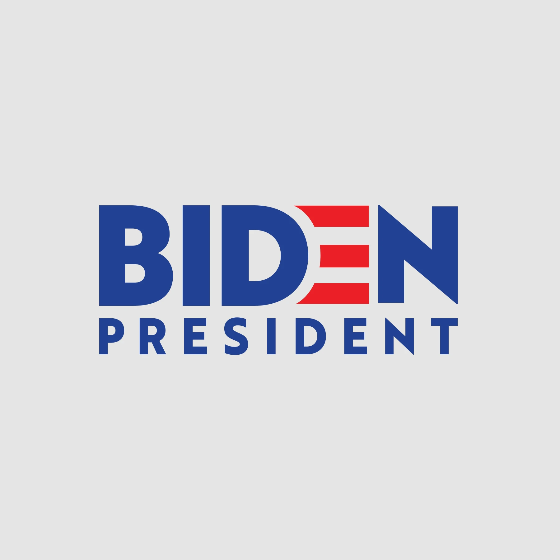
7. Joe Biden
Say it ain’t so, Joe. This logo may or may not look like it has a groping hand inside of it. But this side note has nothing to do with our expert’s critique. No, they’re more concerned that Biden’s logo looks too traditional.
Note that Biden highlights his last name, with a traditional formality. The color and flag inside the logo are traditional, too. With all of this, Biden seems to be overtly broadcasting that, unlike his peers, he very much IS part of the establishment. He was vice president! The experts, however, suggest he hasn’t strayed far enough from Obama’s aesthetic.
“This is the Obama 2.0, Gotham-like logo. But the thing is here, it’s not as exciting because we’re not back in 2008 or 2012, it doesn’t come across as exhilarating, like that Obama was the change candidate for example, because the Biden logo isn’t the change in terms of design for this time. That being said, it does look like a well-done, traditional Democrat political logo.”
The twist is that Biden’s more traditional approach could actually win out in the long run. While we’re seeing a lot of brand experimentation in this election, that doesn’t mean it will necessarily stay that way, says Merriam. “If Biden becomes the Democratic representative—will that [traditional approach] influence the next round of candidates?” she wonders.

6. Elizabeth Warren
Okay, confession time. Warren and Biden actually tied in the scoring, but Warren edged out Biden after more analysis and debate, so she comes in at six.
The two candidates’ logos couldn’t be more different. Biden is a traditionalist. Warren’s logo embraces modernism. Her logo is meant to be a mere part of a larger brand system, on a website, social media, and more. Her name is her last name, underlined, in mint (or what her campaign calls “liberty green”) to a frequent backdrop of purple. Red serves as an occasional accent outside the logo itself, for a little America grounding.
Merriam readily acknowledges and agrees with this summary. But despite its unique, condensed font, she felt Warren’s logo is “playing it safe as well,” she says. “I think they were very intentional choices, I just don’t think they were very bold choices.”
That mint/purple/red color scheme is still notable to Merriam, though. It demonstrates the shift that many political candidates have made against the stars and stripes, probably to differentiate themselves as outsiders. (Call this the reverse Andrew Yang play.)
“If you’re a designer working on these things, [you notice] people who made headlines in 2018 in the Democratic party were Alexandria Ocasio-Cortez and Beto O’Rourke,” says Merriam. “Both used condensed fonts with a slightly quirky typeface. Then they differed in terms of color. Ocasio-Cortez used purple, yellow, and blue. O’Rourke used black.”
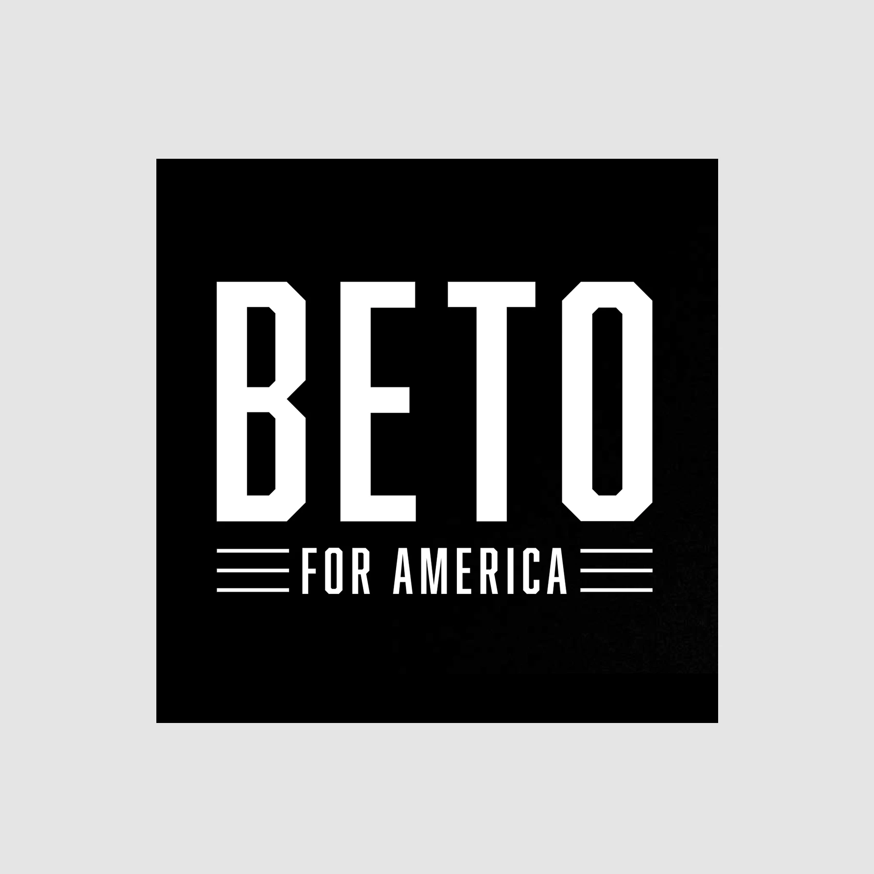
5. Beto O’Rourke
O’Rourke is the only candidate in the bunch with a purely monochromatic logo. Rendered in black and white, in a typeface Merriam simply describes as “Texas roadhouse,” it’s unique and speaks to his roots. “Beto’s logo is a good fit for him,” says Merriam. But does it make us love Beto when we see it?
Our experts weren’t so sure. They each actually only ranked Beto as a three or four on a scale of five. It wasn’t a favorite; it was very middle of the road, something like a plate of mediocre french fries. No one is saying they hated the fries! But nobody wanted seconds, either.
[Images: courtesy Pete For America]
4. Pete Buttigieg
Alright Mayor Pete, you’re up next, buddy. Full disclosure: Being the same age, and living in the general midwestern region, Pete—aka The Petemeister—is a constant reminder of how little I’ve done with my life. So I can’t stand to see him win out of sheer jealousy, but as the closest thing I have to a political surrogate, it also stings to watch him lose.
For Buttigieg, the experts were split. Notably, Buttigieg’s campaign released a mix-and-match, make-your-own brand for any and all Pete content your heart desires. But the campaign still uses one logo on its site. Merriam herself loved the logo, which hangs Pete’s name like the banner of a homecoming football game. She calls the work “young, hip, and retro.” “It aligns well with him being a young candidate.” But again, it was polarizing.
As another expert put it, “Pete’s logo is simultaneously too cute and not cute enough. It looks like a football fraternity for design school.”
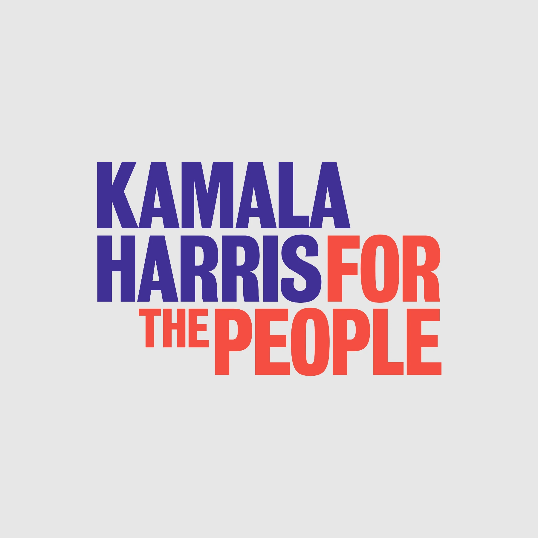
3. Kamala Harris
If Buttigieg was the football logo, Harris’s long wordmark, “Kamala Harris For The People,” presented as one block sentence, is more refrigerator magnet poetry (in a good or bad way, depending on your taste).
Like Buttgieg’s, it was polarizing to the judges. They marked it very high or very low. One judge felt Harris looked like a word map. Another didn’t like the shape of Harris’s “Rs.”
But what works well about Harris’s logo, ultimately, is that it defines a position. She’s not just “Kamala” or “Harris,” she’s the whole person, here for “the people.” It’s a less memorable logo in terms of its symbology, but more straightforward, and perhaps ambitious, in its message.
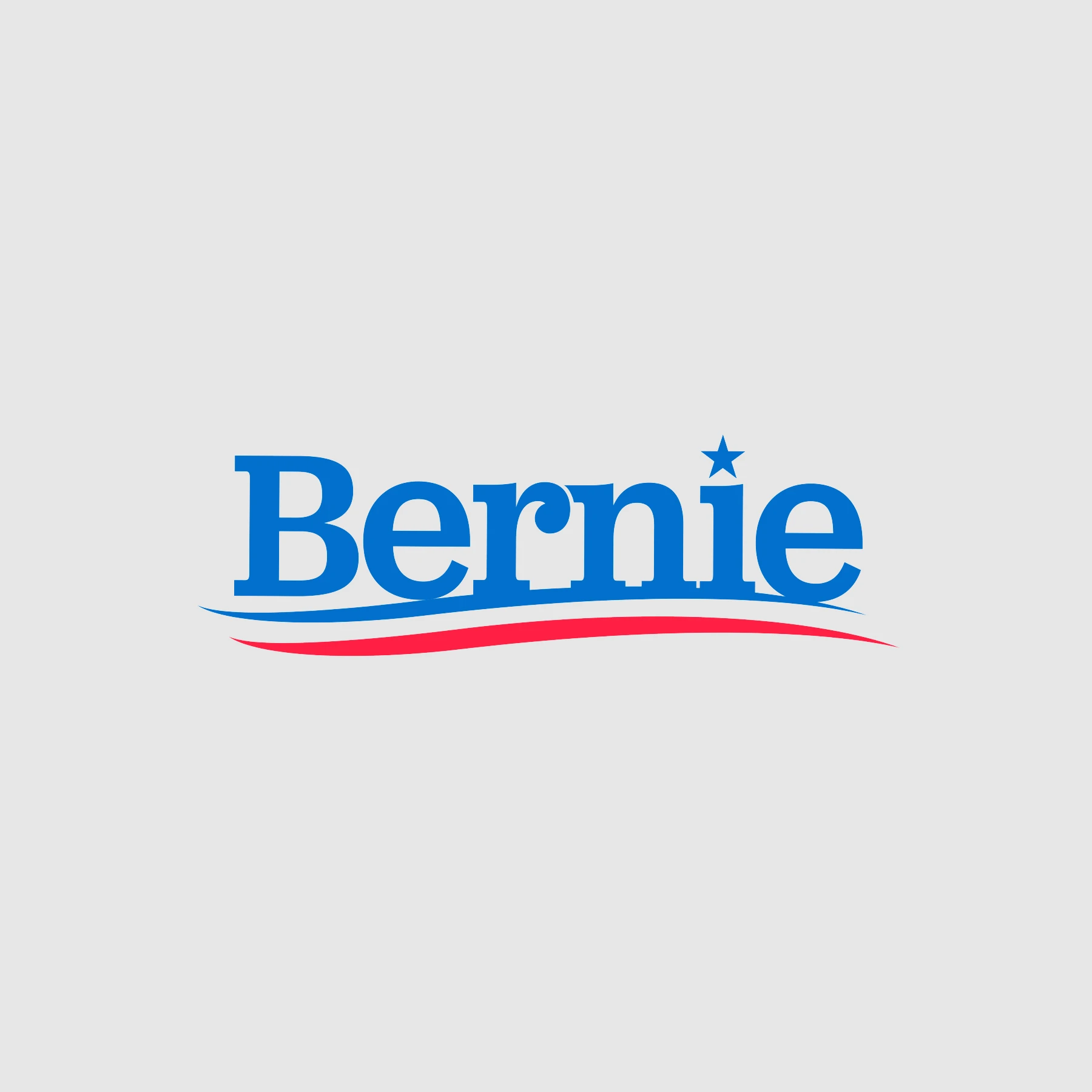
2. Bernie Sanders
Bernie is back, baby! Everyone still feeling the BERN!?! It’s a pun that encapsulates the burning pain of this entire political preseason, isn’t it? Anyway, I hope you are, because his logo is almost completely unchanged since his 2016 campaign. Since new logos are for the 1%, Sanders just swapped out his 2016 for 2020.
That said, his logo scored high and ranked well. “I enjoy this serif, it feels homegrown,” says Merriam. “The type isn’t exactly perfect, but I think that speaks to the more populist view of his brand.”
There was clearly no sense in Sanders starting over if he already had a developed a recognizable brand, but it does make for an interesting thought experiment. “I wonder if [Sanders] designed a logo for 2020 instead of 2016, what that would be?” asks Merriam. Would Sanders’s logo look more like Harris’s or Buttigieg’s? We’ll never know.

1. Cory Booker
When I first received the ranked list from the Center, I honestly wasn’t sure if I was reading it in the right order. Was Booker first . . . or last? In fact, Booker’s stacked, two-block, blue and red logo, which reads “Cory” and “2020,” received the highest scores from every judge but one.
“His was the surprise,” admits Merriam. “What I like about it is, it feels like a presidential logo using red, white, blue—maybe the blue is more vibrant than royal blue—but I think the typeface that was chosen actually has a little bit of character, but not in a way you think it looks too retro. It doesn’t have too much character that it starts feeling distracting.”
That logo also works well on merchandise, in various color permutations. There’s a reason it looks good printed out, too. “[Conductor Condensed Bold], I think it’s a font usually used for signage, and it has that vibe, in a subtle way maybe it looks like an activist poster,” says Merriam.
In any case, the experts have spoken. Cory Booker has the best logo in the Democratic primaries. Now, given that he’s polling in 7th place, with about 2% of the nation’s support, you could make the argument that the Booker brand is not so effective. Or that there’s more to running for president than logos, T-shirts, and websites, after all. But given that everyone here appreciates the power of design, I think we can agree: Cory Booker just became President of the United States of America.
Recognize your brand’s excellence by applying to this year’s Brands That Matter Awards before the early-rate deadline, May 3.