
GoFundMe’s redesigned website is now optimized to load faster, have a sleek mobile display, and features a floating “donate” button that follows users as they scroll through campaigns or read updates from organizers. Those updates are also displayed sequentially, allowing users to understand that current status of a campaign as soon as they reach the page. Both those things are updates from the previous iteration, where you had to scroll back to a single donation button and updates were hidden behind a different tab that you’d have to click and wade through to understand what was going on.
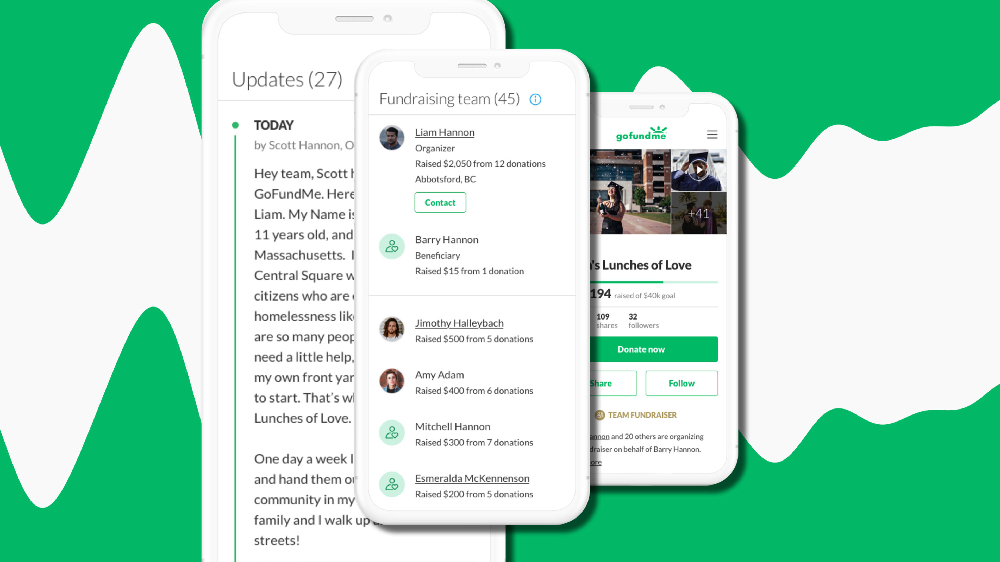
[Image: Gofundme]GoFundMe has also reorganized how it shares actual donation activity. Previously, that information was confined to a sidebar that updated much like a Twitter feed. Now it’s featured prominently in a central window on the main page of each campaign. The dashboard can also share how much revenue is being raised from appointed fundraiser team members, whether they have personally donated or not. That’s because GoFundMe already tracks who contributes through the campaign links that members personally share with their own networks.
“There’s now more of an emphasis on the fundraiser’s team members in an effort to better acknowledge and identify their important role in the fundraiser’s success,” writes design manager Braden Floris in a blog post about the redesign. Floris points out another tweak learned from years of tracking engagement. “People are more likely to donate when there are a variety of photos on the fundraiser. Now we feature multiple photos in a gallery view, rather than hiding them behind a small button.”

In late 2018, GoFundMe battled user trust issues after one campaign that raised $400,000 for a homeless man turned out to be a fraud. The clarity of this design might also help users better track where exactly their money is going in instances where a fundraiser goes viral. “We encourage transparency and continued storytelling,” adds GoFundMe chief technology officer Chi-Chao Chang in an email to Fast Company about the broader values of the company. “By placing the fundraiser updates on the main page, donors are able to quickly see the latest news and photos, while organizers can keep the community updated on progress and latest needs.”
The company sees this redesign as a broad live test—it will be tweaked with potential new features over the next few months. “We are constantly looking for ways to make fundraising fast, easy and effective so we wanted to create a fresh and modern look with improved technology across the site so people can raise money quickly when they need it most,” adds Chang. “We wanted to improve both the technical architecture to speed up load time, as well as rebuild the page to deliver a better experience for our community.”
Recognize your brand’s excellence by applying to this year’s Brands That Matter Awards before the early-rate deadline, May 3.
