


Protests have long been an important part of American history, from the civil rights movement in the 1960s to the Women’s March. The images and symbols of these demonstrations are rightly seared into the national memory. Now, they’re also available in typeface form.


Now, Seals is working on a new typeface family inspired by the group of hand-drawn infographics by the black sociologist W.E.B. Du Bois.
Du Bois famously designed the infographics for the Paris World’s Fair of 1900. They visualized data about black Americans’ economic and social progress since the end of slavery by documenting the numbers of teachers, increasing land ownership, and rural versus urban populations. More broadly, the visualizations depicted how black people were being held back by institutionalized racism. So far, Seals has developed three separate fonts using the letters in Du Bois’s data visualizations and is planning to create different weights for each variety.

The foundry’s work is not just historical; for Seals, it’s also political. He first decided to take on the project after reading an essay about the dearth of black people in design. “That made me start wondering how can I increase diversity in design,” Seals says. “I can’t increase demographics. I love typography, and that’s the basis for every great design project. Why don’t I base typefaces on the history of minority cultures?”

“In the sign that Bayard references, there’s an S on [two] sides and they are completely different,” he says. “It’s always hard figuring out how many liberties I should take in terms of making the typeface more legible…essentially my process is trying to find a balance between that and trying to figure out how to tell that story.”
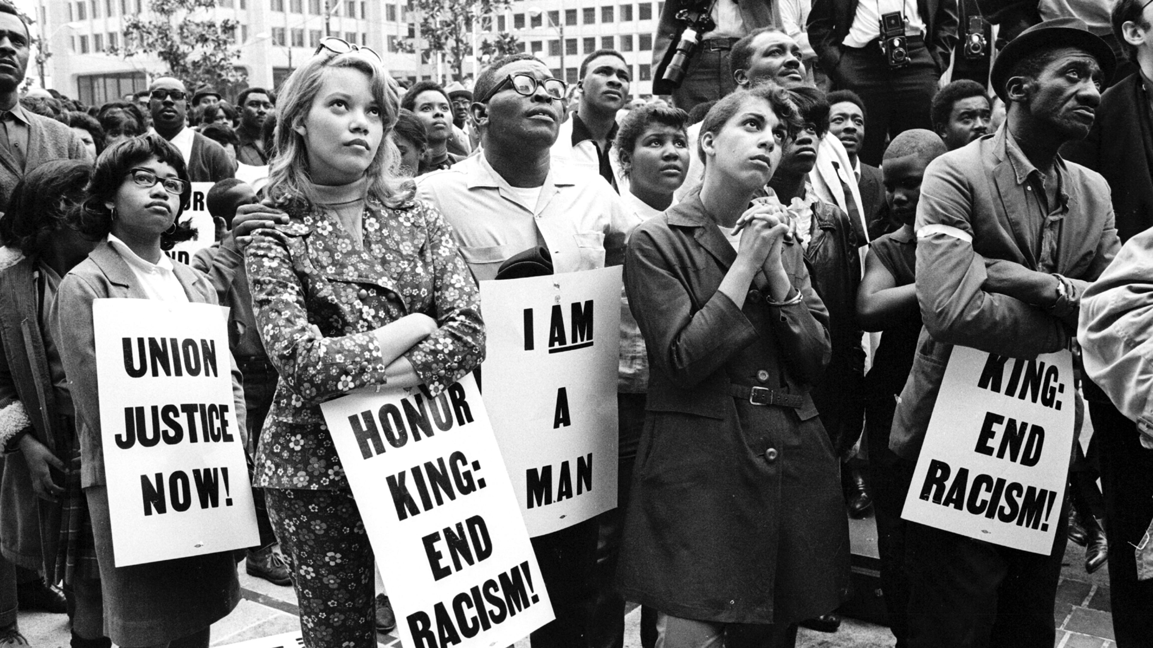
For some of his fonts, that means that Seals creates a historical version that maintains many of the quirks of the original protest posters, as well as a cleaned-up version that hammers out some of the inconsistencies.
So far, Seals’s typefaces have been used in magazines, posters, and on tote bags. His biggest claim to font fame is that Netflix used his font from the ’68 protest, named Martin, to market the documentary What Happened, Miss Simone?
“I was scrolling through Netflix. I was like, wait, I know that S,” he says. “I was so shocked.”
Recognize your brand’s excellence by applying to this year’s Brands That Matter Awards before the final deadline, June 7.
Sign up for Brands That Matter notifications here.
