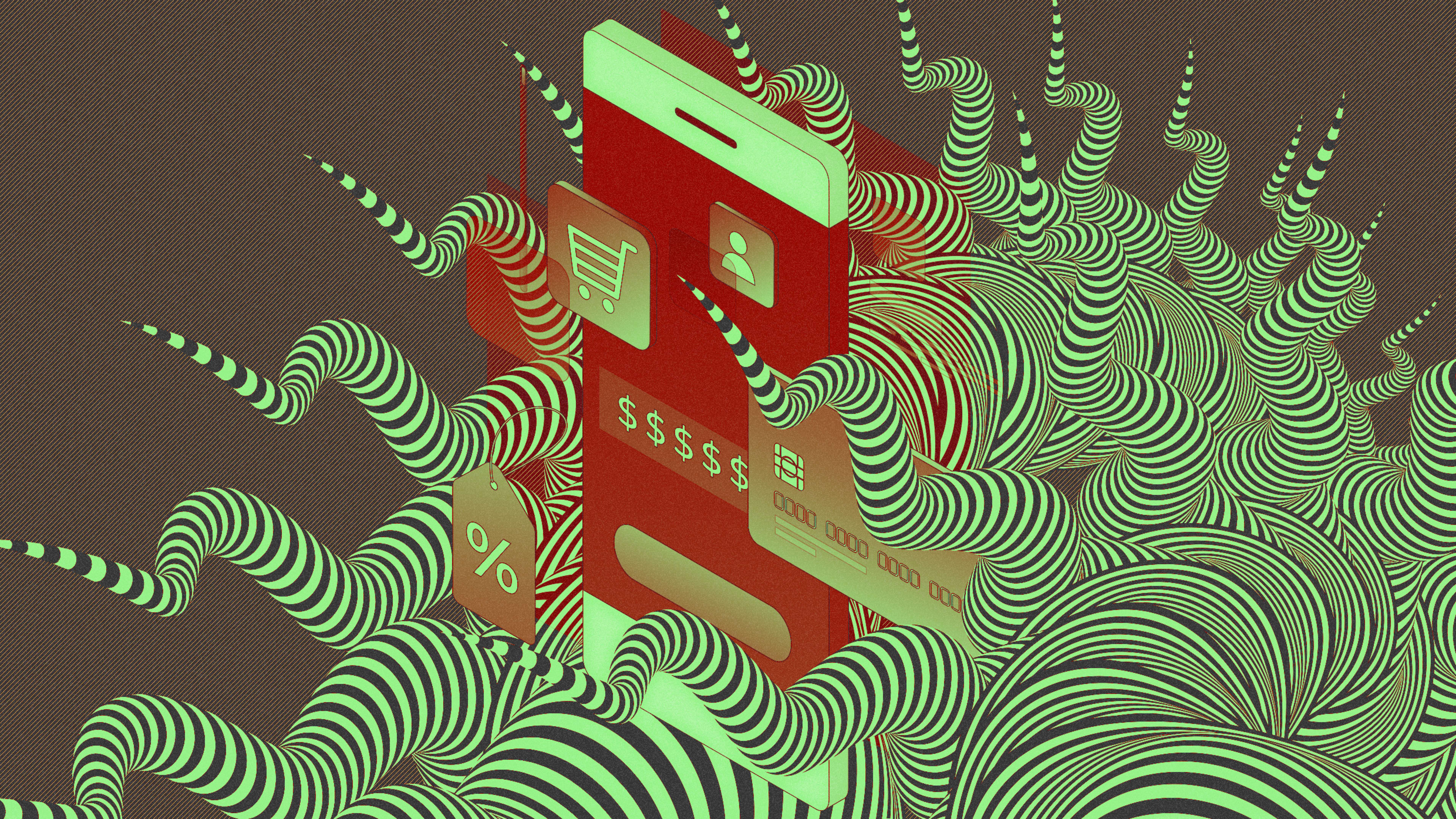
“Would you like 15% off your purchase?” reads a pop-up on RadioShack’s website. The first option below it, colored in bright red, exclaims, “Yes! I’d like the discount.” But the opt-out option reads, “No thanks, I like full price.”

This is an example of confirm-shaming. It’s a type of dark pattern—a user interface that is intentionally deceptive or manipulative—that’s often found on e-commerce websites. Researchers at Princeton University recently built a bot that simulates the way a user might browse a shopping site, while scraping all the text and styling information from each page. They then analyzed whether there were any dark patterns present. Of the 11,000 websites they browsed, they found a total of 1,841 instances of dark patterns on 1,267 sites that range from confirm-shaming to messages that pressure shoppers into making a purchase, by saying an offer will only be available for a limited time. Some sites even added more products to a user’s cart without asking them first.
The perpetrators of this deceptive design are some of the biggest e-commerce sites around, including Walmart and J.Crew, as well as scores of smaller sites. “Our design values reflect the same values of Walmart and therefore we absolutely do not use any dark pattern practices on our site,” says a Walmart spokesperson. “We will be reaching out to Princeton University to understand how they came to that conclusion.” (Fast Company also reached out to J.Crew for comment and the company did not respond before press time.)
The study (still a draft and under submission to conferences) is the first to analyze just how extensively companies use dark patterns on the internet. The authors identified 15 different types of dark patterns within the data, creating a taxonomy that draws on previous research and expands it as well; not every kind of dark pattern fits into previously established categories. According to Gunes Acar, a postdoctoral research associate at Princeton’s Center for Information Technology Policy and one of the study’s coauthors, all of this deceptive design usually has two goals: convincing users to buy more stuff, or convincing them to give up data.

The study comes as awareness about dark patterns among regulators is growing. In the U.K., a public agency recently proposed rules that would aim to protect children from dark patterns. Earlier this year, U.S. senators announced a bill focused on stopping deceptive software. The Princeton researchers are in touch with the team of Senator Mark Warner, who is leading the charge, and their tool, which they plan to open-source, could provide one way to detect and enforce a bill like this, if it were to be passed. (However, the proposed bill would only apply to websites with over 100 million active users, which means that most, if not all, of the sites the team analyzed are too small to qualify.)
The research also highlights the way that companies are specializing in selling deceptive design to e-commerce sites. Consider the “social proof notification.” It’s a dark pattern in the form of attention-grabbing notifications that tell users someone else on the website just bought something as a way of pressuring them into buying something themselves. Some of the companies that offer this to e-commerce sites, like Beeketing, Qubit, and Fera—businesses that tend to characterize themselves as automated marketing companies—also offer other dark patterns. These include tactics to express urgency (through countdown timers and other similar tools) and scarcity (where the site will tell you that there are only a few items left in stock to pressure you to buy something immediately).
Sometimes the messages reflect real availability, but not always. Acar pointed to an instance of a five-minute countdown time aimed at pushing people to buy faster that would simply reset when the clock ran out. Similarly, at the resale e-commerce site ThredUp, the New York Times reports that messages will appear on a shopper’s screen to tell them that “Alexandra from Anaheim just saved $222 on her order”—even though Alexandra doesn’t actually exist, and all the information was pulled from an arbitrary set of names, locations, and items.

To help consumers understand more about the sites that employ dark patterns, another group at Princeton called the Princeton University Corporate Transparency Project released a resource called TrickySites that builds on the researchers work to specify the more than 1,000 websites employing dark patterns that they found. These include the websites of Walmart, Fabletics, Levi Strauss, and J.Crew.
The researchers are planning to continue their work by looking at more than just shopping sites. “We definitely are interested in expanding our research into other kinds of websites or mobile apps or digital platforms that users might somehow be manipulated,” says Acar. “There’s definitely a lot of similar practices going on mobile apps . . . targeted at children.”
Recognize your brand’s excellence by applying to this year’s Brands That Matter Awards before the final deadline, June 7.
Sign up for Brands That Matter notifications here.
