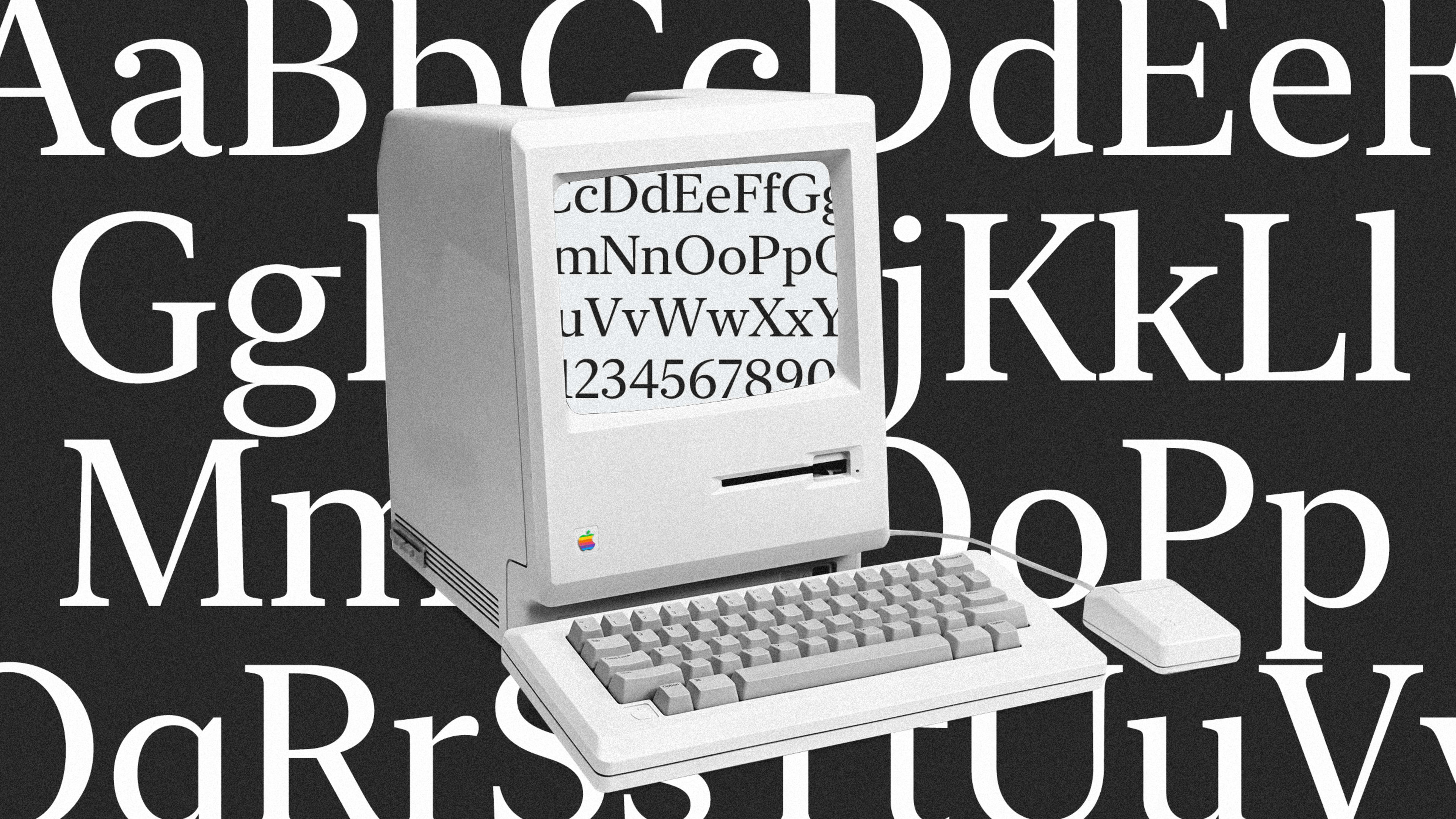
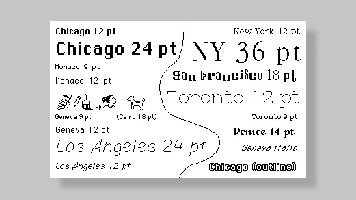
The original Macintosh, released in 1984, featured a series of fonts designed by Susan Kare, all named after famous cities. Chicago was the star, with a certain cool approachability that would make it Macintosh’s default for years, leading it to appear in many ads of the ’80s and ’90s, and eventually be used for the interface of early iPods. But another font dubbed New York had a certain flair of its own, with a look that evoked a quirky East Coast publishing house rather than a corpulently cheeked Midwesterner.
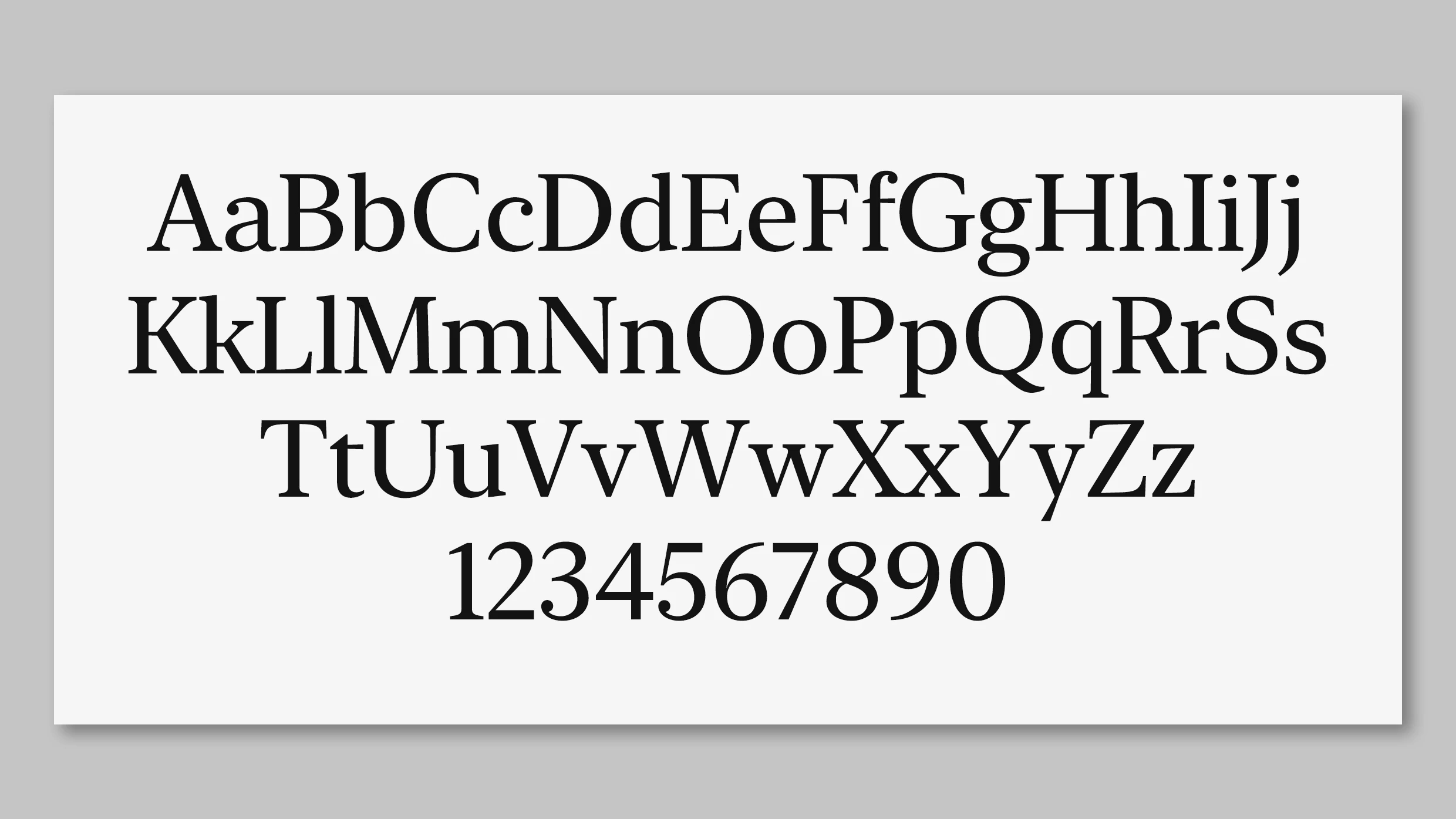
Now, in a quiet announcement during WWDC this week, Apple has officially rebuilt and rereleased New York. The font technically made its second debut last year in an iBooks refresh, but you can download it free right now for the first time. Just keep in mind that the terms and conditions limit you to using it in mockups and Apple-related apps.
It’s not entirely clear how New York will fit into Apple’s plans yet, but you can get a pretty good idea by reading between the lines. Apple’s current default font for Mac and iOS is a sans serif called San Francisco, which is basically an adaptation of Helvetica Neue. Such sans serif fonts, constructed with clear lines that lack the extra filigree of serifs, have been embraced in user interfaces in the digital era. Crucially, they can scale up or down without losing their legibility on even pixelated screens.
But sans serifs can be dull, and a wall of sans serif text can make creating visual hierarchy tricky. That’s why graphic designers will often mix serifs and san serifs in visual designs. Conventional wisdom claims that serifs make it easier, and faster, to read long passages of text (though modern science seems to dispute that). And furthermore, iOS 13 will allow users to change the default fonts across the operating system and their apps for the first time. For all of these reasons, it makes sense for Apple to introduce a sans serif standard, and resurrect New York to do that.
Apple could certainly do worse than follow a strategy of mining its archives for the fonts of tomorrow. The typefaces that Kare designed are not only still beautiful today (check them out here), they have a personality that hasn’t been eroded by Apple’s steel and glass sensibilities. A personal favorite has to be the effortless hand-drawn script of Los Angeles, which feels like Comic Sans grew up to become some globe-trotting celebrity known for leaving short but meaningful handwritten notes to friends. I’d gladly use Los Angeles in the Notes app and just about anywhere else. And what about a Chicago rerelease while we’re at it? It sure beats all these companies making the same boring sans serifs.
Recognize your brand’s excellence by applying to this year’s Brands That Matter Awards before the early-rate deadline, May 3.
