


Helvetica was dreamed up as a universal typeface in 1957 and it’s still incredibly popular –you see it on everything from clever T-shirts to NYC subway signs. But there are all sorts of things Helvetica cannot do well: It can be too plain in some contexts. It can require all sorts of chopping and squeezing of its letters when scaled up. And perhaps most importantly, 61 years after Helvetica was invented, we spend much of our day on tiny screens where its cramped characters are nearly illegible.
But, Monotype–the owner of Helvetica–has spent the past two years creating a fix for Helvetica’s shortcomings. The result is called Helvetica Now, and it’s available for licensing, well, now.
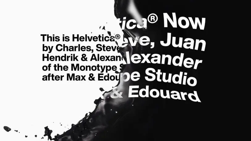
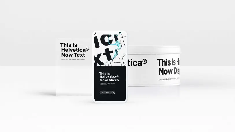
“Helvetica Now Micro solves the decades-old spacing and legibility shortcomings” of Helvetica, by splitting the single typeface into three, says Charles Nix, type director at Monotype.
On top of that, Now features a slew of different weights from very thin to quite bold. Playing with all of these options on Monotype’s own demo site, cranking up and down the sizes and weights, the typeface feels less like the buttoned up Helvetica you know–which often doesn’t look as wonderful on the screen as you might imagine it in your head–and more like the typographical equivalent of a self-healing cutting board. Try as I might, I couldn’t break the font. The trifecta of micro, display, and text really do feel like they cover everything.
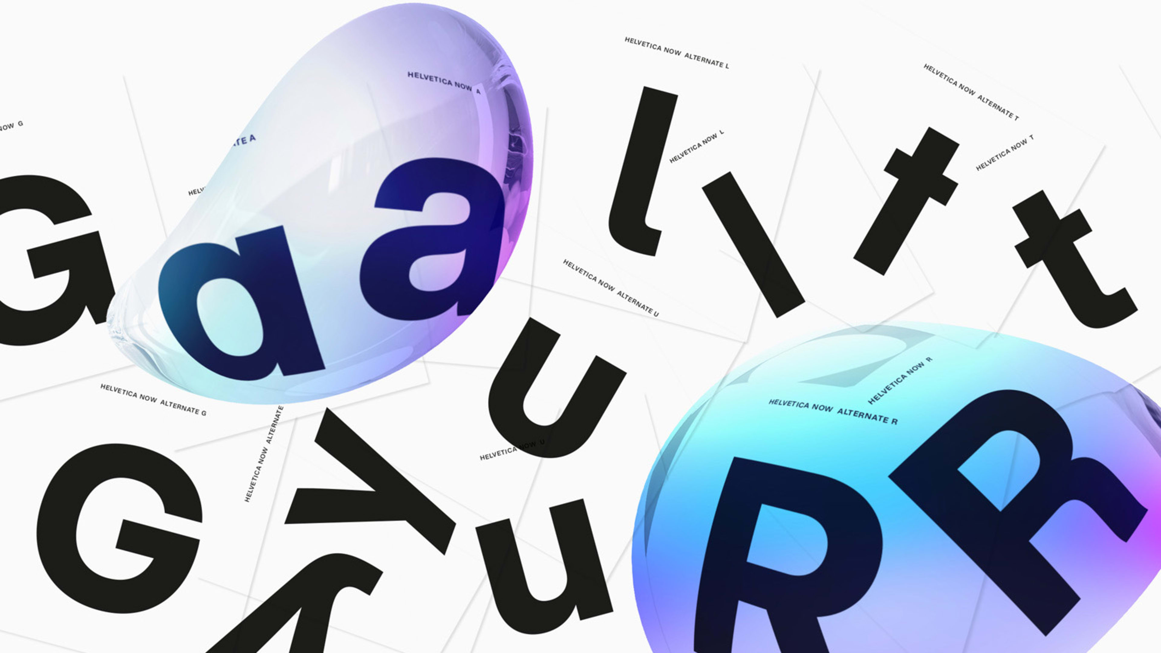
Aside from its balance and legibility across contexts, one other feature in Helvetica Now will be welcomed by graphic designers. Helvetica’s Now reintroduces alternative forms of some characters, including a “G” without the little dangling “beard” off its chin, or a “u” without its asymmetrical serif hanging off the right edge. These are not just tiny details that might drive some designers crazy. They offer options to make Helvetica feel different in different contexts. “Each of these changes holds the power to dramatically alter the entire family aesthetic, and yields countless design possibilities,” says Nix.
Together all of these changes, from new characters to more weights, mean that Helvetica will be more universal applicable than ever before–without necessarily always needing to look the same.
To test Helvetica Now for yourself, try it here.
Recognize your brand’s excellence by applying to this year’s Brands That Matter Awards before the early-rate deadline, May 3.