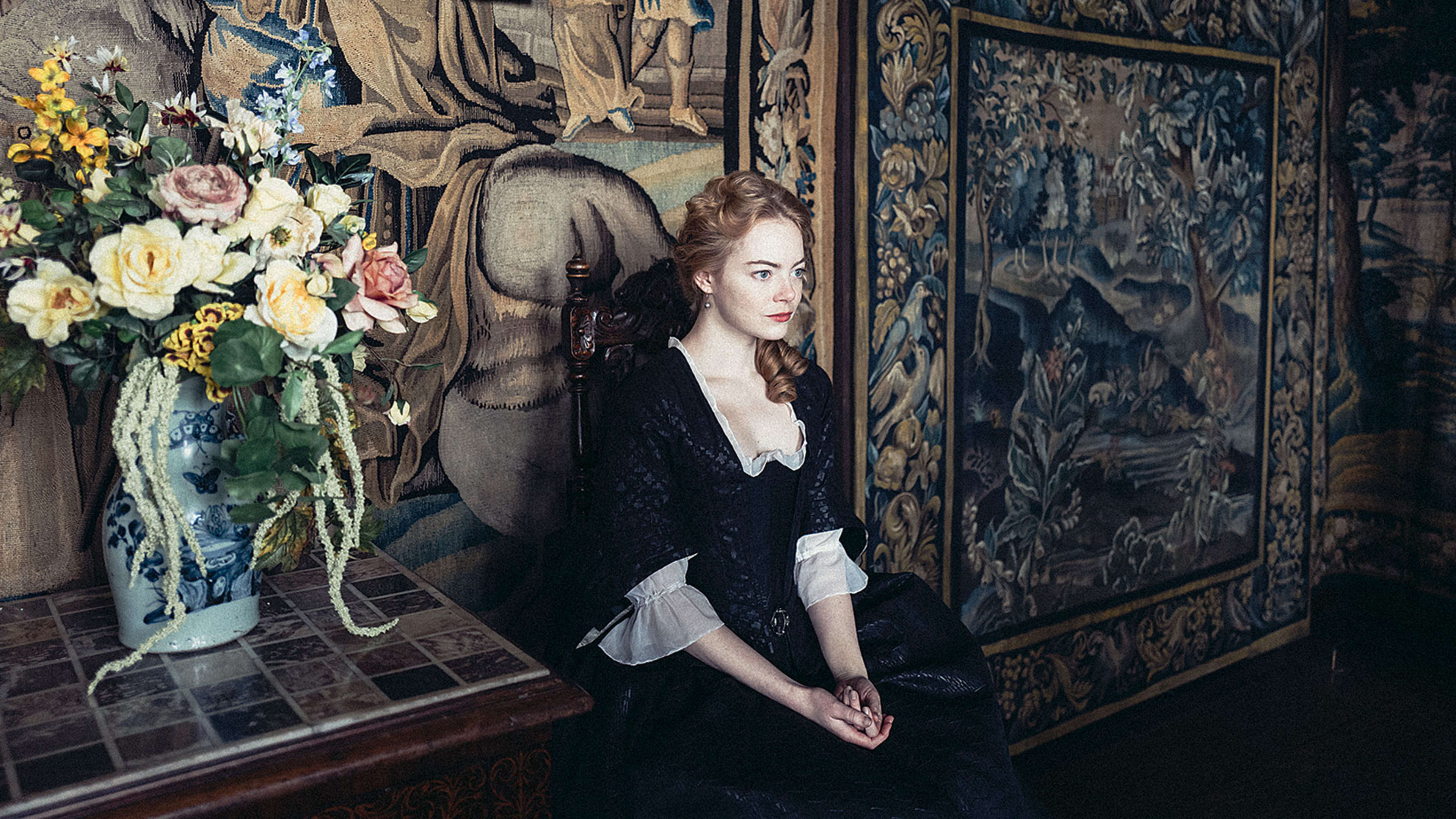
The Favourite–nominated for 10 Oscars this year–is a wickedly dark comedy. The story is something like a meaner Mean Girls set in Restoration-era England, as it profiles two real historical figures, Sarah Churchill and Abigail Masham, vying for the affection of Queen Anne.
The twist is that this rivalry is really a race to the bottom. Queen Anne went down in history as a relatively unremarkable ruler who gained control by unexpected circumstance, and was never raised in preparation to rule the country. She suffered from all sorts of ailments through her life, like gout, which kept her largely immobile. She lost 17 children in attempts to produce a successor, and died at 49. Anne was pitiable by almost any measure, but she was still powerful. She was the queen.
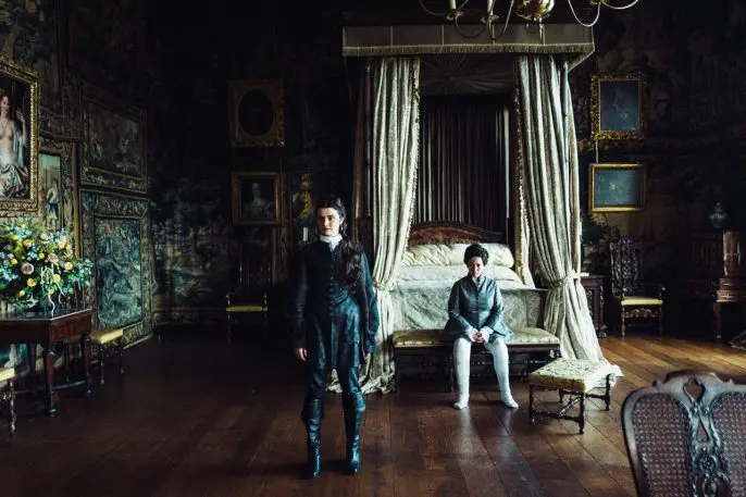
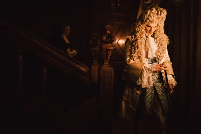
Director Yorgos Lanthimos fills the drama with unexpected and, at times, hilarious details, creating a film that’s almost impossible to categorize as a viewer. And that sensation is enhanced by the production design itself, which unabashedly introduces all sorts of anachronistic elements, rather than creating a perfect historical portrait of England circa 1700.

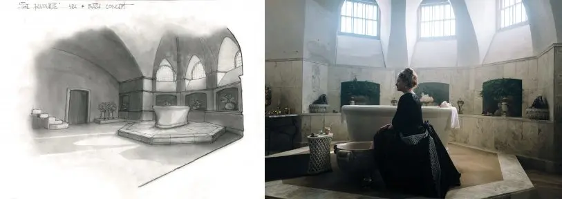
“Basically, I wanted it to feel like she’s in a padded prison,” says Crombie.
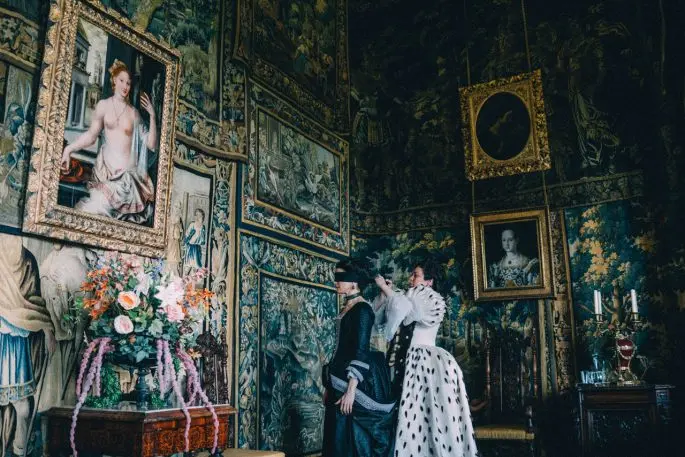
I mention that I didn’t know royalty from that era put that many tapestries on the wall.
“I don’t know if they did!” Crombie laughs. “I actually don’t know if they went that crazy with the tapestries. It just felt right for us.”
Embracing anachronism
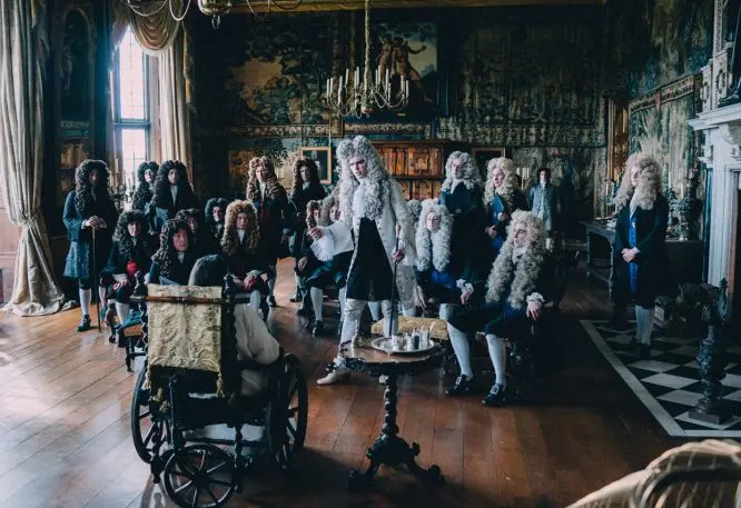
The tapestries are just one example of how the entire art team–from costuming to staging–disregarded historical accuracy to create a depiction of British history in The Favourite that felt like its own world. Just as The Favourite‘s script takes vast liberties in rewriting facts and expounding upon historical rumors, so too did its production embrace splashes of anachronism in interest of the film’s aesthetic.
“I remember at one point, our set decorator, Alice [Felton], said to [director] Yorgos [Lanthimos], ‘You know, in 1705’–and he said, ‘What makes you think it’s 1705?'” Crombie recounts. “And we just all laughed. This has no anchor, really. It’s a representation of a period . . . but it’s skewed. I feel like this is almost like a parallel universe period film.”
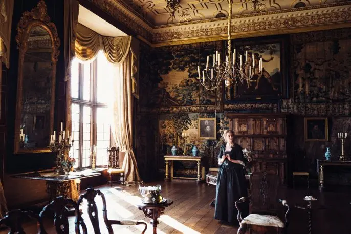
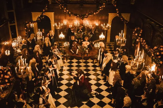
Crombie stripped the rooms bare and built them back up from scratch. She wasn’t inspired by the home’s decor, but she did take cues from the space itself. She cloned the wood paneling in many rooms to create a few standalone sets, and she discovered black-and-white tile in the ballroom, which she installed across many rooms in the Hatfield House to create a congruous visual theme. The same black-and-white motif was woven into the modernized costume design, along with the actors’ hair and makeup. It’s a visual irony in the film–so much black and white in a world that is morally gray.
Crombie points out that, in this sense, her job isn’t much different than the writer’s. “So often we believe a period because we’ve seen it represented in film, which means we have an assumption even about language,” she says. “The reality is none of us actually know how anyone spoke to each other in private.”
Lighting the world
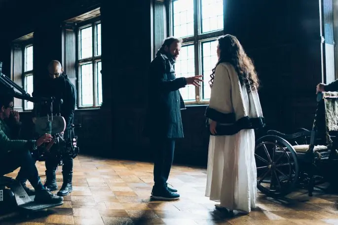
Practically, the greatest technical hurdle of the film wasn’t dealing with bunnies on set (or installing incontinence pads into the furnishings), or even the fact that the sets had to be constructed in 360 degrees so that Lanthimos could film them at any angle. The biggest challenge was dealing with the lighting.
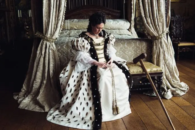
Look closely, and you’ll see every floor in the film has been stripped bare of coverings. Instead, the wood and tile was shined to a high gloss so it could reflect ambient light around the room. Crombie installed a lot of mirrors. Most fabrics were gold to enhance the warmth and brightness of the rooms. “It would have been terrible if I decided the palette would be dark blue” she says with a laugh.
Crombie says it better: “I think sometimes period films can be very polite. This film is impolite–but in as much as it’s brutally honest about human nature.”
Recognize your brand’s excellence by applying to this year’s Brands That Matter Awards before the final deadline, June 7.
Sign up for Brands That Matter notifications here.
