It seems quaint to think of Instagram as a photo filter app, but that’s where the social media platform first found its footing in 2010, offering easy-to-use filters that manipulated the colors and contrast of a digital image to replicate different film styles.
As it turns out, people were starting to find bland, neutrally hued digital images kind of boring. Filters let them skew the colors enough to transform basic images of lattes on restored wood tables and humdrum photographs of the Eiffel Tower into certifiably bloggable moments. Before we knew it, nothing—not even a photo of grandma—was safe. The world was now seen through a rose-colored filter.
Soon, Instagram’s measly 10 pre-set filters weren’t enough for the millions of photographs posted on it. Other apps soon popped up offering more editing and filtering options than ever before. Snapseed, VSCO, and Afterlight had hundreds of one-click options to revitalize everything from photos of your dog to photos of your Thanksgiving dinner.
For the first time, everyone was working with the same camera and creating results that looked nothing alike: there were grainy black-and-whites mixed with oversaturated sunsets and photos of teenagers that looked as if they were shot on a film type that was discontinued before they were born.
One style, though, had a rise unmatched by all others: It would catapult young YouTubers and Instagram influencers to millions of followers and its mass saturation would make it a contentious topic. Behold the “teal and orange” effect.
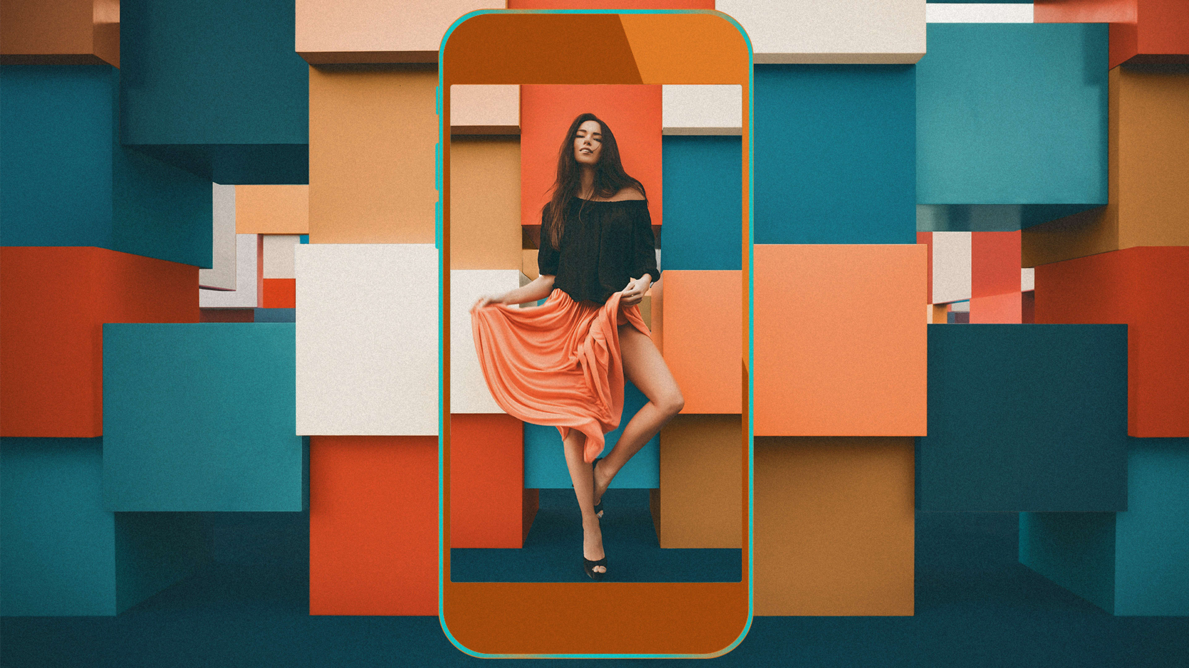
Why call it teal and orange and not blue and orange? Some of it is semantics. The most accurate version is probably “teal and amber.” Since a fair amount of lighter skin tones measured as a amber-ish orange, its direct complement is a tealish blue. And that means turning blue skies and seas into a tealish wonderland.
The hordes of influencers using presets to transform their photographs to teal and orange didn’t learn it from the film photographers of their past. They grabbed the look from Hollywood, where digital color grading had catalyzed an explosion of highly stylized looks. The first movie to be digitally color graded was Oh Brother, Where Art Thou? in 2000. Once the artistic possibilities of such extreme color manipulation were made clear, filmmakers pushed color grading to the extreme. Hollywood’s color experimentation in the early 2000s looked a bit like the first few years of filtered Instagrams. The kindest way to describe it is “a bit much.”
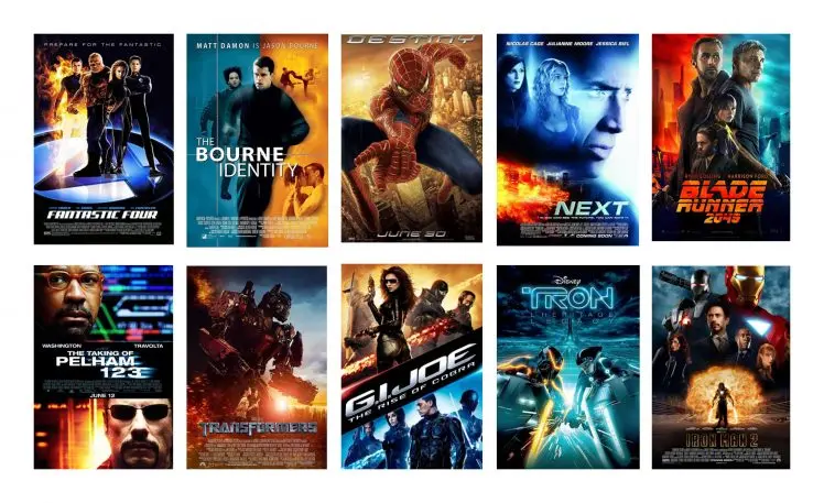
Director Michael Bay was an early adopter. Transformers might be the clearest early example of this look—and like all things Michael Bay, it’s a hyper-stylized version of the same teal-and-orange effect dozens of movies (and hundreds of movie posters) were then using.
The teal-and-orange look, like any color effect in history, has its adversaries. As Todd Miro explained in his comprehensive blog post about the orange-and-teal effect in movies, overuse of this pushes skin tones so orange that characters look like they’re on an episode of Jersey Shore, and it was soon associated with blockbusters, not Oscar contenders. And so Hollywood’s obsession with teal-and-orange came as fast as it went.
But for the emerging group of YouTube and Instagram influencers, it was the perfect look to document their travels around the world.
Bring up the teal-and-orange trend to any creative on Instagram or YouTube, and they’ll point you toward Sam Kolder. About three years ago, Kolder began building a massive Instagram and YouTube following with his cinematic travel videos. He didn’t just develop a following among the wanderlusty travel set but also among photographers and videographers who wanted to mimic his striking cinematic color manipulations.
The look quickly became a hit, and, just as quickly, other photographers and filmmakers started posting dozens of videos that showed you how to re-create Kolder’s captivating looks. What started with one influential photographer would then trickle to other influential creators, and then to other influencers, and then to the rest of the world that wanted their photographs and videos to look just like theirs.
Kolder didn’t offer presets that helped you get his signature look, so others seized on the opportunity. While there were many photographers and videographers willing to create their own signature looks, there were many others—namely influencers and not photographers—who wanted “the look” even if they lacked the skills to make it themselves. For them, a marketplace emerged, with dozens of companies and influencers offering presets and filters that could help them up the professional quality of their Instagrams and YouTube videos.
The presets aren’t just helping to improve images of sunsets in Mykonos and on yachts in Italy—they’re helping pay for the trips of these creators, too. The teal-and-orange effect is a trend, but helping others make images with the teal-and-orange effect (often among other filters and presets) is a market. Some sell their presets individually on their own website, where others partner with creative marketplaces, like FilterGrade, which sells presets made by different influencers as well as their own.
You can find free presets easily, but if you want the exact version of the teal-and-orange effect employed by your favorite creator, you’re going to have to pay anything from $20 to $200 to get it. But make sure you really like it. Because in a few months, the effect might look just as dated as the original Instagram filters. And another look—with its own YouTube tutorials, presets, and price tag—will take its place.
Andrew Goble is a photographer and writer living in Brooklyn, New York. This article was republished with permission from Ceros.
Recognize your brand’s excellence by applying to this year’s Brands That Matter Awards before the early-rate deadline, May 3.
