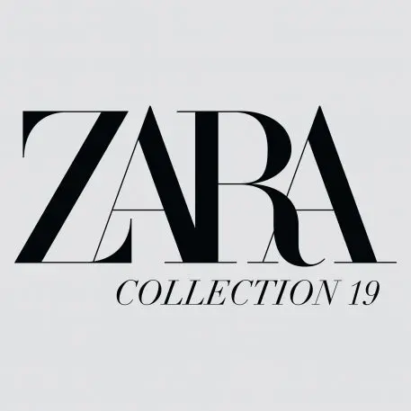
Life is hard. Everybody is working too much. Nobody can keep up with all the people launching presidential campaigns. It’s way too cold right now. And as a final blow, brands keep changing their logos on us with zero warning. Two weeks ago it was Slack, last week it was Kate Spade, and this week, Zara pulled a logo redesign on us. Cut it out, guys. We already have enough to deal with.
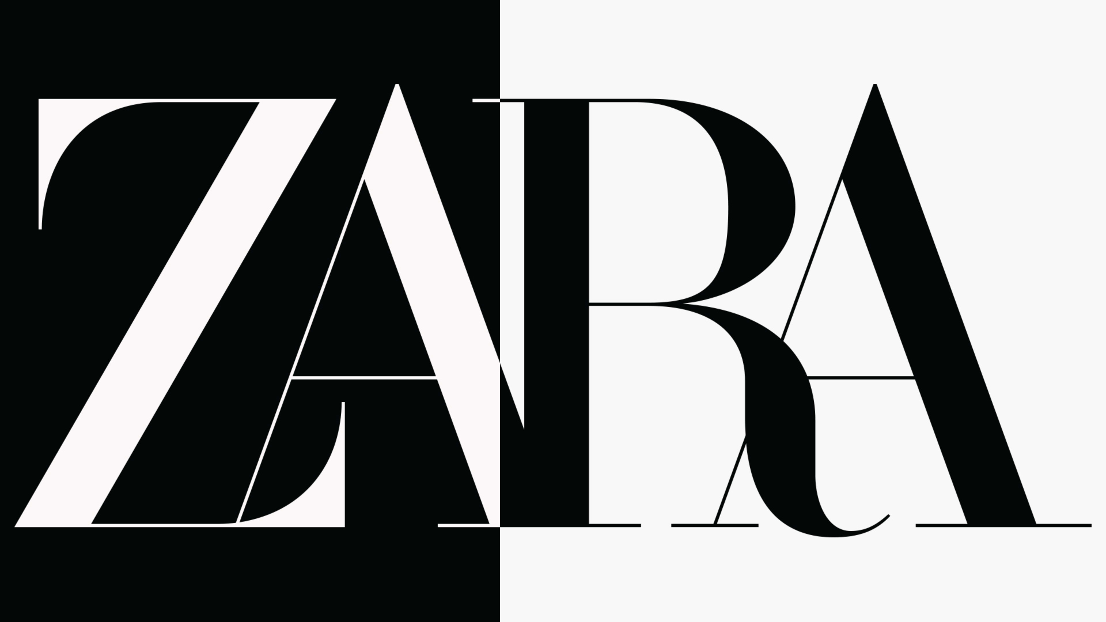
Zara’s new logo is already proving particularly controversial, with fans and detractors weighing in on Twitter with their own arguments about the type design. It bears some similarities to its previous logo, which dropped in 2011. Like the former logo, the new one consists of the four capitalized letters of the brand’s name in a serif font. But while the previous logo had ample space between the letters, creating a sense of airiness and minimalism, the new logo squashes all the letters together, the edges and serifs tangling into one another like they’re struggling to break free. The new font also includes a curve on the “Z” and “R” which only adds to the confusion.
It’s an obvious step away from the minimal logos favored by tech companies and startups–from Google to Uber to Everlane–in favor of the more complex logos common in heritage design houses like Cartier, Gucci, and Bulgari.

As you may be able to tell from my description, I’m not a huge fan of the redesign. It makes me feel claustrophobic, and my mind has to struggle to make sense of what I’m reading when I see the logo. There are others who agree with me, including the well-known designer Erik Spiekermann, who announced on Twitter, “That is the worst piece of type I’ve seen in years. Was this done by one of those new robots that will replace humans?” The logo does, indeed, seem like a technical glitch. Others mocked Zara by saying that if its tendency for compressing letters continues, the next logo redesign will just be a black rectangle with all the letters superimposed on one another.
But some feel strongly that it is a step forward for the brand, including some of us here at Co.Design. Last year, we published a story about how one of the biggest design trends of 2018 was sans-serif logos with way too much white space between the letters. The authors, Thierry Brunfaut and Tom Greenwood, who are both creative directors, say this kind of logo has become so ubiquitous that it is now totally generic. Consider the recent rebrands by tech companies, like Google, Airbnb, Uber, and Slack whose logos are all variations on this theme. We see this in the fashion world as well. Startups Everlane and Cuyana both have logos that fit squarely into this mold. “Let us call them blands,” Brunfaut and Greenwood wrote.
In the face of all this sameness, Zara’s logo stands out. As a brand founded in the mid-1970s, Zara seems to be claiming its place among the older, more established brands of the world, rather than among than the new generation of startups. That’s well and good. But would it have killed Zara to add just a little bit more space between the letters? Just for readability?
Recognize your brand’s excellence by applying to this year’s Brands That Matter Awards before the early-rate deadline, May 3.
