How do you brand your business when your business is “helping any business make its own branded website?”
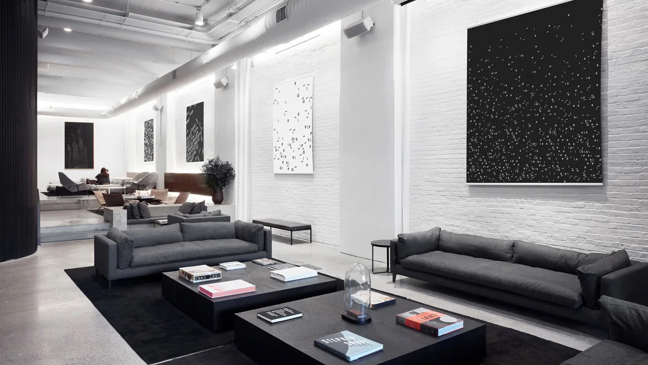
Until recently, Squarespace, the 15-year-old web publishing and design platform, had a fine solution: stylish but unassuming minimalism. Its logo and type felt round, open, and calmly still–like an empty art gallery or yoga studio, solicitously available to accommodate all comers with soothing, upscale grace.
[Image: Squarespace]
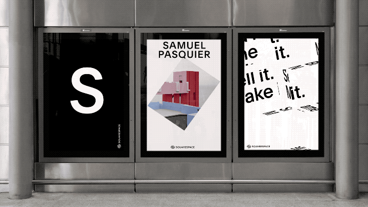
That’s over now. The new Squarespace identity is still minimalist, but less like a yoga studio and more like a samurai sword animated by Saul Bass: it’s hard, sharp, elegant–and always moving. In fact, according to Chief Creative Officer David Lee, that dynamism is the point. “We really wanted to figure out if someone could identify Squarespace purely from its motion,” he tells Co.Design.
[Image: Squarespace]
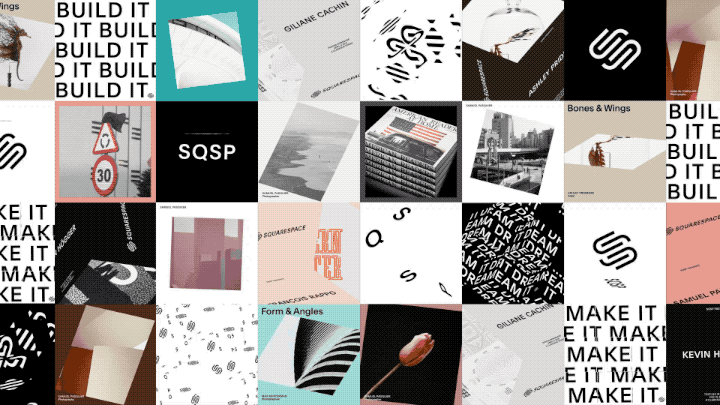
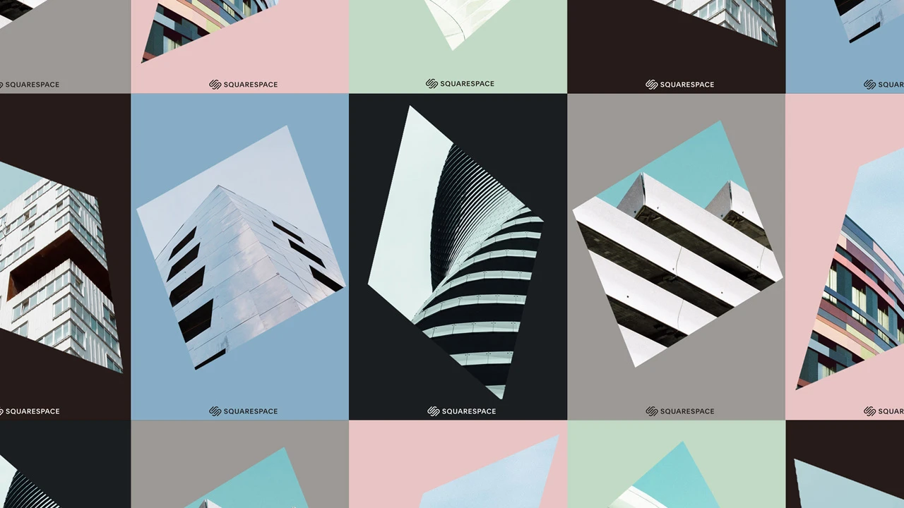
The move (zing) makes sense: after all, Squarespace is a fundamentally interactive product. To figure out what kind of motion felt right, the company collaborated with DIA, “who’s known for this,” says Lee. Based on isometric 3D movement–in which flat, edged shapes rotate along tightly described axes like facets of a Rubik’s cube–Squarespace’s visual identity is now boiled down to its platonic essence. It’s literally squares moving through space: slicing, swiveling, even swaggering.
[Image: Squarespace]
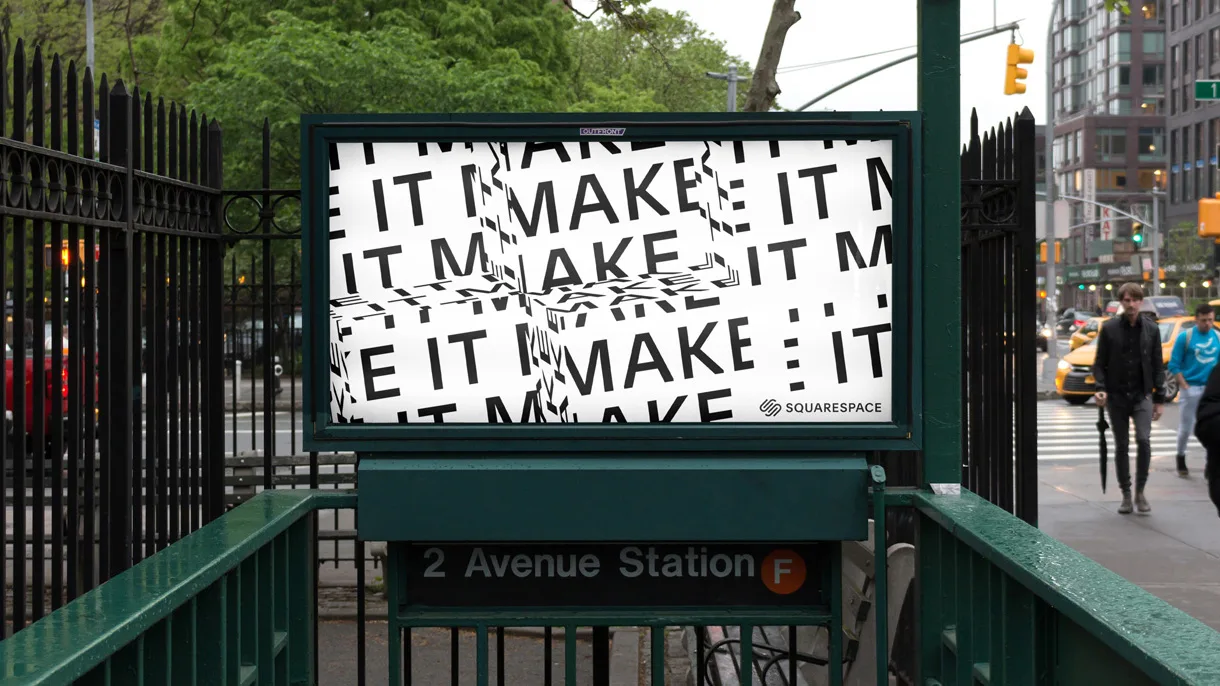
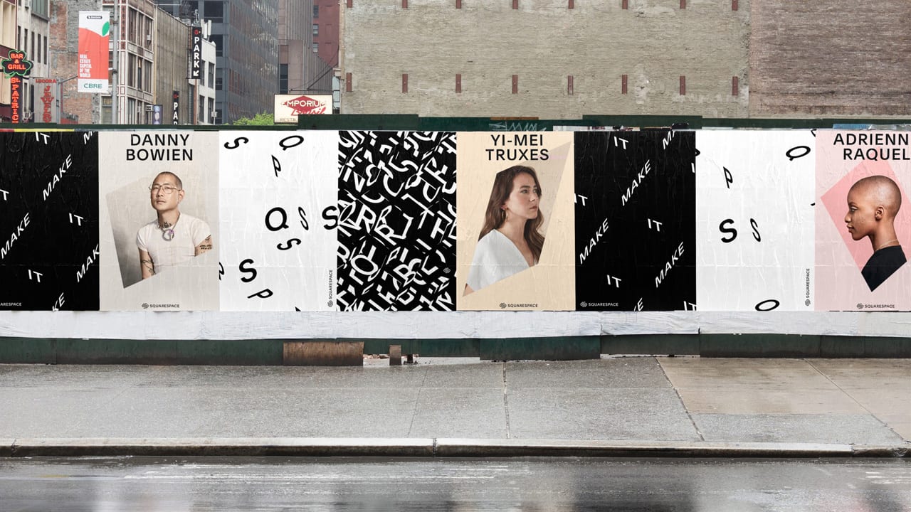
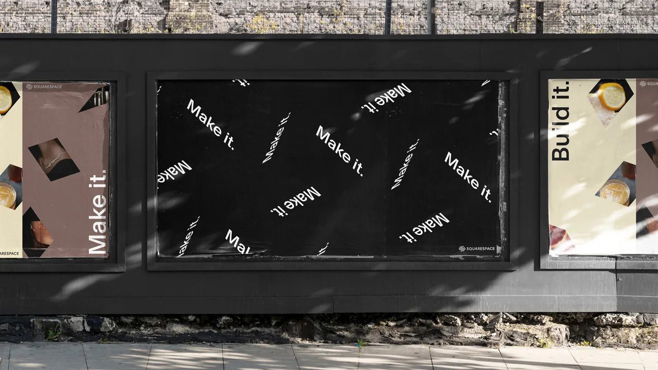
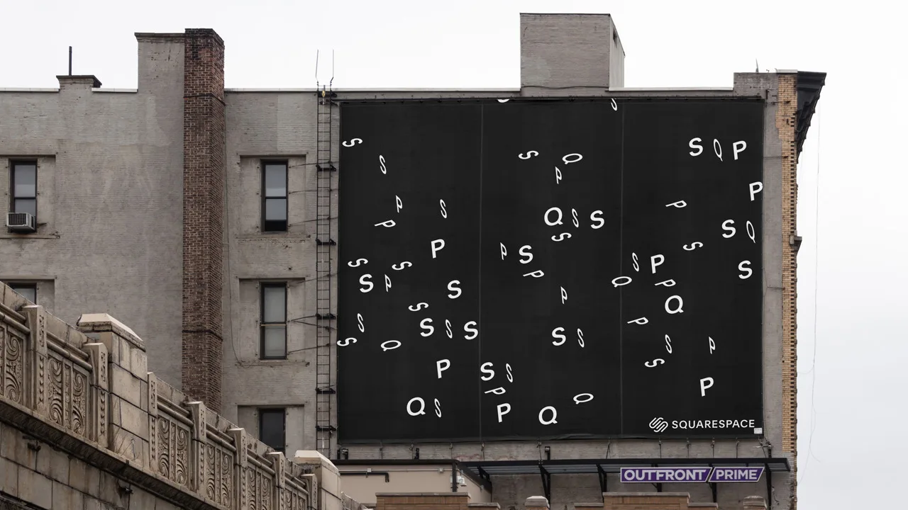
If that attitude sounds very New York, it’s no coincidence. Lee says that the city is in Squarespace’s DNA–“we’re proud that we’re not some Silicon Valley transplant that just has opened up a satellite office over here”–and he wanted the new branding to be more assertive about that fact. Previously, Lee says Squarespace subtly “tipped its hat” to its hometown by using Hoefler & Co.’s Gotham typeface family. Now, the whole package feels New York-ey: Clarkson, a custom typeface inspired in part by subway signage, scrolls around the edges of stacked cubic squares like the outdoor headline and stock-price tickers that wrap around buildings in Manhattan. Jagged-edged juxtapositions (generated by an internal app created for the redesign) mimic a crowded NYC skyline, or the intellectual and physical collisions that happen down on the streets.
[Image: Squarespace]
“In our collaboration with DIA, we came up with this idea of an algorithm that could actually create serendipitous compositions,” Lee explains. “It’d be very hard to design things like that from scratch.”
But Squarespace’s flashy facelift isn’t just cosmetic, Lee asserts. The angular, almost mathematically precise visual scheme was the company’s solution to maintaining a coherent identity while experiencing rapid growth (although the company wouldn’t comment on any specifics). “With all the new designers and creatives that we’re hiring,” Lee says, “it’s really easy for the work to start to deviate. We wanted to create a tighter sandbox than what we’ve had before, to make sure that everything that goes out the door–from squarespace.com and the Instagram channel, to tiny details like how superimposed graphics come in on TV commercials–really feels like our brand.”
[Image: Squarespace]
The custom Clarkson typeface sprung from a similar necessity: Gotham’s “very horizontally stressed” letterforms had been creating problems for Squarespace’s increasingly internationalized UI. (As of last year, the site and product are operating in six languages: English, Spanish, French, German, Portuguese, and Italian.) “The German language is like 150 percent longer in character count than English,” Lee explains. Clarkson may evoke hip New York ‘tude, but it also lets the company fit more text into the same amount of space.
While the Squarespace site itself doesn’t look quite as aggressive–even, dare we say brutalist–as the redesign teaser microsite or Instagram channel, the company is clearly making a break with its cuddlier former self. The new Squarespace is looking sharp–so much that you might cut yourself on it.
Recognize your brand’s excellence by applying to this year’s Brands That Matter Awards before the early-rate deadline, May 3.
