
In the midst of what has been an incredibly upsetting week of news for many Americans, New Yorkers had a reason to rejoice as they witnessed a historic victory in the city’s 14th congressional district. First-time candidate Alexandria Ocasio-Cortez, a 28-year-old Democratic Socialist with a progressive agenda, beat out 10-term Democratic incumbent Joe Crowley in the biggest, most inspiring upset to mark this year’s primary midterm elections. Come 2019, she’ll be the youngest person to represent in the history of Congress.

Pledging to run with zero contributions from lobbyists, Ocasio-Cortez won by a 15-point margin, an especially impressive feat given that Crowley’s campaign worked with a corporate-bankrolled budget that was reportedly 18 times larger than her modest $300,000. One of the many factors contributing to Ocasio-Cortez’s spirited, grassroots-powered win? An effectively designed visual campaign.
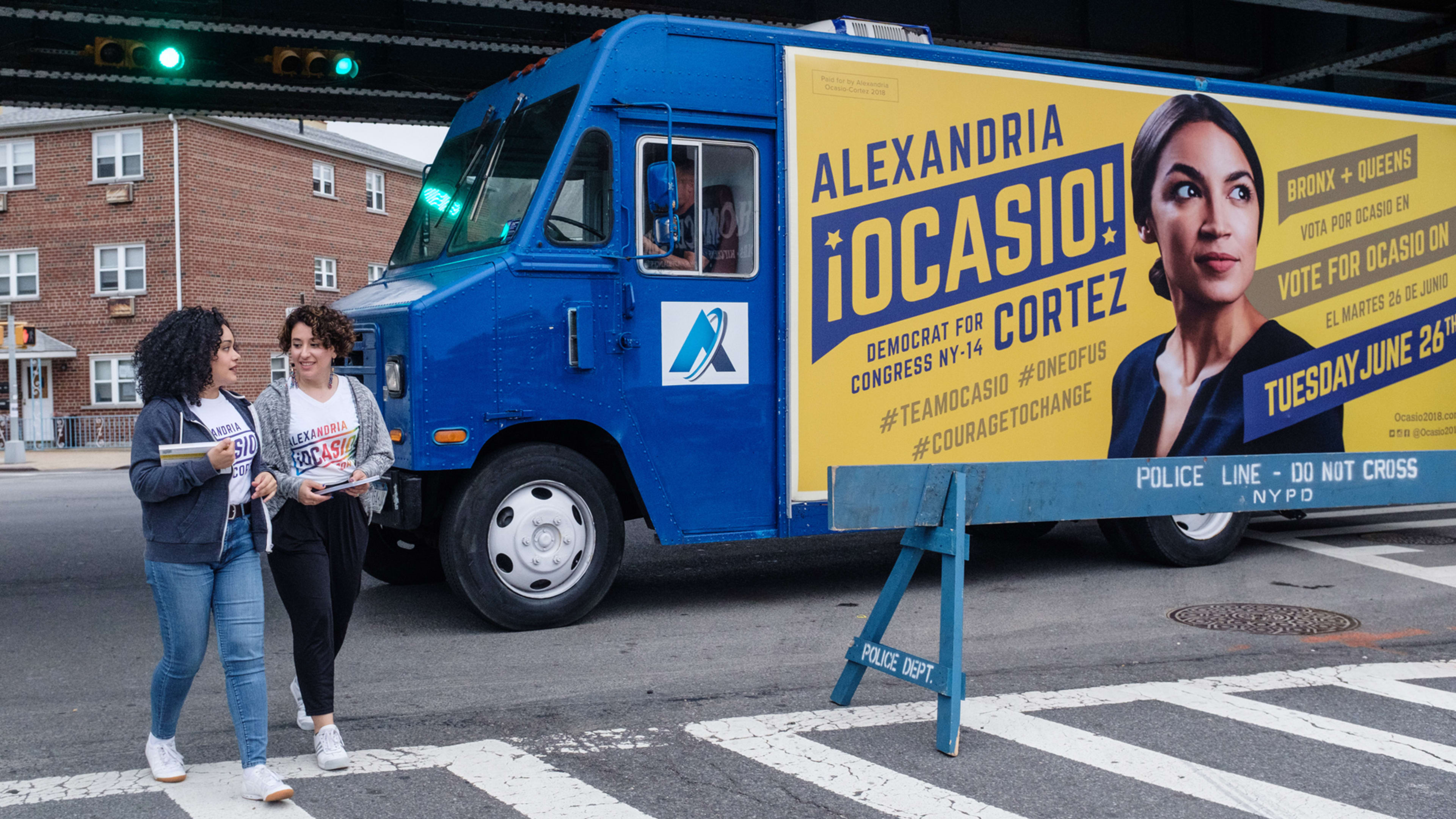
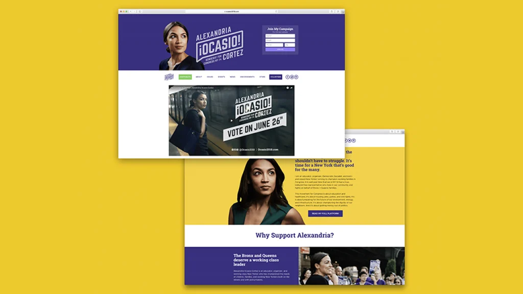
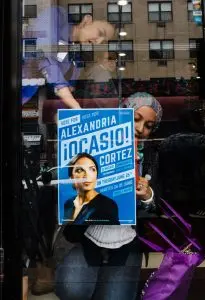
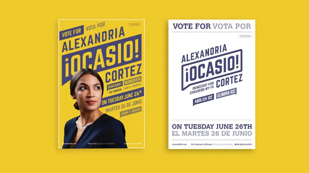
In posters, on Ocasio-Cortez’s campaign website, and plastered on the side of an “Ocasio 2018–mobile” that made the rounds through the Bronx and Queens communities within her district, Ocasio-Cortez’s visual brand features a portrait of her center stage against a sea of deep violet-blue, her hair tied back in a low bun, with a look of undeterred gumption on her face as she looks upward and beyond, her gaze directed not at the viewer, but slightly askew and into the distance, as if to propel our attention onward to the future. Visual text-framing devices are styled as speech bubbles, symbolizing a vocal, pluralistic approach to politics. As Ocasio-Cortez says in her powerful campaign video, calling for more diverse racial, cultural, generational, and ideological representation in the face of monied, career politicians: “This race is about people versus money. They have money, we have people.”
The grassroots campaign sought to speak to a different voter base and audience–and that required a different visual language, explains Scott Starrett, 34, co-founder and creative director of the five-person graphic design firm, Tandem Design NYC, that designed the overall campaign brand and visual identity as an in-kind donation. Starrett, a close personal friend of Ocasio-Cortez, is a politically engaged designer who has previously worked with Brand New Congress and Justice Democrats–two progressive political organizations who have backed her campaign.
“Knowing Alex (we call her Sandy) personally gave us a lot to work with,” Starrett told Co.Design. “We spent countless hours discussing politics with her before she began her bid, so we knew exactly where she stood on the issues, we knew the caliber of person she was and the style of campaign she was running so it was a much easier challenge than most.” By no coincidence, Tandem’s team also falls into Ocasio-Cortez’s generational demographic; Starrett’s partner, Shaun Gillen, is 32, and the studio’s lead designer on the project, Maria Arenas, as well as colleague Carlos Dominguez, are recent 24-year-old graduates.
In crafting the visual look and feel of the campaign, Tandem’s team looked to revolutionary grassroots movements of the past, and specifically to the movements led by labor and civil rights activists like Dolores Huerta and Cesar Chavez–direct, refreshing visuals often made by hand and conveying a sense of cultural urgency. It was serendipitous that the defining photograph of Ocasio-Cortez, which was photographed by Jesse Korman and supplied by her volunteer team, carried “the same feeling of hope, the upward gaze to the future, to the vision of positive change,” says Arenas. “That gaze, in turn, informed the logo and typography to be set at a forward-leaning angle.”
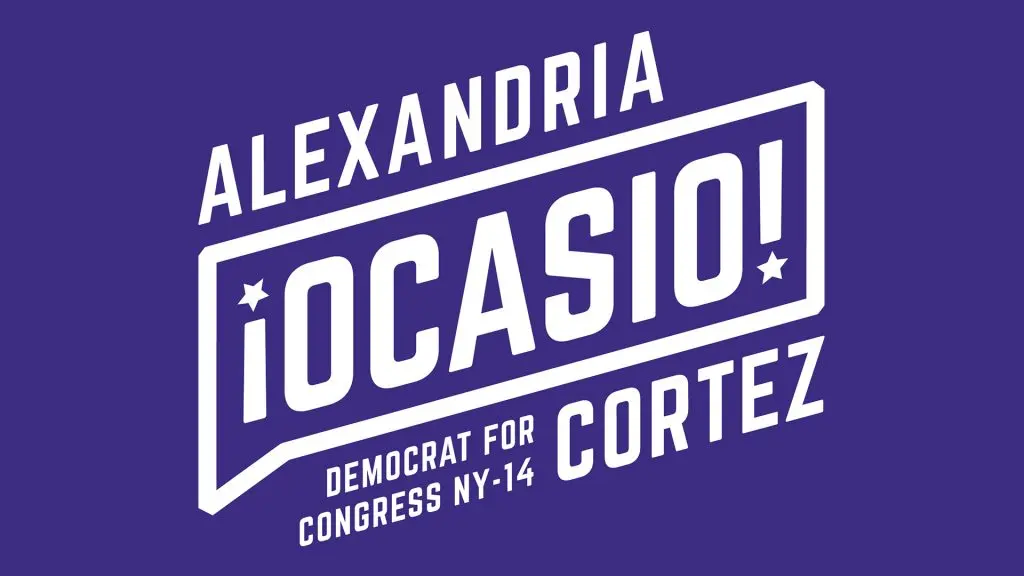
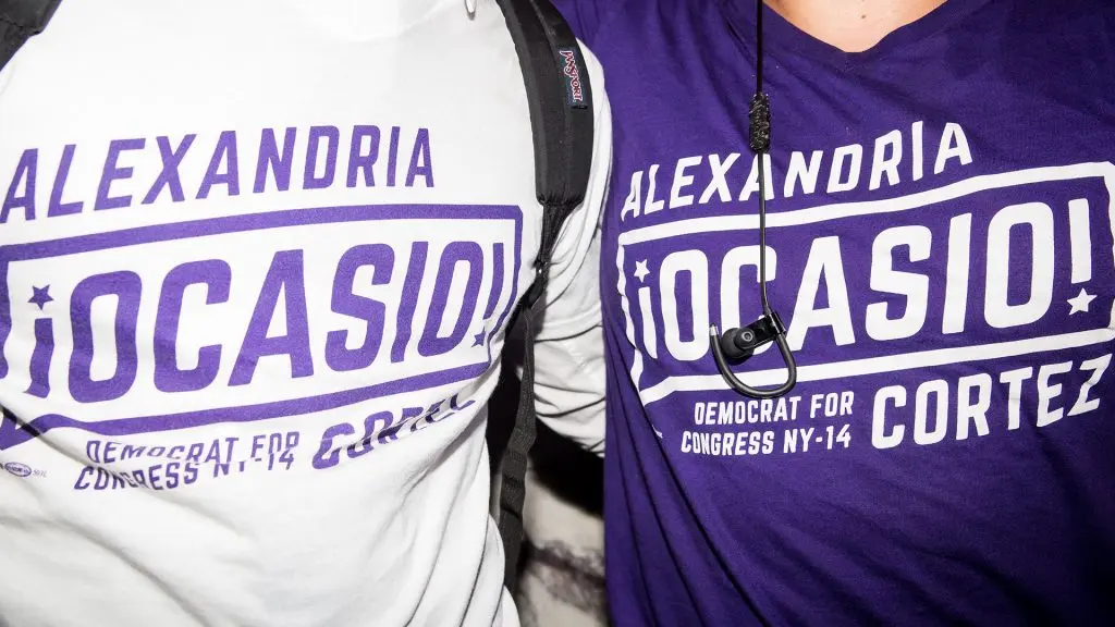
Opting for bold lettering and a flat design treatment that forgoes drop shadows, gradients, American flag motifs, and other visual cliches, the identity intentionally avoids pretentious signifiers to refreshing effect; one might even liken the energetic campaign visuals to a local poster bill. In place of red, white, and blue, Ocasio-Cortez’s color scheme draws upon purple–a symbolic blend of the two-party system’s red and blue, also used by Brand New Congress–and yellow, as its aesthetic complement.
Enlarged, all-caps text–set bilingually in English and Spanish, in equal weighting–frames Ocasio-Cortez’s countenance with similarly angular effect, and her name, proudly flouted with inverted exclamation marks and stars, is emphatically, unapologetically multicultural. It’s an outward display of Ocasio-Cortez’s roots as a third-generation, working-class Bronxite with Puerto Rican heritage.
While typical corporate-backed political campaigns have increasingly come to visually and semantically mirror their donor base, with sleek, disingenuous logos bearing more likeness to a pharma company or Wall Street firm, Ocasio-Cortez’s eye-popping branding bucks convention.
“She is a non-traditional candidate running a non-traditional campaign, and we wanted her visual identity to reflect that, to be true to Alexandria Ocasio-Cortez,” said Arenas. “There’s a misconception that political graphic design is about misleading people, misrepresenting the candidate, that branding is just for marketing, ergo, dishonest. Most political design is very timid, safe, and traditional. I think our work was able to break through that perception … Good design has a place in politics.”
If Obama’s wins taught us anything about design, it was the importance and power of a memorable and symbolic brand identity in an increasingly hyper-visual, digital landscape. At the same time, it goes without saying that graphic bells and whistles alone won’t clinch a win. Suraj Patel, a 34-year-old, first-time candidate who similarly ran against a longstanding incumbent in New York’s 12th congressional district, doubled down on an aggressively youth-friendly campaign identity, replete with millennial pink and merch tees featuring splashy taglines and graphics inspired by artists like Virgil Abloh. Anjelica Triola, the chief creative officer of Patel’s campaign, as Racked reported, was by no coincidence a former creative strategist to lifestyle brands like Adidas, Target, and LVMH. In the end, however, the appeal of Patel’s millennial ticket may have been curtailed by a shortsighted strategic move to catfish voters via dating apps like Tindr and Grindr.
Ocasio-Cortez, with her refreshingly direct, no-holds-barred progressive agenda, proved that the impact of knocking on doors and engaging community members IRL beats digital marketing any day. As Harvard Law School faculty member Ian Samuel aptly opined on Twitter: “The visual design of Ocasio2018 stirred my curiosity. But it was her Extremely Good politics that got my attention.”
Recognize your brand’s excellence by applying to this year’s Brands That Matter Awards before the final deadline, June 7.
Sign up for Brands That Matter notifications here.
