


This month, the the 118-year old MIT Technology Review launches the first issue of its redesign, featuring a new visual identity and editorial look. The strategic overhaul of the print bimonthly, led by Pentagram partner Michael Bierut, offers important lessons in how to revamp a legacy brand at a time of rampant disruption.
Founded in 1899 and published independently by MIT, the Review has rigorously examined and analyzed technology over the span of three centuries, even as that term “technology” itself has been vastly expanded and redefined from decade to decade. Surely, the publication’s 19th-century founders couldn’t have fathomed an era where having a personal, hyper-compact supercomputer at our fingertips at any given time would become a ubiquitous reality—let alone the industry-wise demise of print media altogether. While the relaunch is twofold—a new website, designed by Upstatement, features related, complementary content distinct from the magazine—the choice to keep and reinvest in the longevity of its print edition is a bold and even subversively ironic gesture from an institution that is all but synonymous with cutting-edge innovation.
All of that came to bear for Bierut, who led the redesign and felt the weight and responsibility of the institution’s immense and long-lasting reputation. How does one go about redesigning a historic brand that lays claim to being the oldest technology publication in the country, after all, and emphasize the strengths of print in an overwhelmingly digital media landscape? Below, Bierut enlightens us on how to reshape a legacy without killing your idols.
Root it in the urgency of the present
“Online trolling, fake news, social-media echo chambers, election hacking, cybercrime, immensely powerful tech firms, privacy breaches, job automation . . . perhaps not since the invention of nuclear power or pesticides has it been so starkly clear that technology cuts both ways,” editor Gideon Litchfield wrote, upon the site’s recent relaunch, articulating MIT Technology Review‘s renewed mission to steer what has now become a “crucial global conversation.” What was considered within the realm of tech journalism in 1899, and in 1998, for that matter, when the magazine was last redesigned, has surely evolved. In 2018 and for the foreseeable future, the once-niche bubble of tech news is now simply news. By reasserting a premium on its print edition, the magazine aims to bring more weight to more considered, in-depth analysis on these range of pressing issues.
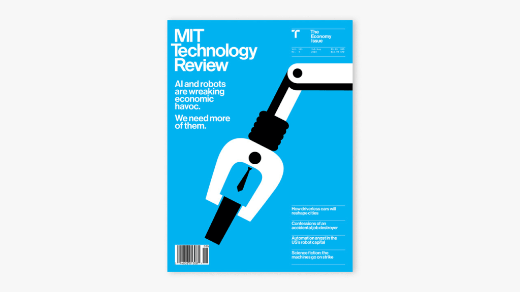
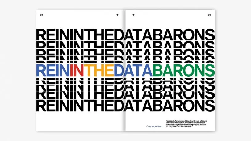
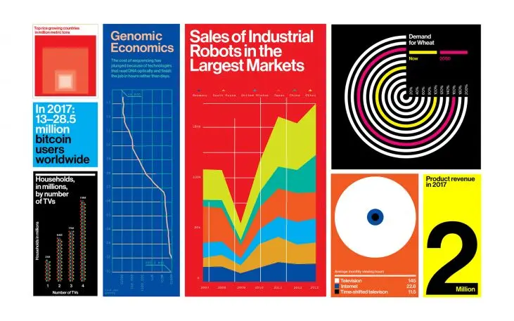
“You and I and every other person we see in the course of a day is mediating almost all their experiences through one form of technology or another,” says Bierut. To signal this wider cultural shift between everyday life and technology, he and his team looked to newsstand-friendly publications, such as Bloomberg and Harvard Business Review, to bring a bolder, more accessible look-and-feel suited to a wider, mainstream readership—as well as to distance itself away from the look of a small-circulation alumni mailer, which is how the Review modestly began in its early years. Punchier, sans-serif typefaces bring a sense of visual clarity and news-driven urgency to the cover and stories, while a wider range of visual assets—ranging from infographics and illustrations to expressive, custom typographic treatments—play a larger role in conveying the publication’s more complex, analytical stories that can often be difficult or dry to portray through straight photography. “Our goal is to really try to visualize these topics in a way that adds a level of artfulness and ingenuity that will have the capacity to surprise people, and make them look twice at it,” says Bierut.
Learn the rules before you bend them
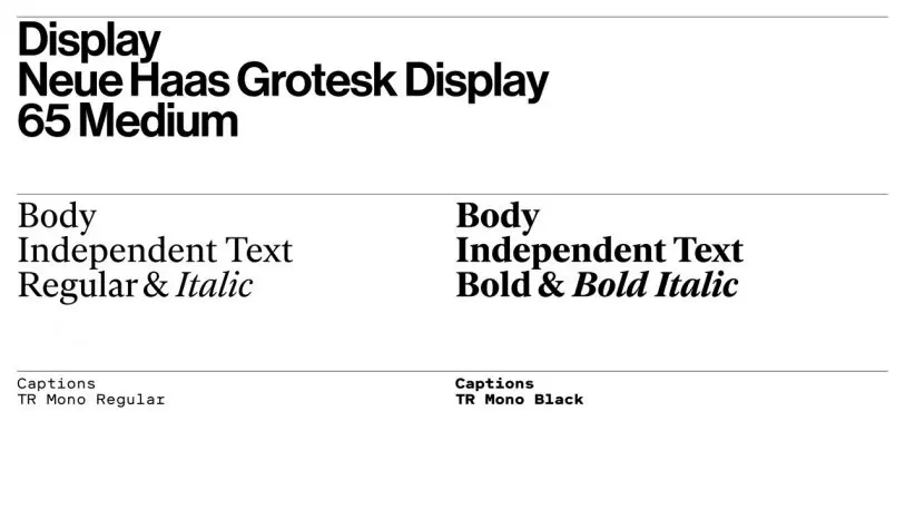
The biggest update to MIT Technology Review‘s design is the implementation of Monotype’s Neue Haas Grotesk, a modern digital revival of Helvetica, as the primary typeface and in the refreshed nameplate, which was redrawn by Christian Schwartz of Commercial Type, and respectfully keeps the publication’s full name intact. The decision to go with Helvetica—a well-known and admittedly divisive typeface, says Bierut—was primarily made in reference to MIT’s Office of Design Services, the pioneering in-house graphic design team led by Muriel Cooper with Jacqueline Casey, Ralph Coburn, and Dietmar Winkler in the 1960s and ’70s, and which revolutionized its use in evocative, expressive ways well before it became synonymous with corporate culture in later years.
“Part of the challenge that we saw was to have [the typeface] read in the magazine not just merely as a style that’s being deployed around, but something that’s being done with real specificity and confidence, and speaks to MIT and the publication’s long history with it,” says Bierut, who also led the recent visual rebranding of MIT’s Media Lab. The magazine’s interior spreads are also designed as a nod to the golden age of midcentury Swiss graphic design, characterized by sans-serif fonts and a rectilinear grid, while at the same time gently breaking convention with a flexible 12-column grid that can be customized around new story formats. As Bierut shows, there’s a wrong and a right way to show inspiration from the greats. Heavily referential yet updated to work for today, the design respectfully nods to the canon without sacrificing function.
Don’t kill your idols—kill your ego
Over the years, Bierut has designed countless visual identities and brands—for Mastercard, the Poetry Foundation, the Frank Lloyd Wright School of Architecture, and Hillary Clinton’s presidential campaign—and insists that time and time again, the best project briefs are those that come with distinct limitations and challenges. In fact, he goes to far as to say he’d choose the pressures of working with a legacy brand over a carte-blanche brief any day.
“I know there are a lot of designers that can barely get themselves up in the morning unless they know they’ve got a blank slate to work with,” he quips, of younger designers eager for the chance to showcase their personal aesthetic leanings and make their mark. “I see myself more as a chef, going into the pantry to see what ingredients I’ve got, and figuring out how to work with what’s in the kitchen,” he says, or—to borrow another helpful analogy from his previous boss and mentor, the legendary designer Massimo Vignelli: “Designers are like doctors: You’re an authority, and people are trusting you to make them well. But in able to understand how to remedy them, you have to be very empathetic and have good bedside manner in order to diagnose the problem.” The takeaway? The best projects involve a collaborative dialogue—between the designer and client, the end product and your audience, the past and the future.
Recognize your brand’s excellence by applying to this year’s Brands That Matter Awards before the early-rate deadline, May 3.