
America is a place where a disturbingly large proportion of people, faced with the prospect of traveling somewhere less than a mile away, get in their car to do so. Around 60% of trips under a mile are made by car, which adds up to around 10 billion miles a year–the equivalent, according to the Environmental Protection Agency, of the entire population of Chicago up and driving to Las Vegas and back in single-occupancy vehicles (SOVs).
Ideally, on World Car Free Day–held this year on September 22–these people would opt not to drive. Since 2000, advocates for more pedestrian- and cyclist-friendly streets have used the day as a way to remind people that there are transit options beyond SOVs–and embracing them is not only beneficial to individual health and well-being, but crucial to the task of reducing carbon emissions, for which cars and trucks account for around one-fifth of in the U.S. To give people a better sense of their non-SOV options, the Washington D.C.-based information technology company TransitScreen, which develops real-time dashboards of transportation options, has rolled out a new tool, MobilityScore, in time for this year’s World Car Free Day.
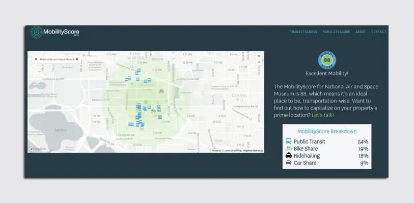
When a user enters their location into MobilityScore, they’ll receive an overall score ranging from zero (no mobility choices) to 100 (excellent mobility choices), that’s then broken down further by each of the four categories. The overall score and the percentage accounted for by each category fluctuates in real time, and reflects transit options available throughout the day. For instance, during the day, the location of City Hall in Oakland scores 100, because it sits literally atop a BART station, and is serviced by bike-share and multiple bus lines. But because BART stops running at midnight, the score dips overnight. The score also reflects how accessible each of the transit options are–if there are multiple subway and bus stops within the one-mile radius, but they’re all farther away than a five-minute walk (the general amount of time, Caywood says, that people are willing to take to reach a transit hub), the score will reflect that.
Because MobilityScore is pegged to very specific locations within cities, it’s tough to make sweeping statements about one city’s transit options versus another’s. Rather, it’s most useful for comparing the accessibility of certain amenities–city halls, for instance, are usually pretty well served by transportation alternatives, Caywood says; NFL stadiums, in general, are not. But he did note that Boston, overall, scores relatively low among major U.S. cities in terms of transit availability. Around 25% of people in the city walk to work, and its earned the nickname America’s Walking City, but transit advocates are frustrated with Mayor Marty Walsh’s less-than-trailblazing leadership when it comes to developing amenities like more transit lines and protected bike lanes.
And despite its release on World Car Free Day, MobilityScore is not pushing a fully no-car agenda. “Car-free is obviously a great goal in terms of sustainability,” Caywood says. “But we at TransitScreen have always taken the approach that really, anything is better than driving your own car.” A 2016 UC Berkeley study found that a single car2go vehicle could take as much as 11 privately owned cars off the street; it also avoids what Caywood calls the “induced usage effect” of owning a car–if you own a car, using it is almost a no-brainer, but if you have to walk to access a car-share, or go through the motions to call a Lyft, you might think more favorably about just using your own two feet, or a bike. “Basically, the worst possible scenario is when you and a 3,000-pound metal box are traveling everywhere together,” Caywood says. He’s onto something: In 15 years, millions of people are expected to ditch their cars for the options aggregated on MobilityScore.
Recognize your brand’s excellence by applying to this year’s Brands That Matter Awards before the early-rate deadline, May 3.
