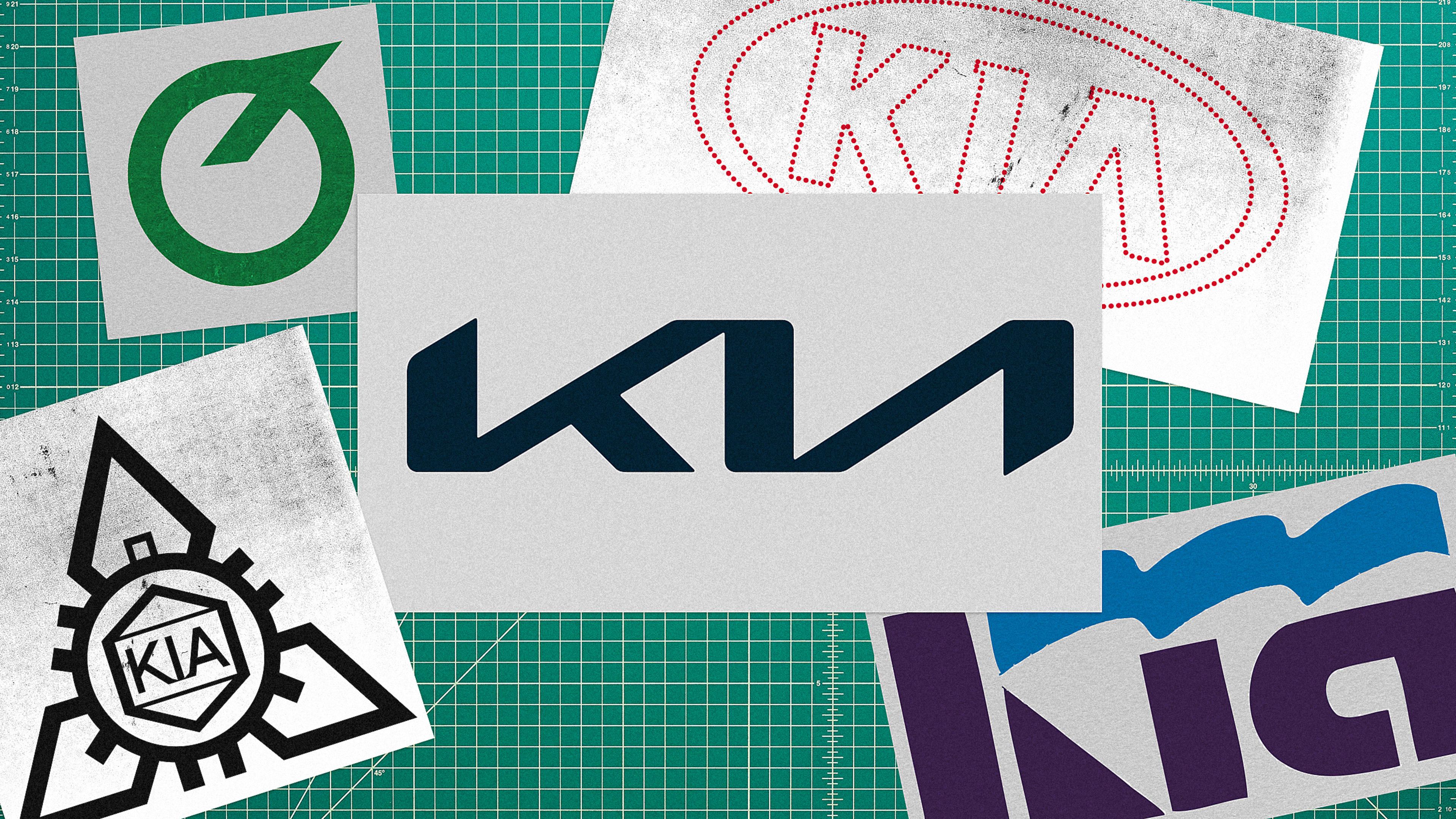
Historically, Kia has been a visually quiet brand. It doesn’t typically generate media attention for its design and marketing choices, unless, of course, it was for those now iconic hamster commercials for the Kia Soul that ran ceaselessly in the late 2000s. That all changed in 2021, when the company revealed its new logo, which transformed Kia’s traditional wordmark of three clearly defined letters into an angular glyph kerned so tightly that it looks more like a KN than a K-I-A.
The divisive rebrand sparked plenty of media criticism and consumer confusion; so much so that, near the end of 2022, there were around 30,000 web searches just for “KN car” each month, according to data posted by ad agency owner Ashwinn Krishnaswamy on Twitter. Search volume for “Kia” in general also surged during the same time period, topping out around 1.8 million.
The history of Kia’s logo
The latest rebrand is part of a long and varied logo legacy. Kia has updated its logo six times since the company was founded in 1944 as a manufacturer of bicycle parts, under the name Kyungsung Precision Industry. Building the first Korean domestic bicycle, the company switched its name in 1952 to Kia Industries and continued as a bicycle manufacturer—its earliest logo reflecting that. The black and white geometric logo consisted of three radial diamonds connected by a circular gear icon around a small hexagon with the three-letter name of the brand at the center.
Kia, now a car manufacturer, rebranded that logo in the 1960s, swapping out the complex original for a minimalist circular emblem slightly resembling an upside-down Q. After another updated wordmark in the ‘80s, the automaker evolved the logo yet again in the ‘90s to include a horizontal oval surrounding its minimalist name—and this iteration remained largely unchanged for two decades. Until now.
Why did Kia change its logo again?
Last year, Fast Company reported on the drastic logo revamp, noting that the lack of a cross-bar in the letter “A” suggested “an air of futuristic high technology; its inclusion in NASA’s 1974 ‘worm’ logo certainly went a long way in this regard,” wrote James I. Bowie. Kia also swapped its traditional red and white color palette for a black and white design that’s not only associated with futurism and modernity, but with luxury as well (picture the stark black and white logos for Chanel, Dolce and Gabana, or Gucci). Visual references to the future also align with Kia’s new forward-thinking business strategy as it’s positioning itself to move beyond automaker to a future mobility company.
Kia recently announced its mid-to-long-term mission to expand business into the sustainable mobility industry, which includes electric vehicles, mobility solutions and services, and purpose-built vehicles (PBVs). This move reflects the global shift among automakers to invest in EVs and advanced mobility, with brands like GM and Buick also updating their logos to reflect their new visions of the future.
According to Kia’s in-house design team, the new logo stands for “Symmetry, Rhythm, and Rising” and embodies the brand’s determination to lead change and innovation. The dynamism of city life also helped to shape the company’s logo as well as the new slogan, Movement that Inspires. In an interview with Hyundai Motor Group, SVP and head of Kia Global Design Center Karim Habib, explains, “I was inspired by the energy of Seoul; it has opposing energies that coexist, such as the new and the old, or turbulence and silence.”
While the new logo is supposed to represent the state of moving forward and changing to meet customers’ evolving needs, pushing the design so far away from the original left customers and (the internet at large) preoccupied with its striking similarity to the Nine Inch Nails logo, and its subtle design flaws.
One writer even went so far as to analyze its optical alignment in photoshop to confirm that it was in fact slightly crooked. “It’s sort of like when you realize Colorado isn’t actually a perfect square and you can never look at the state the same way again,” writes Peter Holderith for The Drive. Despite all the negative criticism, Kia’s rebrand hasn’t hampered sales or stock value, and after two years we’re still talking about the logo update. They say any press is good press, right? Kia sure seems to think so.
Recognize your brand’s excellence by applying to this year’s Brands That Matter Awards before the early-rate deadline, May 3.
