One day earlier this year, Kimberly Silver noticed something unexpected happening in her Brooklyn neighborhood of Red Hook. Scores of young men were roaming in and around the waterfront neighborhood’s cruise terminal. They were all migrants, it turned out, who had arrived at the cruise terminal because the city’s government had moved them there after facing a spiking influx of more than 50,000 migrants who arrived in the city in recent months. With existing shelters overwhelmed, the city has turned to other unconventional spaces, like the cruise terminal, which became a temporary emergency relief shelter for up to 1,000 men seeking asylum or residency.
To Silver, the sudden depositing of 1,000 men in a somewhat isolated corner of the city was concerning. She wasn’t annoyed about the crowds or mad about US immigration policies. Rather, as a designer for the architecture and planning firm CannonDesign, she was upset about a poorly designed experience for people already living in harsh conditions. “I saw that a lot of people looked a bit confused and unfamiliar with what was going on in the neighborhood,” Silver says.
She convinced a few of her colleagues at CannonDesign to think about ways that they as designers could help make the migrants’ experience at the cruise terminal a better transition into the U.S. After a few weeks of collaboration, the team zeroed in on using the environment around the terminal as a tool for helping the men navigate the city.
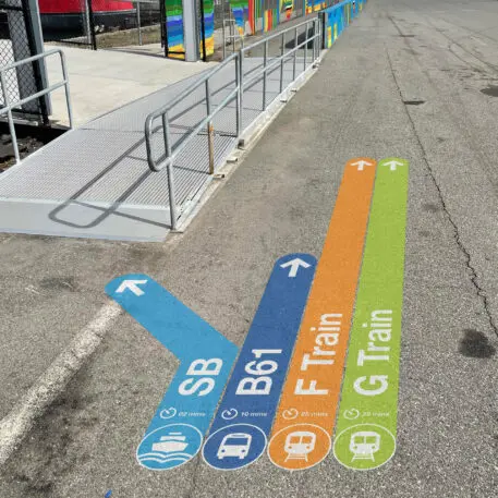
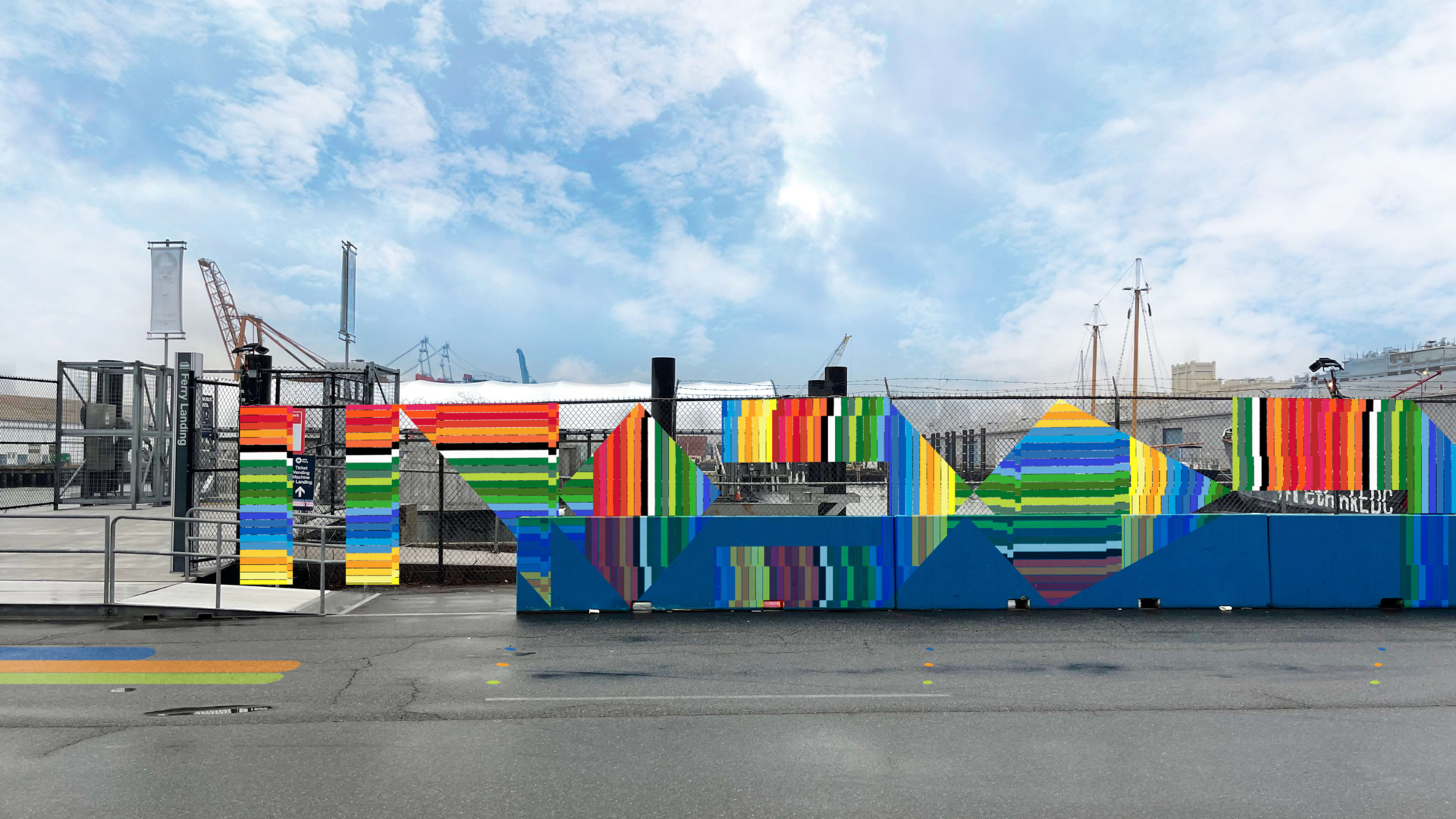
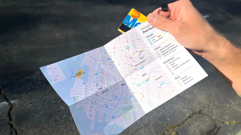
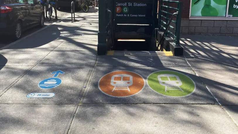
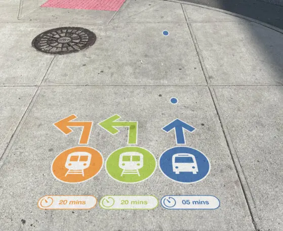
They came up with a concept for a clever and color-coded wayfinding and navigation system that could be deployed to assist migrant populations like the one in Red Hook. The wayfinding system includes colored graphics that can be placed directly on the ground to direct migrants to transit, government offices, and other resources as they get on their feet. A smartphone map lays out these specific resources in a straightforward way, and a printed version makes this basic information legible and usable even without access to a phone or the internet. And a recurring mural format intended to be placed near resources in the city acts as a kind of immediate marker of the spaces that migrants may need to access as they adjust to their new environment. The project is only a concept at this point, but the designers behind it believe it can be useful in other contexts and for other migrant populations.
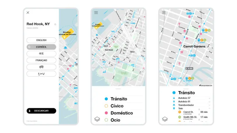
The primary goal of the design was to help guide migrants from the Red Hook terminal to nearby transit stations and stops. Silver notes that New York already has an effective universal wayfinding system of colors, numbers, and letters for its transit services, but the migrant-focused design brings that system closer to the people who need it by using large informational and directional graphics that can be pasted on the ground. “It’s meeting them where they are,” says CannonDesign creative director Dylan Coonrad.
Environmental graphic designer Steffany Brady helped guide the look of these interventions based on her own experience as an immigrant. She moved with her family from Colombia to the U.S. when she was 15, and says it took years to feel familiar in her new home. For migrants, she says, being in a foreign country and trying to make one’s way can be isolating. “That’s why we wanted to infuse so much joy and color into this piece,” she says.
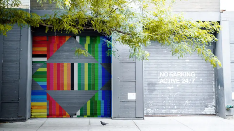
Her background also influenced the look of the mural element of the design concept, which is based on the colors and lines of international flags and is intended to serve as both public art and a signifier of migrant-related services throughout the city. The colored lines in the murals are mostly straight, but then have abrupt interruptions, which Brady says are meant to reflect the major changes immigration can create in people’s lives, and the fact that many of those changes stick with people for years.

Silver says the project is intended to operate as a sort of code within the city, showing the people who need it how to access services and gain a foothold in a new place. “One of our subliminal goals was the hope that we achieve familiarity, and that the system isn’t needed by the users over time,” she says. “Once they become acclimated they can navigate through their instincts and just being familiar.” Before that, though, this kind of easily legible system could be the helping hand many would benefit from, as they’re starting a new life in an unfamiliar land.
Recognize your brand’s excellence by applying to this year’s Brands That Matter Awards before the early-rate deadline, May 3.
