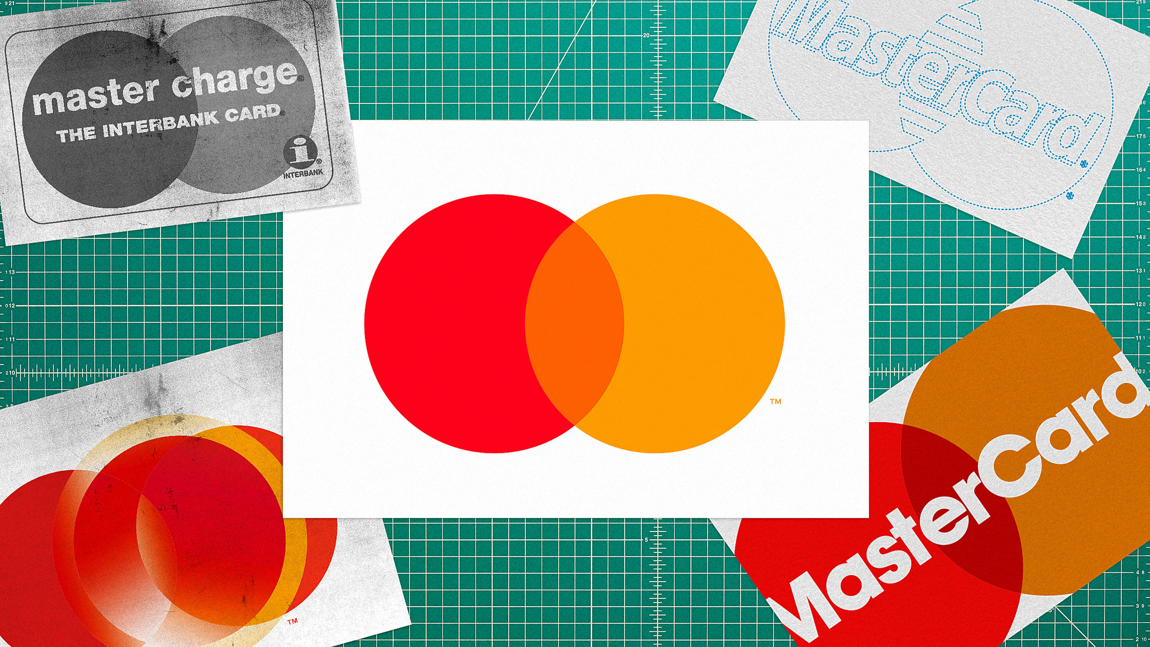
You’d recognize it anywhere: Two circles—one red, one yellow—overlapping to create an intersection of orange. Mastercard’s logo is arguably the most famous icon of any financial institution on the planet, and it’s one of the rare marks that has retained much of its DNA from the early days.
The story of Mastercard and its logo begins in the 1940s, during a time when banks offered “like cash” card equivalents that could be used at retailers. Rather than a single bank controlling this operation, multiple stakeholders managed the association, which by 1966 became known as the financial group Interbank Card Association (ICA).
ICA’s lettermark encapsulated a lowercase “i” within a circle, making it look and feel similar to William Golden’s CBS identity. With its lowercase “i,” ICA’s identity was a direct competitor with BankAmericard (later Visa), which also originated in California. Bold, singular, the “i” logo still works nicely today, but the company’s identity has changed in big ways over the years.
The history of MasterCard’s logo
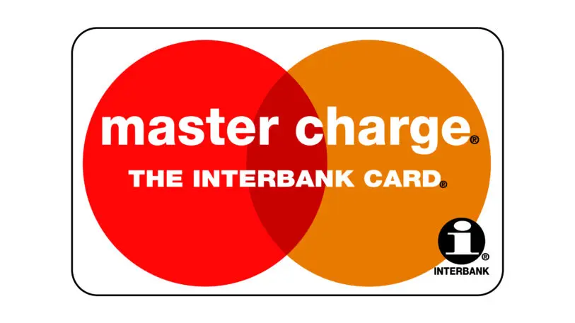
By 1968, ICA rebranded as Master Charge, which is when the company first introduced its famous red and yellow overlapping circle motif. This new logo retained some of the brand DNA from the Interbank days: Below the lowercase sans-serif “Master Charge” was a bolded, “The Interbank Card,” typed in a sans-serif white.
That mark has continued to be a mainstay, differentiating it from other financial brands, such as the Visa stripes and the American Express gladiator (or centurion). During that time, ICA’s membership would expand with stakeholders in Africa and Australia, soon changing from ICA to Mastercard International.
The meaning of Mastercard’s logo
With the rebrand from Master Charge to Mastercard came an updated logo. From the start, Master Charge struck gold with its boldly colored and geometrical approach to the logo. As Pentagram writes of the early logo: “The overlapping forms effortlessly express the idea of connection, while the basic circular shapes suggest inclusiveness and accessibility, key to Mastercard’s brand message of ‘priceless possibilities.’”
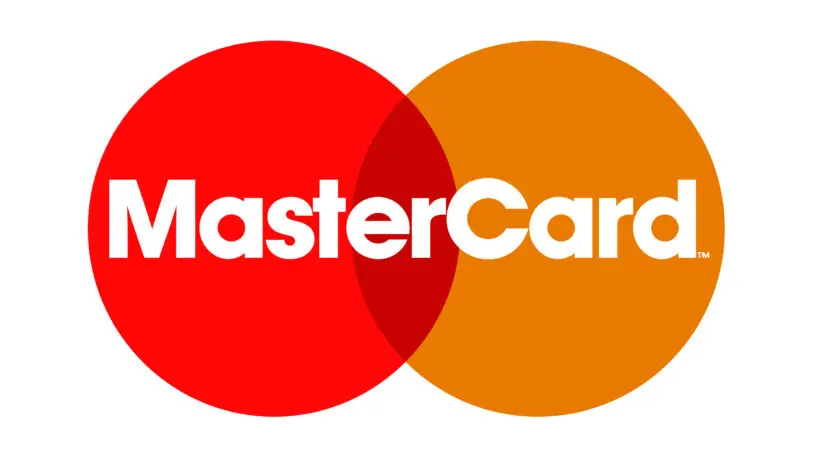
This new identity—two circles coming together to create a new and different color in the middle—also suggested unification as well as connection, appropriate since, by the 1980s, the Mastercard brand had expanded into Asia and Latin America. By 1987, Mastercard became the first payment card to be issued in the People’s Republic of China. In 1988, the first Mastercard card was issued in the Soviet Union.
During that time, they acquired Cirrus ATM who’d have their own interlocking circles. Since the brand identities were similar, you could draw a straight line from Mastercard to Cirrus to Maestro’s debit network, one in the same, interconnected. The 1990s brought about slight changes to the logo with the interlocking circles joining not as a new color, but as stripes, or wires, or however else one interprets the small, stacked, interwoven lines.
Why Mastercard changed its logo again
In 2016, Mastercard circled back to its roots with a striking new logo. Designed by Pentagram’s Michael Bierut and Luke Hayman, the new logo retained much of Mastercard’s visual legacy, but updated for the modern era, so it could coexist on screens and in the physical world.
“The question for us was, evolution usually means a further and more complex articulation,” Bierut said at the time. “In this case, what struck us is that underneath this stuff are two of the three primary colors on the wheel and the most simple shape, which is circle. And they own this. . . . That’s a gift we were given. We were smart enough not to—or failed to be dumb enough to—throw it all away.”
Instead of the linear “comb effect” between the circles, previously designed to make it easier for printers to replicate the overlap of red and yellow, Pentagram opted once again for a solid orange in the middle. “They’ve never changed the overlapping circles, but they’ve made it aggressively complicated due to technical requirements,” Bierut explained. The new, simplified geometry highlights the meaning of Mastercard’s logo as a card designed for connection.
MasterCard, aka Master Card, now had a friendly all-lowercase look as mastercard. The new wordmark, set in FF Mark, harkens back to the original name and branding, as well as the circular identity itself, thanks to Mark’s rounded, single-story “a” and approachable geometric shapes in its “e” and “c” and “d.”
As part of its ongoing evolution, the two-circle mark can exist on its own, without the Mastercard wordmark at all. This “no text and all mark” approach makes the forward-thinking brand stand out from the crowd, and aligns it with other “no text” identities, such as Target, Starbucks, and Apple, among others.
Recognize your brand’s excellence by applying to this year’s Brands That Matter Awards before the early-rate deadline, May 3.
