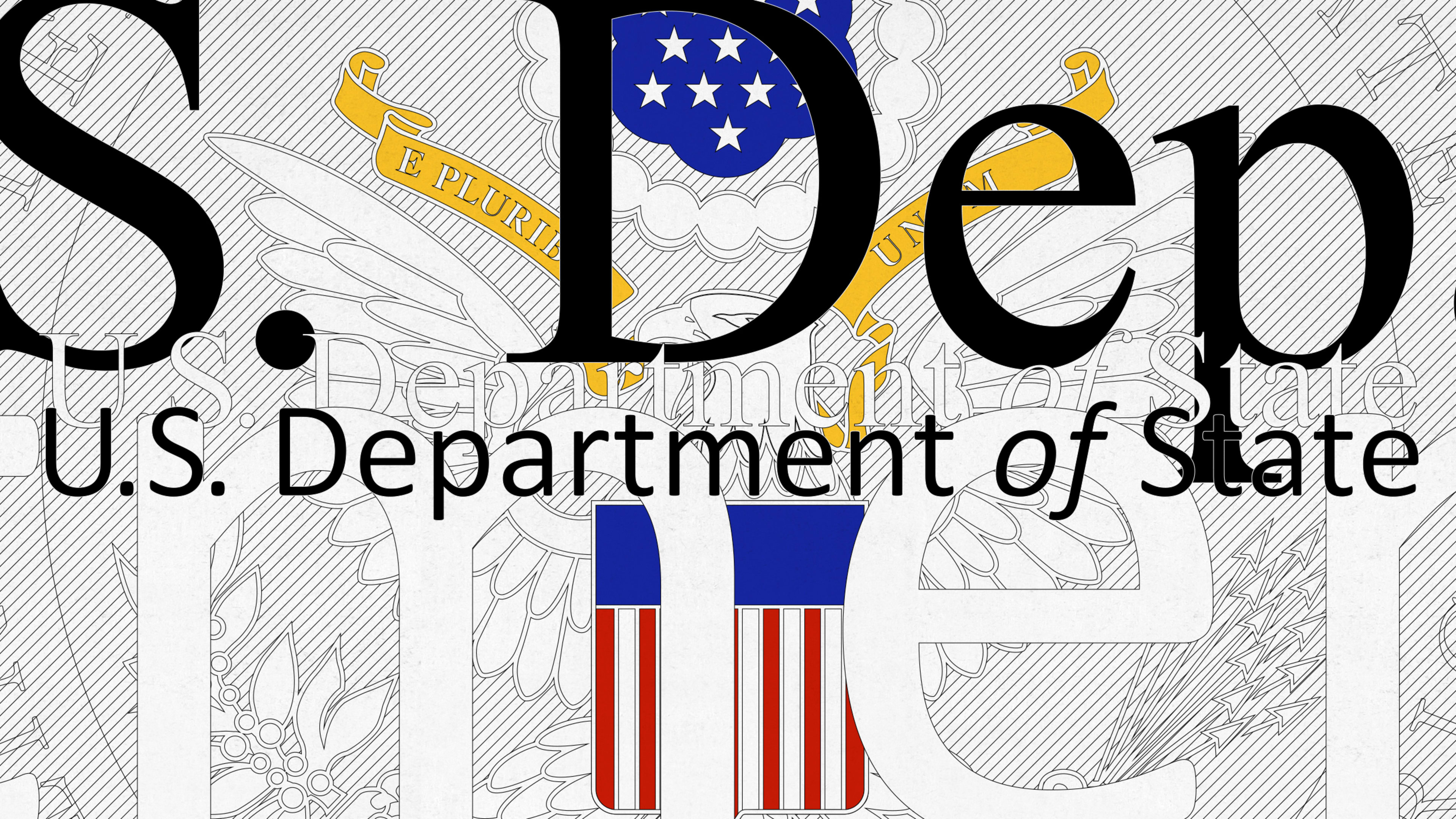
A delightfully nerdy debate has erupted over the past 48 hours. Based on a hard-hitting leak obtained from The Washington Post, the State Department is planning to ditch Times New Roman for all of its official communications and high-level internal documents, opting instead for Calibri.
The reason? According to a memo to staff from Secretary of State Antony Blinken, serif fonts like Times New Roman “can introduce accessibility issues for individuals with disabilities who use Optical Character Recognition technology or screen readers.” The switch to Calibri, a sans-serif, was recommended by the secretary’s office of diversity and inclusion.
Already, the Twittersphere is abuzz with opinions:
This is not the first time that Calibri has dethroned Times New Roman. Back in 2007, Calibri (then newly designed) replaced the old serif workhorse as the default typeface in Microsoft Word. (In 2021, Microsoft announced it was replacing Calibri with a new custom default font, but the official switch doesn’t appear to have occurred yet.)
Lucas de Groot designed Calibri in 2004 as part of a collection of fonts for Microsoft meant to enhance screen reading. The reason Microsoft opted for Calibri then is largely the same reason the State Department is opting for it now. But is Calibri actually more accessible than Times New Roman? That depends on who you ask.
The general consensus among graphic designers and accessibility experts is that sans-serif typefaces are more accessible for screens because of their lack of ornamentation—no serifs, no decorative features. But research about font accessibility remains inconclusive.
“Opinions about taste prevail over research about what helps us read more efficiently,” says Brockett Horne, a professor at Northeastern University, whose research includes information design and typography. “For fonts, familiarity breeds legibility over the shape of any specific letters, and Times New Roman is a familiar old friend.”
Charles Nix, who is a creative type director at Monotype, agrees. “What the reader is accustomed to will influence their willingness to engage with the content. If I’m used to seeing books set in serif type and I’m confronted with a 400-page novel set in a sans-serif font, I may struggle to engage with the narrative. And if I’m suddenly seeing my Twitter feed in a serif font, rather than the familiar sans, I’ll balk.”
Funnily enough, though, the change of font isn’t what Nix is irked about. It’s the font size: New guidelines recommend 14-point type for all paper submitted to the State Department’s Executive Secretariat. Indeed, using 14-point type in a sans-serif font like Arial or Calibri is advised by the Tarjan Center at UCLA, the University of Edinburgh’s Disability and Inclusive Learning Service, and others. Nix contends, “at that size, both Calibri and Times are hyper-accessible.”
The challenge is that there is no such thing as a universally accessible font. There have been heated debates over whether certain fonts are more legible for people with dyslexia, or if the research is bunk. Other fonts are supposedly more accessible to people 65 and older. Some fonts (like Calibri) were designed to be more legible on a screen but they are not necessarily more legible on printed materials.
Whatever its reasoning, the State Department’s decision to adopt Calibri could mean a shift in the way it’s positioning itself to the public. “As a sans-serif 21st-century font, Calibri certainly gives the State Department a more contemporary voice than the antique Times New Roman,” Horne says.
Nix, meanwhile, believes the switch suggests that typography matters and the State Department knows it. “There are millions—if not billions—of world citizens who understand that the form of type helps shape the meaning of text. The State Department is now part of that contemporary club.”
Recognize your brand's excellence by applying to this year's Brands That Matters Awards before the early-rate deadline, May 3.
