Meng Shui was angry. The designer and brand consultant, best known for her taboo-breaking campaigns at period underwear brand Thinx, had spent years advocating for body positivity and inclusion. Then Roe v. Wade was overturned, women across large swaths of the U.S. were stripped of their right to an abortion, and in Iran, they were brutally beaten and raped to quell protests. “I felt like I wanted to do something as a form of resistance, and instead of being angry, to find an outlet to create positive impact,” says Shui. So, she went back to her roots as a graphic designer, and chose an outlet that’s long carried weight in protests: typography.
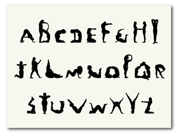
Titled Project Body Type, the new typeface was created by 28 people modeling letters with their own bodies (like the famous YMCA dance, but a million times more graceful). The participants are vastly diverse, including plus-size models like Jordan Underwood, models with Alopecia like Madison Woytovich, and dancers, artists, writers, videographers, and creators from all corners of the world. Each performer picked a letter on a first-come, first-served basis, linked it to a word that spoke to them—like “A” for Agency or “M” for Mother—and chose from a bank of poses Meng’s team had choreographed.
Some letters were harder to model than others. Meng says the “Q” was particularly challenging, considering it involved a baby: The bowl of the “Q” was performed by a Brooklyn couple who arched their backs to form a circle, while the letter’s tail was shaped by their toddler crawling on their legs. The ampersand’s convoluted shape was equally tricky to get right.
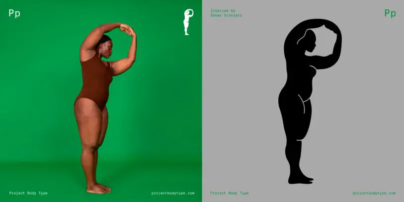
To turn the body shapes into a typeface, Shui’s team photographed each person (or group), then transformed their bodies into black silhouettes inspired by black-figure pottery painting of ancient Greek vases. To add a bit of dimensionality, the team used thin white lines to highlight some body details like the crease of a flexed leg, or the outline of a braid resting on someone’s back. Shui chose the black-figure pottery technique for stylistic reasons, but considering that it dates from the 5th century BC and often portrayed idealized body silhouettes, she also wanted to apply the same timeless treatment to real, contemporary bodies.
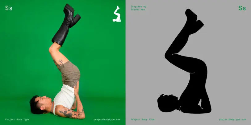
Either way, the final look was less important than the process and the people involved. Still, to honor the wide array of bodies that performed in the project, Shui made sure to include details that mattered to each of them. The letter “S” for example, was performed by Shaobo, who cofounded a gender-nonconforming high heel brand called Syro. As a result, Shaobo is the only performer wearing shoes. “The heels are a really important part of their identity, and they came to the shoot with a pair of amazing boots,” says Shui. So naturally, the team included the heels, which Shui says accentuated the form of the “S” even further.
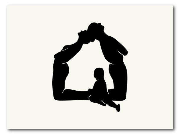
In the end, the font isn’t the most legible ever created, but that’s not the point. It’s not going to replace Helvetica, and that is more than okay. The point is to give anyone who wants to use it for campaign headlines, slogans or posters, a “tool of expression” with an inclusive message embedded. (For now, the font is available by invitation only, but the full version is set to launch in January). “It’s not good for heavy text,” says Shui. “It’s more of a statement, so I hope there could be opportunity to make a big statement in collaboration with someone who already has something to say.”
Recognize your brand’s excellence by applying to this year’s Brands That Matter Awards before the early-rate deadline, May 3.
