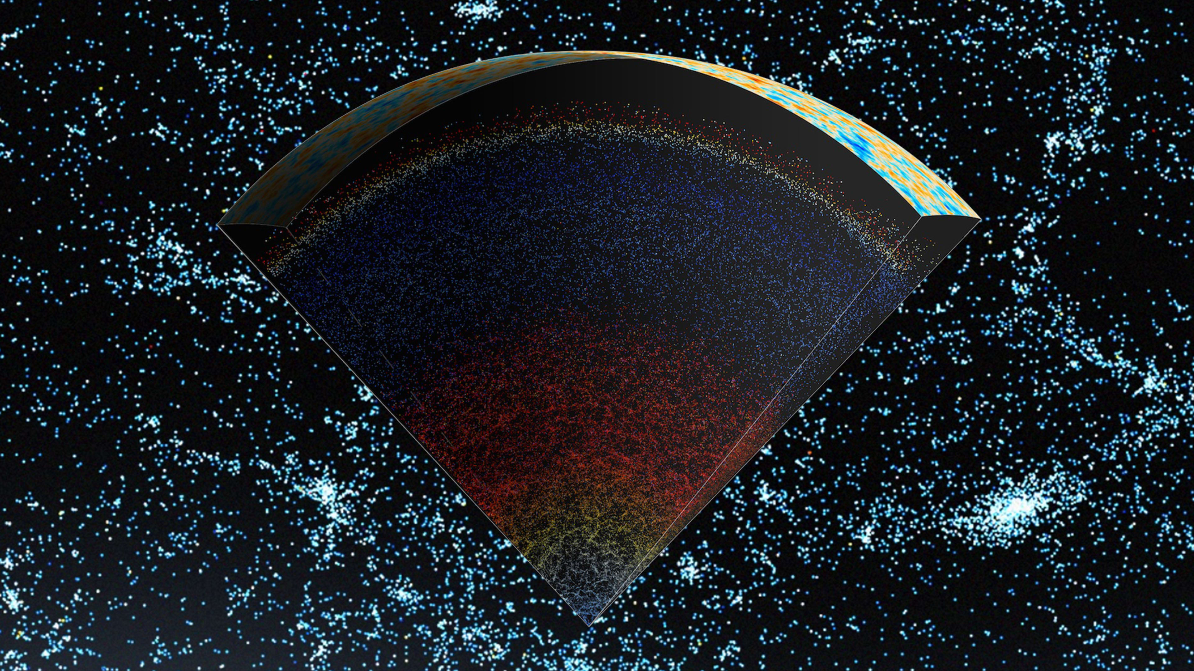
Every good map has a “You are Here” marker. In this extraordinary version, said marker is at the very bottom of the map, and represents the entire Milky Way—in one tiny pixel.
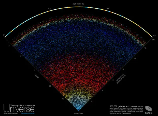
Astronomers at Johns Hopkins University designed an interactive map of the universe that illustrates 200,000 galaxies, which stretch from our own to the very edge of the observable universe. Each galaxy is represented as one pixel.
For the past 20 years, scientists have mapped millions of galaxies using a 2.5-meter-wide telescope (that’s the equivalent of one 8.2 feet wide) in New Mexico, culminating in the Sloan Digital Sky Survey—the largest, most detailed astronomical survey that has ever existed. Together with 3D artist and designer Nikita Shtarkman, the scientists used coding and data visualization principles to translate 15 years of this data into an awe-inspiring map that is both easy on the eyes and scientifically accurate. “The data have been accessible for years, and astrophysicists have been working for many years, but no one took the time to make a beautiful map that’s accessible to anyone who’s not a scientist,” says astrophysicist Brice Ménard, a professor at Johns Hopkins University who led the map project.
The map is representative of the entire cosmos, but the final visualization only shows a fraction of the observable universe to increase legibility. A map showing the entire cosmos would have been impossible to render in 2D—instead of a pizza slice, it would have looked like a sphere. The team decided to single out a “slice” of the cosmos, about 10 degrees thick, that represents “only” 200,000 galaxies, compared to the billions of galaxies we would see otherwise. Ménard says that if they had chosen to portray every single galaxy we know of in the cosmos, the map would be “completely saturated.”
To design a scientifically accurate map, the team used an algorithm to plot an array of 3D coordinates that were provided by the Sloan Digital Sky Survey. What started as an “intimidating” spreadsheet, as Shtarkman puts it, turned into an approachable map that even the science-averse can read.
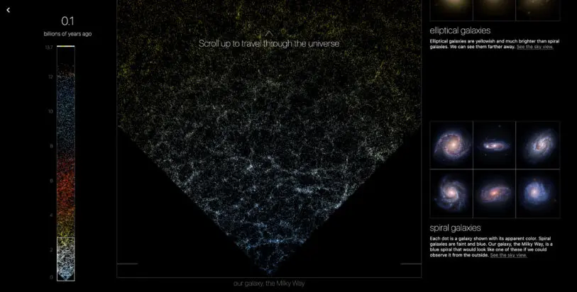
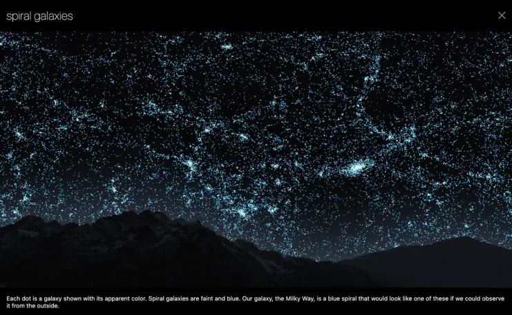
The result is a color-coded feast for the eyes. The bottom corner of the map is a constellation of faint blue spiral galaxies that show how the Milky Way would look if we could observe it from the outside. Then the map turns yellow to represent elliptical galaxies, which are further away but brighter than spiral galaxies. Toward the middle, which equates to about 4 billion years ago, the map turns red because elliptical galaxies appear red in the distance.
Beyond that, galaxies are hard to make out, so the map gives way to quasars, supermassive black holes that are so powerful they create an extremely bright disc of light as they suck anything around it. The closer quasars appear blue, then as the universe stretches outward, they appear reddish, like the elliptical galaxies.
The very top edge of the map is ringed by a marbled, yellow-and-turquoise strip representing the first flash of light that was emitted soon after the Big Bang, 13.7 billion years ago. Known as The Cosmic Microwave Background, the image is an amalgamation of three years’ worth of scans performed by the European Space Agency’s Planck space telescope.

Scrolling through the entire map is a humbling experience, but it also highlights the immense scientific advancements of the past few years. “The main goal of the map was to have people see what the universe looks like and to show them that astrophysicists have mapped out a pretty good fraction of the entire thing,” says Ménard. “Twenty years ago, most of that map would have been black.”
Recognize your brand’s excellence by applying to this year’s Brands That Matter Awards before the early-rate deadline, May 3.
