Apple has done it again. The genius of these guys knows no limits. Their bombastic chutzpah is worth a billion Apple Park donuts. If you ever doubted Steve Jobs’s gall was alive and kicking at Apple, look no further than to what happened during the iPhone 14 presentation, when one of the seemingly Midjourney-generated presenters (/imagine “politically correct human with the right set of features to convey lofty brand ideals”) announced that new pill thingamajig.
[Image: Apple]You probably know what I’m talking about by now. “The Dynamic Island,” Apple calls it. But if not, allow me to give you a full timeline of events so you can understand how we got to this new . . . feature? Back when the iPhone X came out, Apple introduced FaceID, which required an ugly notch cut into the screen that negated the #1 selling point of that iPhone: “It’s all display.” People hated it, but it stayed and it eventually became a symbol that identified Apple’s new phone generation, much like the white earbuds did with the iPod.
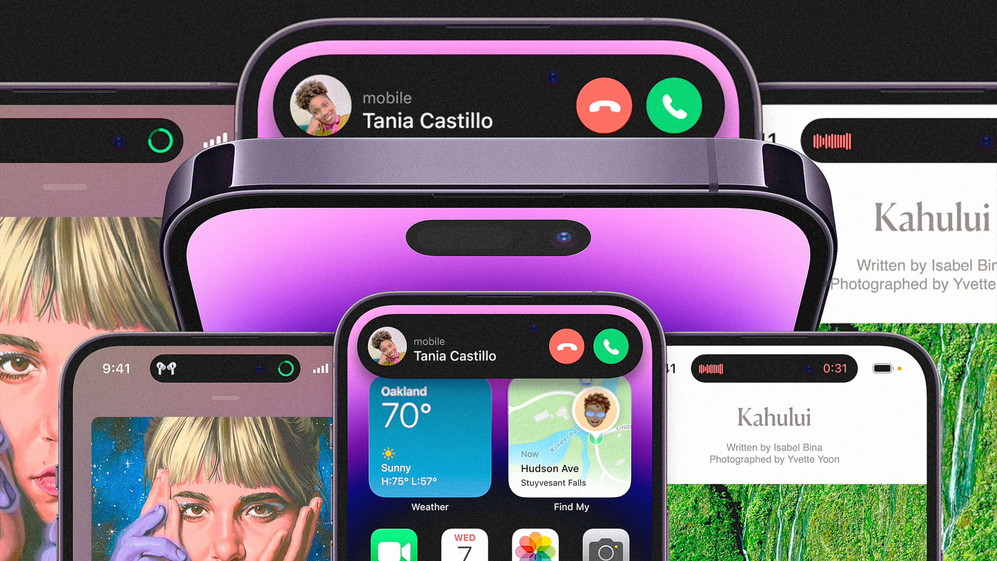
Fast-forward four generations and here we are, with a new iPhone 14 Pro that transforms the hardware notch into a pill-shaped hole in the top middle of the screen that contains the front camera and all the FaceID sensors. And the true genius of that pill isn’t in its updated physical design, but in how the software so adeptly normalizes a hole in your screen. Apple has made the once-maligned camera in the middle of your precious content feel absolutely essential.
[Image: Apple]
Apple played an ugly feature beautifully
Now, Apple’s new pill looks ugly. Apple knows it. You know it. It’s basically the same wretched mechanism that many Android phones have been using for years now. But rather than shying away from it, this is what Apple did: make it into the centerpiece of their new design with some gimmicky-but-clever-but-actually-pretty-useless-but-pretty-cool-but-mostly-silly user interface element that is a true master class on how to turn a drawback into an advantage. Man, the audacity of these peeps. I love them. I hate them. But mostly love them. And hate them some more.
The black pill now serves as a main interface element of iOS. It expands to show all kinds of things, from live sports results to useless soundwave animations when people call you. It also serves as a physical anchor point that expands to different sizes to display timers, alarms, turn-by-turn navigation, and notifications from apps.
And it appears to work perfectly, but only as a way to make something ugly into something palatable. Because you could have done all of the above without having that horrible hole in the middle of the display. It just happens that Apple doesn’t have the option to have FaceID or the selfie camera under the display yet, so it had to make this approach work.
Of course, the Apple blogs and tech press were all over it like jelly on peanut butter or flies on a turd — whatever side you pick on this new Apple battle. “This feature alone makes iPhone 14 an exciting upgrade,” one commenter said. “Unexpectedly sexy. Damn, I had counted on not wanting to buy this one,” cheered another. “It’s nice to see Apple returning to its roots with whimsical features like this,” reflected someone else.
[Image: Apple]
Apple’s long history of turning water into wine
Yet it’s hard to be too excited by the Dynamic Island, because this is not a whimsical feature like the ones that Apple used to include by choice (I’m thinking about how the Apple logo in old MacBooks used to pulsate with light to signal to you the machine was alive and sleeping). It’s a forced patch to a clear limitation, a product of choosing design over engineering and eliminating the button behind TouchID fingerprinting unlocking. Like bumpers became a “great way to personalize your iPhone” after the iPhone 4 antennagate disaster showed Apple design’s limitations. Or how the lack of a physical keyboard in the original iPhone was presented as a great feature, complete with sound feedback and key zooming, even while predictive text didn’t work as well as a Blackberry at the time.
The iPhone X’s FaceID was perhaps the pinnacle of this practice of turning bad decisions or flaws into shiny features. Like I wrote at the time of its introduction: “The iPhone X is a sham. The epitome of fluff over function. The penultimate step in Apple’s downward spiral toward replacing the Ramsian ‘Less is more’ with the ‘more, more, more!’ of a greedy kid in a cupcake shop. One more brick, at last, on its towering monument to bad design.”
The Dynamic Island is also that. It’s the perfect symbol of Apple’s shameless cheekiness, condensed into one glorious pill of marketing and user interface genius.
Recognize your brand’s excellence by applying to this year’s Brands That Matter Awards before the early-rate deadline, May 3.
