Fast company logo
|
advertisement

A new book, The Secret Language of Maps, shares techniques that can help you sort information and make it more compelling—no matter who your audience is.

Maps can make you better at your job. Here’s how

[Images: © 2022 by Jeremy Nguyen and Michael Hirshon (illustrations)/courtesy Ten Speed Press/Penguin Random House]

BY Elissaveta M. Brandon3 minute read

We live in a world full of data. Stats, facts, numbers, and even our own thoughts can be hard to sift through, let alone convey to others in a clear, concise way. Inevitably, this bleeds into the way we work and turns into a sea of information we have to synthesize on a daily basis. But here’s the good news: design can help.

[Image: courtesy Ten Speed Press/Penguin Random House]
In her captivating new book,The Secret Language of Maps, Carissa Carter highlights three different mapping techniques for anyone who has to navigate a lot of information in their work, be it a yearly report or a murder mystery (no, really). Complete with delightful illustrations byNew Yorkercartoonist Jeremy Nguyen, the book teaches you how to use visual techniques to make data more accessible and more compelling—even if you don’t have a cartography degree.

Carter is the academic director and an adjunct professor at the Stanford d.school, where she teaches courses on the intersection of data and design, maps, and the visual sorting of information. She argues that any information presented visually and arranged spatially counts as a map, be it infographics, charts, frameworks, or timelines. It just depends on how you use them.

Experiment with form

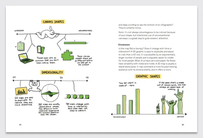
We all know what a bar chart looks like, but does it have to be made of rectangles? A chart about the varying sugar content in soft drinks could take on a whole new meaning if the bars were replaced by lollipops. Similarly, a chart that involves people could be more powerful if each bar was a hand. “The minute you add a series of hands with different postures, that’s a layer of meaning,” says Carter.

Click here for a larger version. [Image: © 2022 by Jeremy Nguyen and Michael Hirshon (illustrations)/courtesy Ten Speed Press/Penguin Random House]
The same thinking can be applied to the size and dimensions of your illustration. Is what you’re trying to say best conveyed on a paper or a laptop screen? Or would it be more compelling if illustrated on an unconventionally shaped canvas or a 3D map—maybe an object that can be held in the palm of your hand, or an immersive VR experience, or even a pop-up installation?

Build nuance into your visualizations

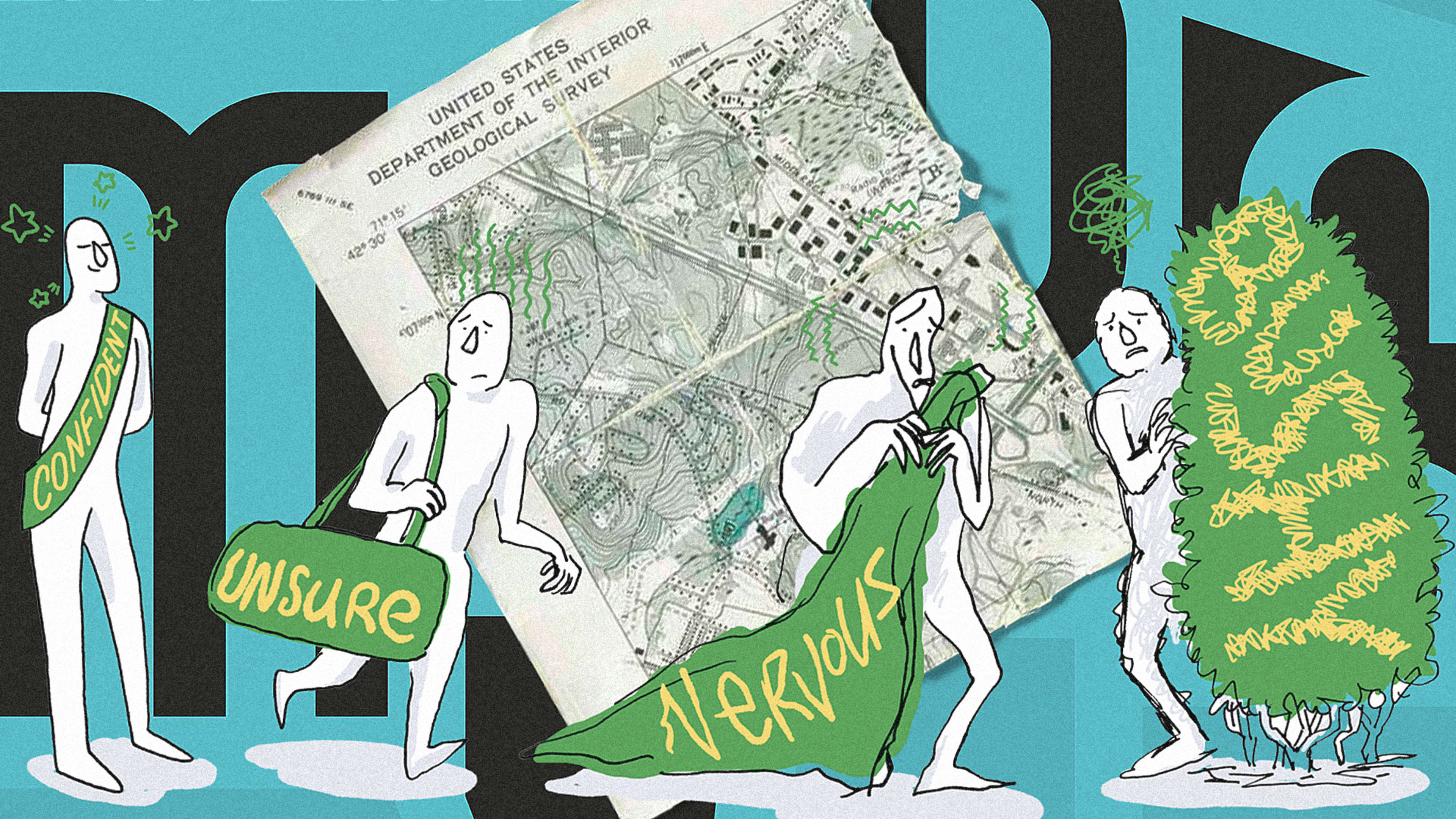
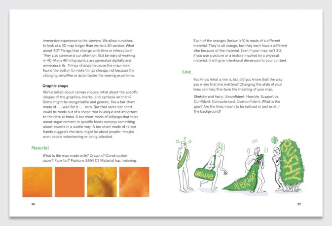
Yes, your data matters, but the way you present it matters, too. You could draw your map on the computer or by hand, and each strategy will have a different effect. “The minute you show super high-resolution conveys this is perfect and complete,” says Carter. “When you draw something by hand, and your line isn’t perfect; that’s implying that data isn’t perfect either.” Data journalist Mona Chalabi‘s hand-drawn graphics demonstrate this strategy perfectly. “With her hand-drawn [maps], she is showing you that the boundaries of the data are imperfect.”

Click here for a larger version. [Image: © 2022 by Jeremy Nguyen and Michael Hirshon (illustrations)/courtesy Ten Speed Press/Penguin Random House]
Color and scale matter just the same. A black-and-white graphic scribbled on a Post-It Note will be interpreted differently than if it was printed in full color on a billboard. Colors also elicit different kinds of emotions. An amusing illustration in the book suggests that a red car might imply “I need you to see me,” whereas a green car means “I was on sale.”

Think beyond charts

Charts are useful, but they’re limited in scope. Venn diagrams can help you introduce complicated relationships between seemingly unrelated things (and they don’t have to be made of circles). Continua (a line with two points on either end) allows you to organize data in a chronological timeline, or in a way that explores contrasts. A nested framework can be used to explore the boundaries of your subject, and how it sits within the larger context (think of it as a real-life version of Russian dolls). And a magic quadrant (with a vertical and a horizontal axis) can help you overlay a number of variables.

Click here for a larger version. [Image: © 2022 by Jeremy Nguyen and Michael Hirshon (illustrations)/courtesy Ten Speed Press/Penguin Random House]
“Each one of them is a tool for exploration,” says Carter–and each tool can help you highlight something differently. “In the same way you go to the eye doctor, and they flip the lenses and for a while it’s blurry and then all of a sudden, that works,” she says. “You want to look at the information you have and map it in different ways.”

Recognize your brand’s excellence by applying to this year’s Brands That Matter Awards before the early-rate deadline, May 3.

CoDesign Newsletter logo
The latest innovations in design brought to you every weekday.
This site is protected by reCAPTCHA and the Google Privacy Policy and Terms of Service apply.
Privacy Policy

ABOUT THE AUTHOR

Elissaveta is a design writer based in Brooklyn. Her writing has appeared in The Atlantic, Wired, CityLab, Conde Nast Traveler, and many others More


Explore Topics