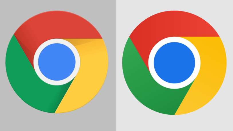
When Google Chrome revealed its first logo refresh in nearly a decade earlier this year, the internet was left scratching its head. The change was so slight, the new logo so simple, merely removing the highlights and shadows to completely flatten the logo, slightly adjusting the proportions, and saturating the colors.
The driving factor is more than just a trend in our visual language—it’s about adjusting to our new normal as companies and consumers. As we’re all too aware, the world is changing at an unprecedented pace. Brands are looking for simple designs that give them flexibility to adapt across new platforms, appeal to new audiences, and pivot as things change around them. And—jokes about Chrome’s new logo aside—consumers are craving simplicity in an increasingly complex world. A 2021 study by brand strategy agency Siegel+Gale found that 76% of people are more likely to recommend a brand that delivers simple experiences.
While this shift is important for all companies to pay attention to, it presents an especially exciting opportunity for startups, which are constantly changing by nature. When done correctly, approaching branding with simplicity can help startups more easily align their brand with their strategy—and save a lot of money in the process.
Why distinctive branding doesn’t work for startups
Company branding used to feel permanent: You spent a lot of time and money getting it right and then didn’t change it for as long as possible. Take American Airlines, which didn’t change its branding for 40 years. While the original branding was classic, it ended up looking a little too patriotic as the world became increasingly globalized. When they addressed this issue with a major rebrand, they faced some pushback for such a drastic change. And yet, too many founders still adhere to a mindset where they see branding as a boxed-in solution that will last, even if their business changes.
The reality is exactly the opposite. There’s no way to create strong visual branding without a solid understanding of a company’s core product, purpose, and audience—something startups are still figuring out in the early years. As startups pivot their strategy to find product-market fit or appeal to different audiences, branding that used to work might not anymore. I’ve even seen designer friends work on projects where the brand is already dated by the time they’re exporting the final files (no exaggeration!) because of the speed at which the client is pivoting.
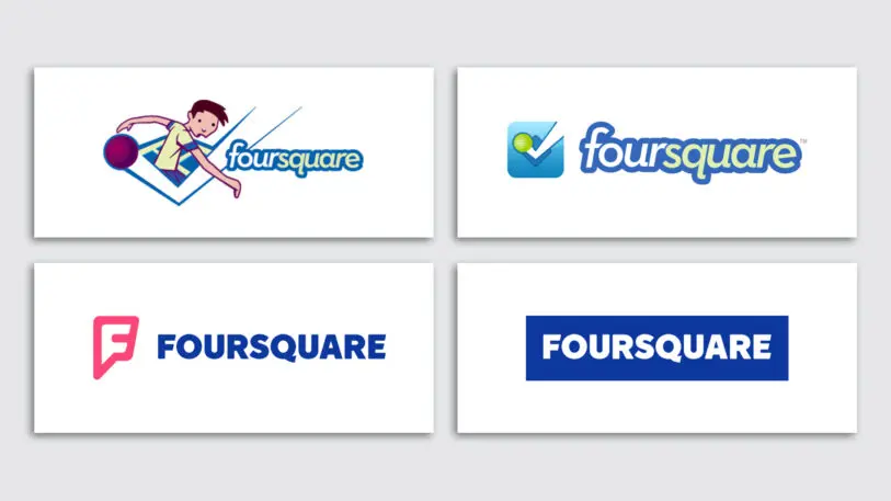
The more distinctive a brand identity, the more exaggerated this problem becomes. Foursquare is a great example: They launched over a decade ago with complex, consumer-focused branding and have had to significantly rebrand every few years as they found their footing and eventually expanded to include a B2B business model.
A more fluid way forward
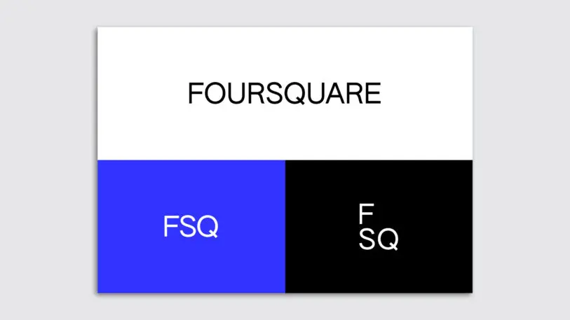
Looking at Foursquare’s latest rebrand, you see how simplicity helps solve these issues. The company stripped its branding back to a wordmark and a few basic colors, describing the new approach as a “simple, scalable system” that allows them to appeal to the multiple audiences they’ve grown to serve.
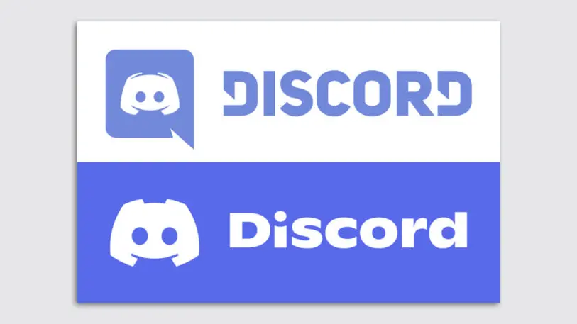
Chat app Discord took a fluid approach last year in a brand update they described as “not too different: just a little friendlier”—a move to make the product more welcoming as they expand beyond the gaming community.
[Image: Dropbox]
Save money on simplicity
So, why am I talking about this approach when there are plenty of brands—big and small—that already do it?
For one, there are still plenty of startups taking the old approach, looking for trendy or flashy design to help them stand out, when they should really be seeking a simple brand that gives them flexibility while they find product-market fit.
The other issue is that startups are hiring branding agencies at all—at great cost. Top agencies for early-stage companies typically charge $150,000–$500,000 for their branding work; even entry-level agencies often start at $50,000. At that price, growing companies (that barely have that money in the first place) feel pressure to get it perfect and never update their branding.
Instead, young companies can DIY a simple design system, with a sleek wordmark, professional fonts, and a basic color palette. Moreover, when they take the fluid approach, there’s no pressure for this early branding to be perfect: Tweaks can and should happen along the way.
I’m not saying that the work brand designers do isn’t valuable—but it’s only valuable once a company feels secure in what it’s doing and who it’s marketing to.
So, my advice for startups: Take advantage of this simple design trend to create something that’s good enough for now, make perhaps imperceptible changes as you learn along the way, and spend the bulk of your resources getting your product right. Once that’s in place, you can pay for all the fancy design work you want.
Saskia Ketz is the founder of MMarchNY, a New York City-based branding agency that’s worked with brands like Netflix, IKEA, Timberland, and Mojomox, an online wordmark builder that allows startups to create dynamic, professional-looking logos themselves.
Recognize your brand’s excellence by applying to this year’s Brands That Matter Awards before the early-rate deadline, May 3.
