Color influences our daily lives far more than we think it does. Academic studies and our own unique experiences have proven that color is a powerful psychological tool that affects the way we feel and perceive the world around us. Translating this into the workplace environment allows us as designers to work alongside organizations to leverage color associations for the greater good of staff. As companies map out their return to the office strategy, those that choose either a full-time or hybrid return are evaluating how color will take hold of productivity and company culture.
Principles of color psychology
As soon as we perceive color, our brain and endocrine system receive the input—releasing hormones throughout the body. This process is what sends signals to the brain to make us respond and feel certain ways. According to the Institute for Color Research, a study found that people make a subconscious judgment about an object, person, or environment within 90 seconds of initial viewing. In that small pocket of time, 62% to 90% of that assessment is based only on color.
Behind color psychology is also color therapy. Healing through color works through the physical exposure to color. Recent research studies have assessed stress and anxiety reduction after color exposure using a commercially available relaxation-through-color routine. There’s also increased evidence on color perception change due to seasonal change. Therefore, it is important for us to take note of our plasticity of color perception, and it’s influence on our affects.
The office of the future
As the COVID-19 pandemic enters its third year, the office of the future looks a lot different than what we predicted even a year ago. At a time when the views and priorities of employees have shifted, studies are showing that well-being, flexibility, work-life balance, and company culture are top of mind. And though these are seemingly aspects of the workplace directly related to the organization, architecture and design plays a large role in the way employees react, feel, and respond to their day-to-day tasks.
Traditionally, color has been used in various industries including marketing and graphic design to evoke responses that are synonymous with the brand’s messaging. In the workplace, color is used as a tool to elicit specific emotional responses amongst staff to ultimately encourage and support their needs.
- Green: The most important colors in the workplace are those that have strong ties to nature. This isn’t limited to one shade of green, but a variety of shades that exist in nature. Green evokes a feeling of abundance and is associated with refreshment and peace, rest and security. In the office, the connection to nature helps people feel rested and secure.
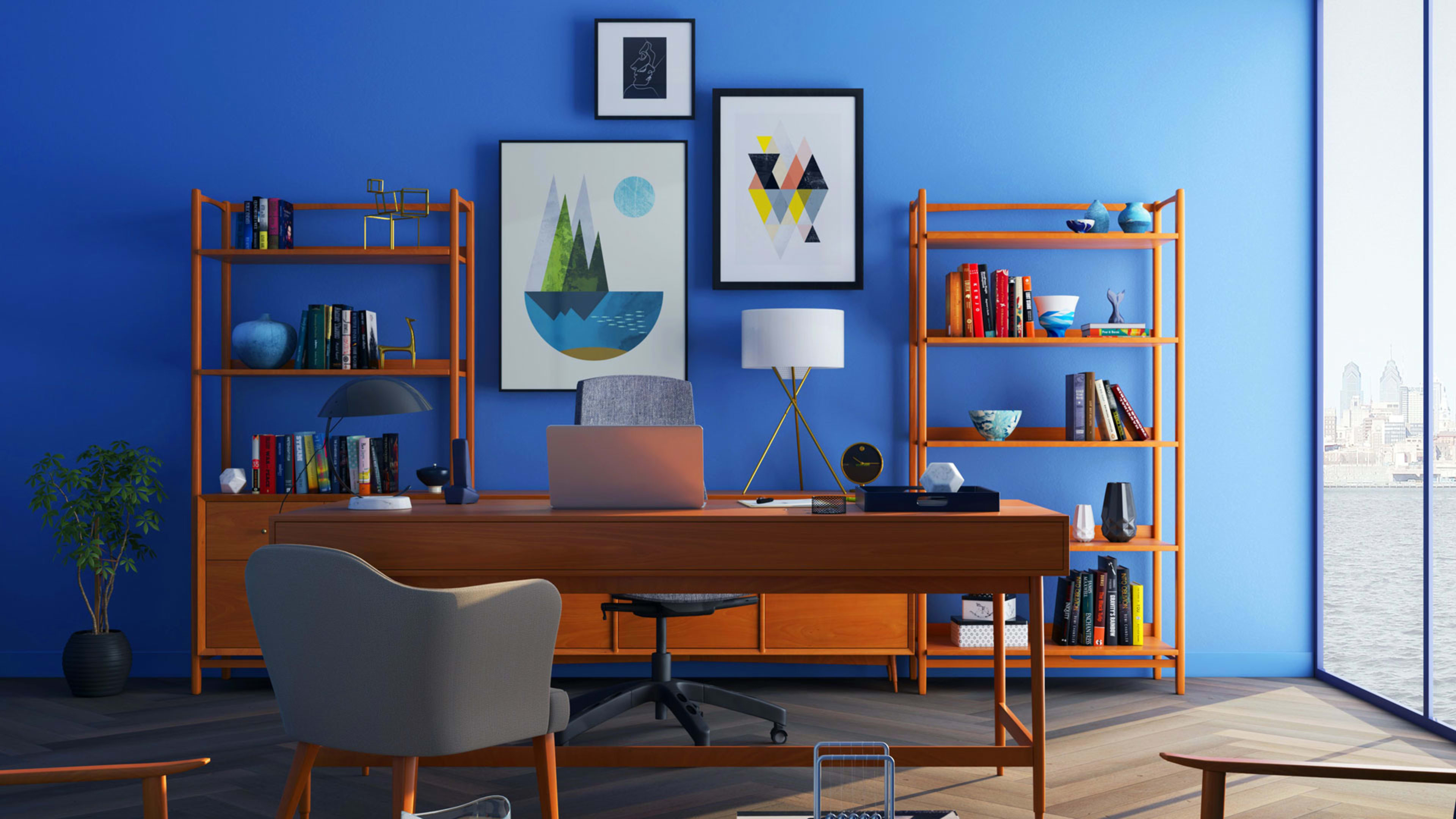
- Blue: Similar to green, blue is a color that is reminiscent of nature, whether it’s through the bright sky above us or the deep blue sea. Blue calls to mind feelings of calmness or serenity and it is often described as peaceful, tranquil, secure, and orderly.
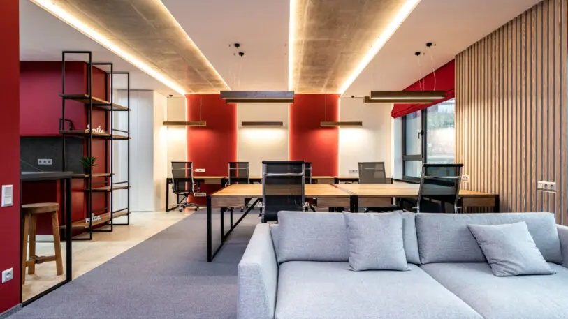
- Yellow: This color stimulates emotion, which makes it an ideal choice for creative industries. It also evokes feelings of happiness and can brighten one’s mood. Despite being such a bright and lively color, yellow works in offices that are geographically positioned in colder and rainier areas, such as Seattle or Northern Europe, to heighten the energy.
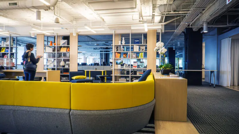
- Grays/neutrals: Neutrals work especially well in the context of a home office. Neutral tones can represent anything from peace and calm to wholesomeness and reliability.
As a rule of thumb, colors that are reminiscent of nature are always a go-to—especially as workplace wellness continues to dominate. Greens and blues, or a combination of the two, relaxes our anxieties and makes us feel at ease. Colors that lean towards the warmer side are generally more up-beat colors than cooler tones and work well in geographically darker areas. Depending on where your office is located, designers should lean towards shades that support the local population.
Companies looking to improve their businesses should seek opportunities that incorporate nature as part of their color palette—whether that’s through movable pods, indoor planters, green walls, or increasing access to sunlight and the sky. It’s also important to consider the activities and specific needs that will take place within any given space. For example, a meeting room or brainstorming space is likely to benefit from having “happy” colors to encourage conversation. Lounge spaces might benefit from taking on a slightly darker or muted material to encourage a relaxed feeling. At the work station area, a flexible system that allows employees to have some level of customization is also a monumental step in achieving workplace productivity and satisfaction.
Overall, the general consensus is that color associations take precedence over the visual appeal of colors on our walls or in branding. As organizations around the world continue to study the modern employee and their needs, workplace design will be a physical manifestation of that through the strategic use of color, material, furnishings, and amenities.
Recognize your brand’s excellence by applying to this year’s Brands That Matter Awards before the early-rate deadline, May 3.
