Branding a company isn’t always about making it stand out from the crowd. Often it involves an almost opposite process of helping the organization fit into the environment in which it does business. Failure to do so can result in the brand seeming out of place, a fate that looks to have befallen the Washington Commanders.
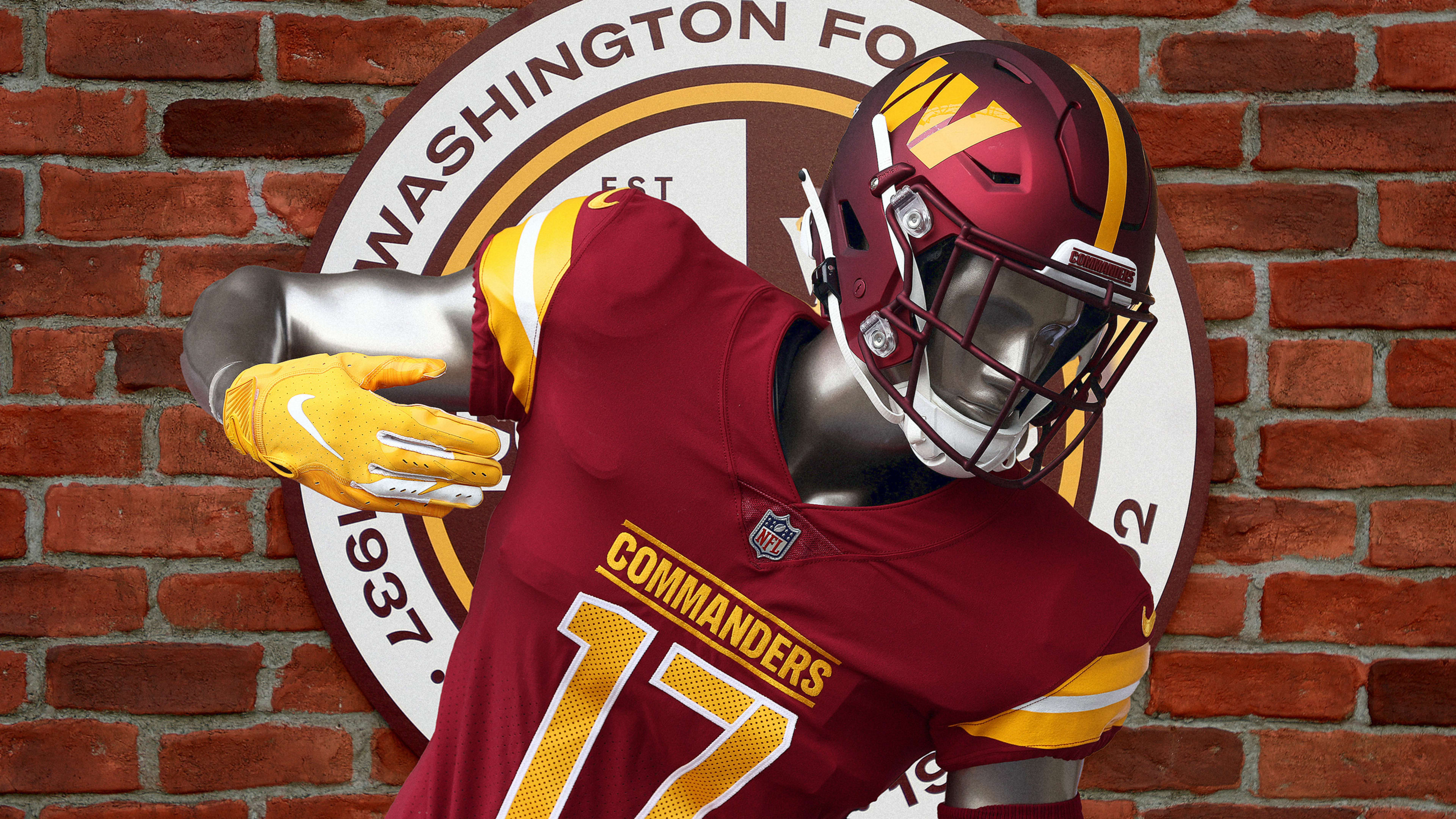
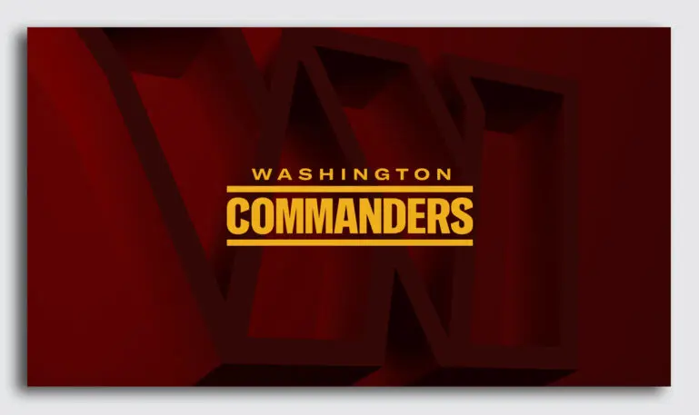
Unveiled yesterday, the new name and logo replaced the Washington Football Team branding that had served as a placeholder for the past two years, following the team’s long-overdue abandonment of its previous Native American identity slur.
“Commanders” was, in fact, a minor league name, used in 2019 by the San Antonio franchise in the short-lived Alliance of American Football. But beyond that footnote, the name has a minor league ring due to its sheer grandiosity. Not many big-league teams feel the need to puff themselves up with lofty monikers. Certainly, the NFL has more than its share of teams named after fierce animals, but none are really over the top in the manner of the XFL’s St. Louis BattleHawks or the United States Football League’s Pittsburgh Maulers. New and small-time teams, without much in the way of history or tradition to serve as a basis for their appeal, use such ostentatious names as a crutch.
There’s also a haughtiness to the Commanders name that’s off-putting. It evokes an unpleasant sense of hierarchy and authority, as well as a whiff of datedness: “Commander” appears in U.S. trademarks filed since 2000 at a rate that is 73% lower than last century. And while it’s not surprising that a team in the NFL, a league that festoons itself in camouflage every November for its “Salute to Service” campaign, would adopt a military-theme name, most of the American public likely identifies more with the boots on the ground than the brass giving them their marching orders.
Americans today seem less fond than ever of being commanded, whether reflected in the record numbers of those quitting their jobs or in the millions resisting public health mandates. The Commanders name, then, aligns with the most negative stereotype of our nation’s capital: a place full of out-of-touch bigwigs and stuffed shirts who enjoy imposing their will on the rest of the country. Of course, the Commanders branding is targeted at the local fans of the team, not everyone else. Still, there appears to be little benefit to turning your team into the football equivalent of the professional wrestling “heel.”
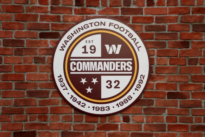
W is a strong and symmetrical letter well-suited for use as a monogram (and, in fact, is the sixth most commonly used letter in such logos). But the Commanders seemingly accordion-folded W gives off a vibe that’s more corporate than athletic, aside from its spiky serifs of the type that has become de rigueur for 21st century sports logos. And of the 31 other NFL teams, only 7 take the field with a monogram on their helmets; it’s a look that is decidedly more collegiate or high school than professional (and even gives the impression of being behind the times, as the use of single-letter monogram logos peaked in the early 1970s). The heavy lifting of the brand’s appearance is left to the familiar burgundy-and-gold color scheme that has been retained, with some assistance from the crest’s “Est 1932,” to remind fans of the team’s long history.
Even though it may not currently live up to the NFL’s standards, the Commanders team identity gives the impression that it is still something of a work in progress. Over time, not only will increasing familiarity dull the perception that the brand is out of place, but the team will have the opportunity to evolve elements of the brand to better conform to the public’s big-league expectations. The new branding is not a failure, but it has left itself with some catching up to do.
James I. Bowie is a sociologist at Northern Arizona University who studies trends in logo design and branding. He reports on his research at his website, Emblemetric.com.
Recognize your brand’s excellence by applying to this year’s Brands That Matter Awards before the early-rate deadline, May 3.
