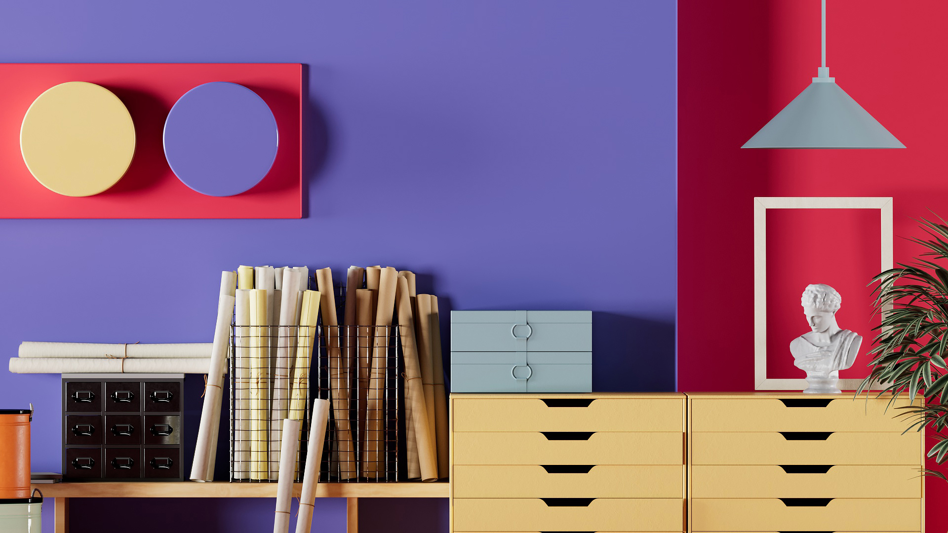
Around the year 2000, aesthetics shifted. Gone were the pop, grunge, and minimalism of the ’90s. What replaced them was a shiny, oversaturated look, inspired largely by the rise of the internet and mobile phones. Since dubbed Y2K, the aesthetic was impossibly optimistic (once the time’s techno-panic turned out to be a farce), full of silvery sheens and rainbow liquid metal effects that were almost too bright to behold.
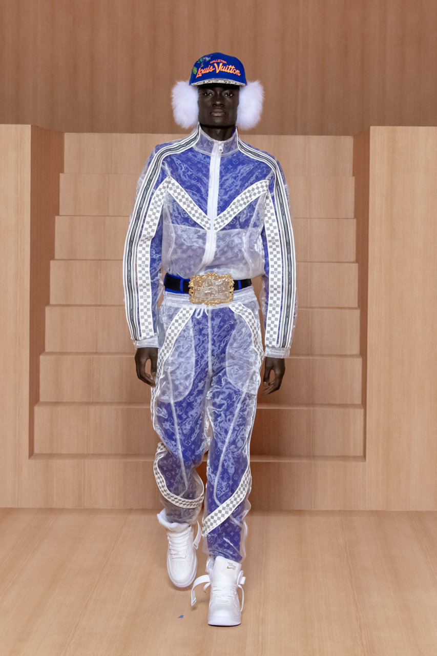
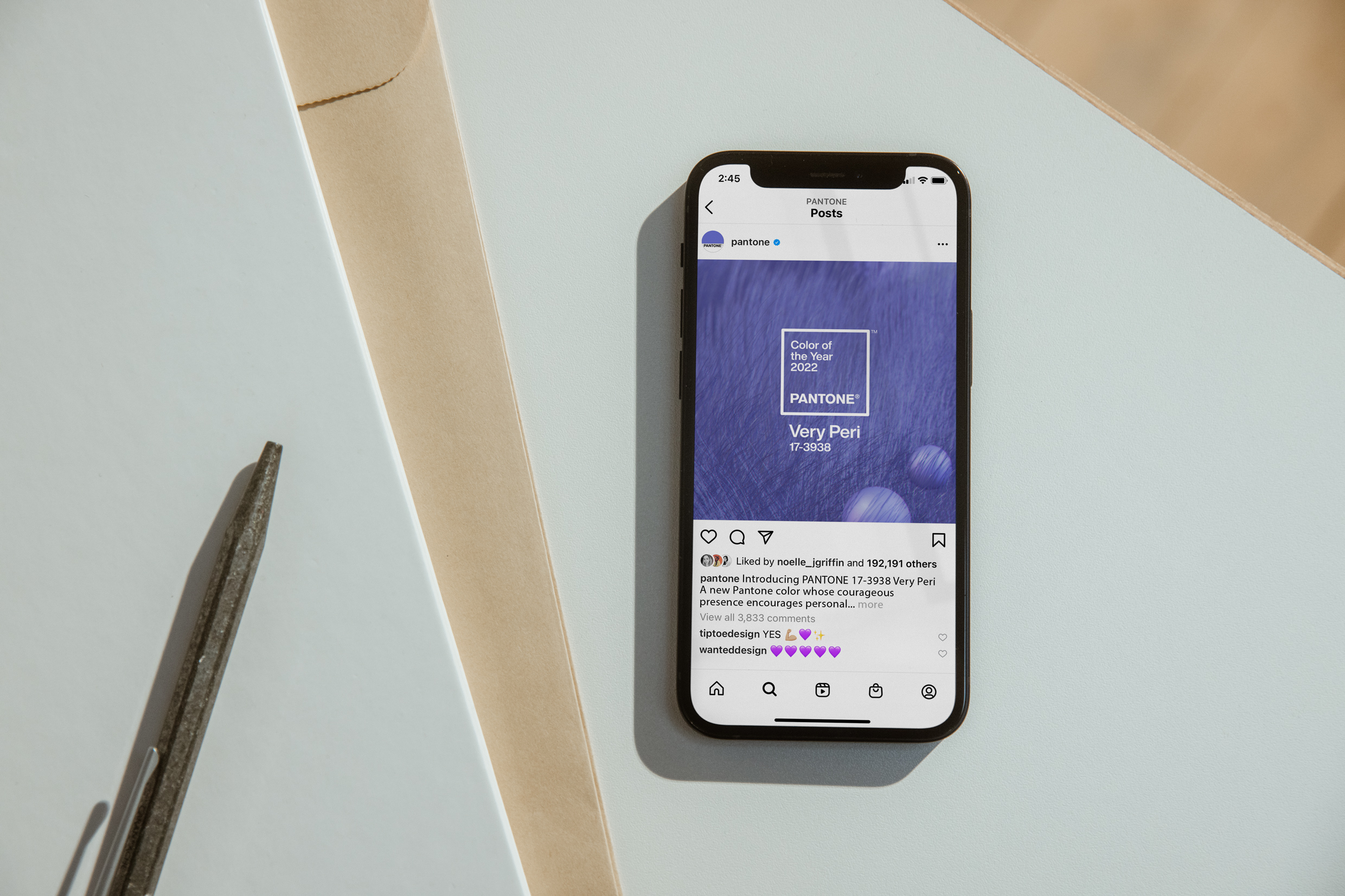
[Image: Polygon1993/Pantone]Today, with the explosion of Zoom meetings, NFTs, and talk about the metaverse, it’s like Y2K all over again. Which is a big reason why Pantone’s Color of the Year for 2022 is Very Peri. Its baseline is a true periwinkle—like the flower of the same name—but with an iridescent red lurking below its surface. The result is a shimmering color that you can already see anywhere from Fortnite to high-tech S-Works mountain bikes to the catwalk of Louis Vuitton’s Men’s Spring-Summer 2022 show to LED lighting. But Pantone believes it captures the current zeitgeist.
Louis Vuitton Menswear Spring-Summer 2022. [Photo: Kristy Sparow/Getty Images]“The colors we see in technology are having a greater influence on design,” says Laurie Pressman, VP of the Pantone Color Institute. “But we’re still connected to nature.”
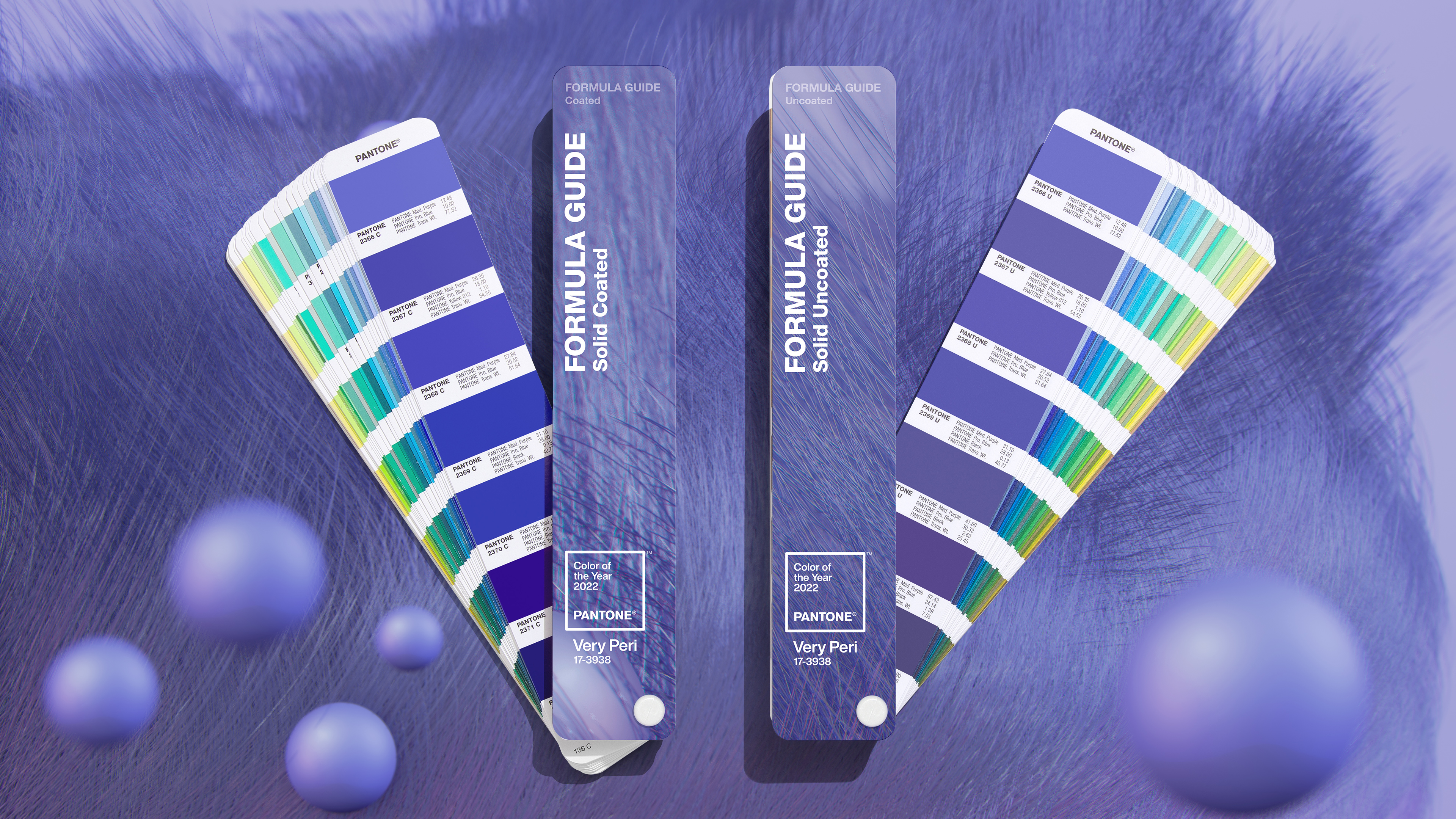
[Image: courtesy Pantone]Pantone came to its color choice the same way it always does: researching trends across the color world—in fashion, products, art, travel, and materials. But for the first time since launching its Color of the Year program in 2000, the company actually created a new color for its announcement rather than pulling something from its existing library of branded hues. Pressman—who tends to discuss the program as a social thumbprint as much as a trendspotter—believes the decision mirrors the adaptation of a society that’s rapidly shifting its own practices in the face of COVID, embracing everything from remote work to grocery delivery as a way of living that has seemingly changed overnight.
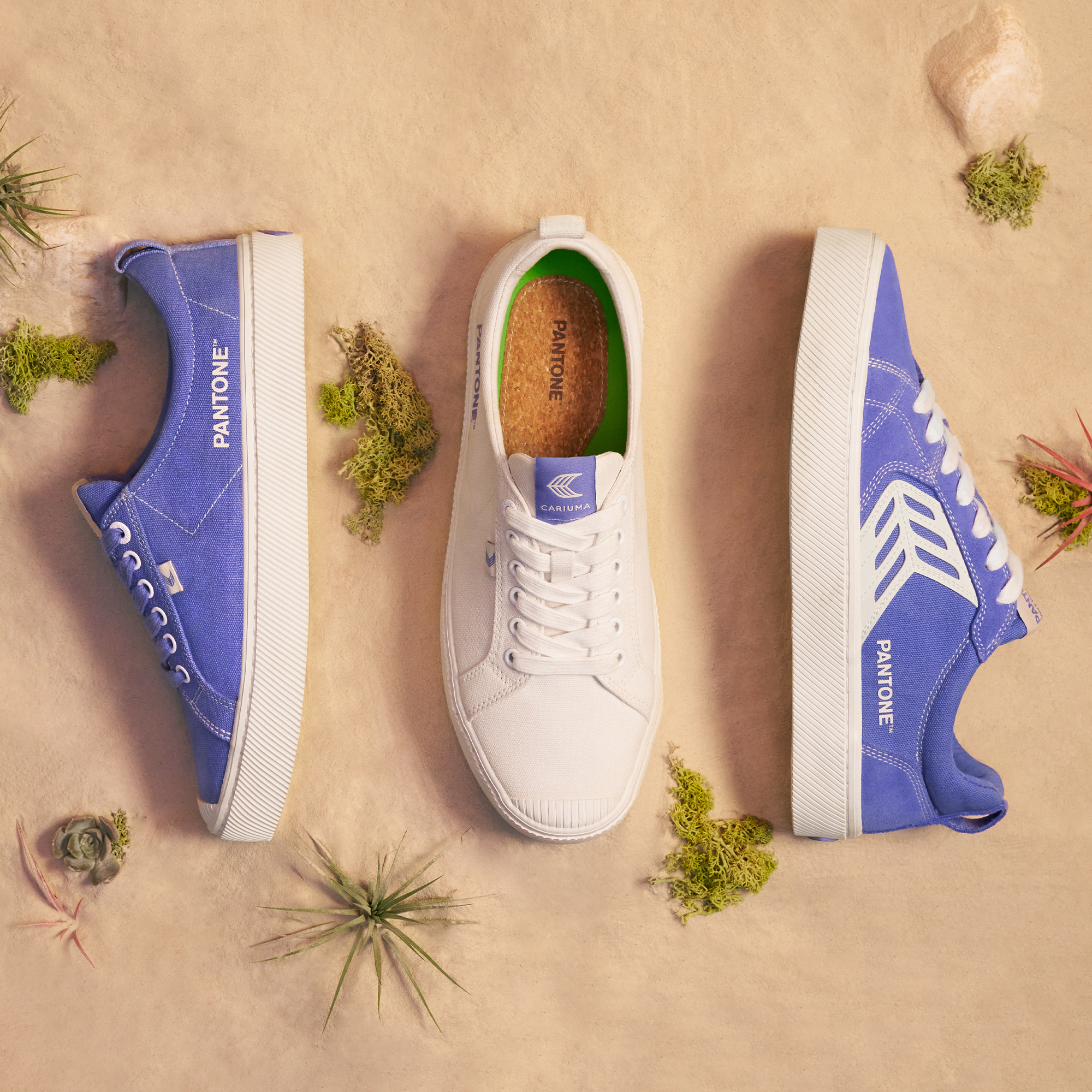
[Image: courtesy Pantone]“We really felt, with the world in transformation, the best way for us to capture this collective mood and stepping into the unknown, [was to] transform our own process, but make sure the color we introduced was reflective of this unique cultural moment,” says Pressman.[Image: Cariuma/courtesy Pantone]She calls Very Peri “the happiest and warmest of blues”—noting blues are considered a “dependable” color. The addition of red adds a dash of vigor.
advertisement
“Every single day you can’t know what’s going to happen,” says Pressman. “We need that energy and boldness for what’s ahead.”
[Image: Microsoft/courtesy Pantone]But Very Peri is not just a cyclical, nostalgic return to Y2K. For one, Cerulean Blue was Pantone’s Color of the Year 2000, with a baseline more of a cool technological silver—picture aMotorola Razr flip phone—while Very Peri’s an organic hue found in nature. As for that red undertone, it’s almost impossible to see on digital, or the low-resolution graphics and displays of a bygone Y2K era. Very Peri’s iridescence requires higher fidelity 3D-rendered texture, be it real or digital, to truly come to life.
[Image: Huge/courtesy Pantone]Case in point: Pantone’s sample image for the color is an abstract scene that resembles animal fur as much as it does fiber-optic cabling, dotted with perfect spheres that could only come out of a machine. “We usually pick a pretty tangible image so people can understand exactly what we’re looking at,” says Pressman. “This [change] was intentional. We don’t know yet what the future will bring.”
[Image: Microsoft/courtesy Pantone]To further embrace the technological themes, Pantone also teamed up with Microsoft to launch Very Peri as a series of wallpapers, PowerPoint palettes, and even a Teams camera filter that will let you add the “happy” Very Peri backdrop to your home without having to repaint your walls. Pantone even collaborated on a piece of digital artwork in Very Peri with the digital artist Polygon 1993, rendered with a lenticular effect that shimmers on screen. But not all companies that teamed on pre-release color objects were digital. The Cariuma sneakers (pictured above) are part of the same program.
“We’re a company that helps designers express, communicate, and be able to replicate color,” says Pressman, who declines to clarify if the work is an NFT. “That’s really what it is. We’re exploring our path forward in the metaverse.”
Recognize your brand’s excellence by applying to this year’s Brands That Matter Awards before the early-rate deadline, May 3.
The latest innovations in design brought to you every weekday.