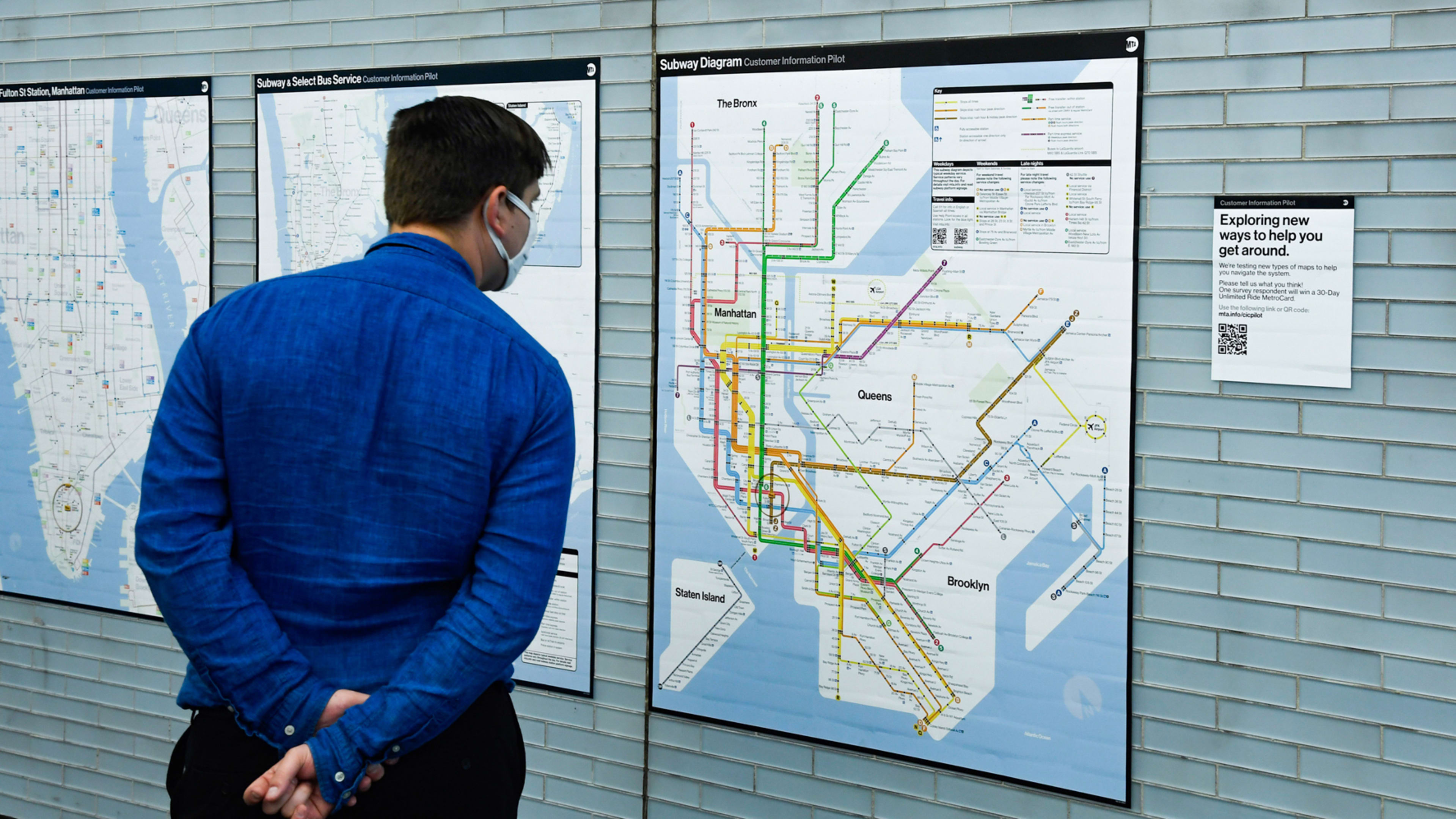
New York City’s subway system has a new map with a very old design concept.
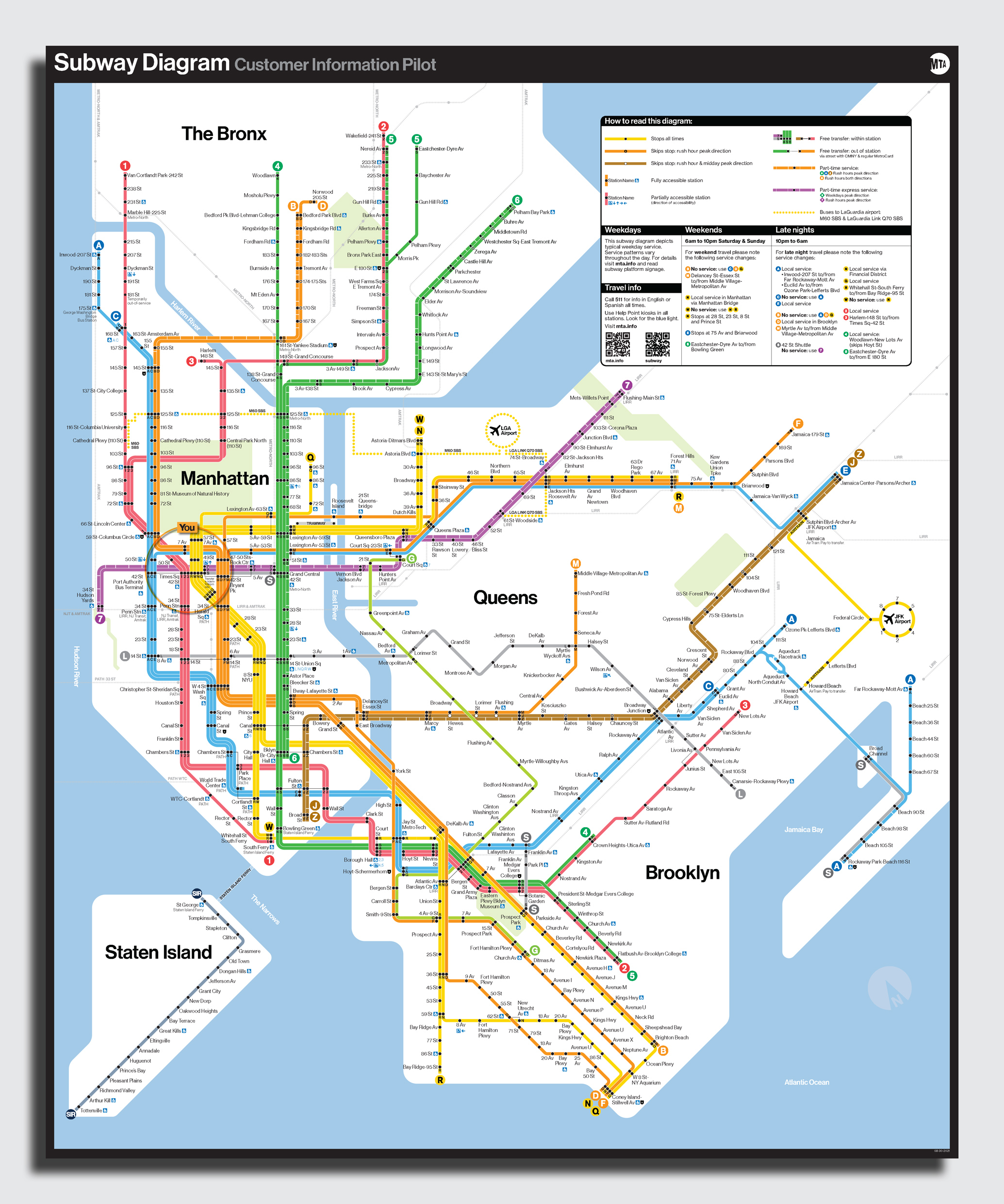
Rolling out in a handful of stations across the city, a pilot version of the Metropolitan Transportation Authority (MTA) subway map features an abstract version of the city, overlaid with bold lines marking each route. It’s an attempt to clarify where each line goes and how they connect at stations.
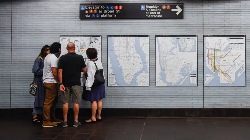
The printed map, now being tested on the walls of nine subway stations, is an updated version of a 1970s-era map that has become a classic example of informational design. The new map simplifies the shape of the city, and the precise location of subway lines, to give riders an easily comprehensible overview of the system, showing which lines connect and how to get across boroughs or into different neighborhoods.
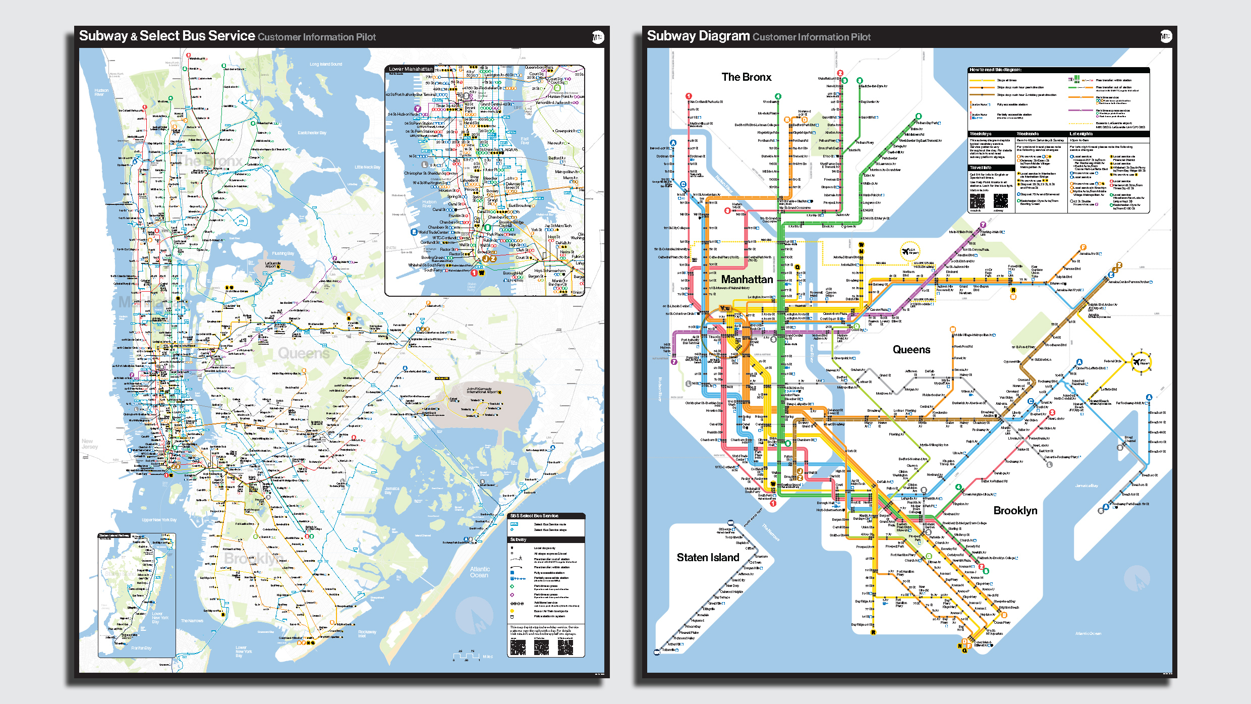
The next year, Vignelli’s map was replaced by one designed by Michael Hertz Associates, based on Tauranac’s concept. It features a more accurate representation of the city’s layout and distances between stations but simplifies some of the subway routes by combining multiple lines into a single trunk. Nonetheless, it’s been the MTA’s subway map for more than 40 years.
A few years ago, the MTA began reconsidering the wisdom of the Hertz design in the digital age. In 2020, Meyer worked with the interactive agency Work & Co to develop a digital version of the subway map that riders could use to plan journeys and see when service changes might affect their routes. Before, service updates and changes were mostly communicated on paper inside stations.
“I’m personally directionally challenged and really rely on maps,” Meyer says. “The disconnect from having our customers use two different visual forms to try to understand where service is felt wrong to me.”
“The two together is a very powerful way to understand the geography of the system, where you need to go and how long it’s likely to take you to get here,” says J.P. Chan, senior director of creative at the MTA. “You have the best of both worlds.”
Though the new subway map may be seen as vindication for fans of Vignelli’s version, Meyer says the redesign is not about choosing sides, but about getting people information efficiently. “We’re putting up what’s relevant for 2021 riders and the tools that they have.” (Besides, Vignelli’s map is part of the collection of the Museum of Modern Art in New York.)
The maps installed in the nine subway stations also include a QR code linking to a webpage that riders can use to provide feedback on the designs. Chan says the MTA has received hundreds of responses so far, and the maps will continue to evolve ahead of a system-wide rollout. A final version of the new map is likely months away, Meyer says. “But not that many months.”
Recognize your brand’s excellence by applying to this year’s Brands That Matter Awards before the early-rate deadline, May 3.
