The last thing we wanted to be doing in the summer of 2021 is writing about COVID-19 dashboards, but the worsening situation with the delta variant sadly calls for it. Nationwide, new coronavirus cases are up 139% over the last two weeks, according to data from the New York Times, while hospitalizations are up 92%.
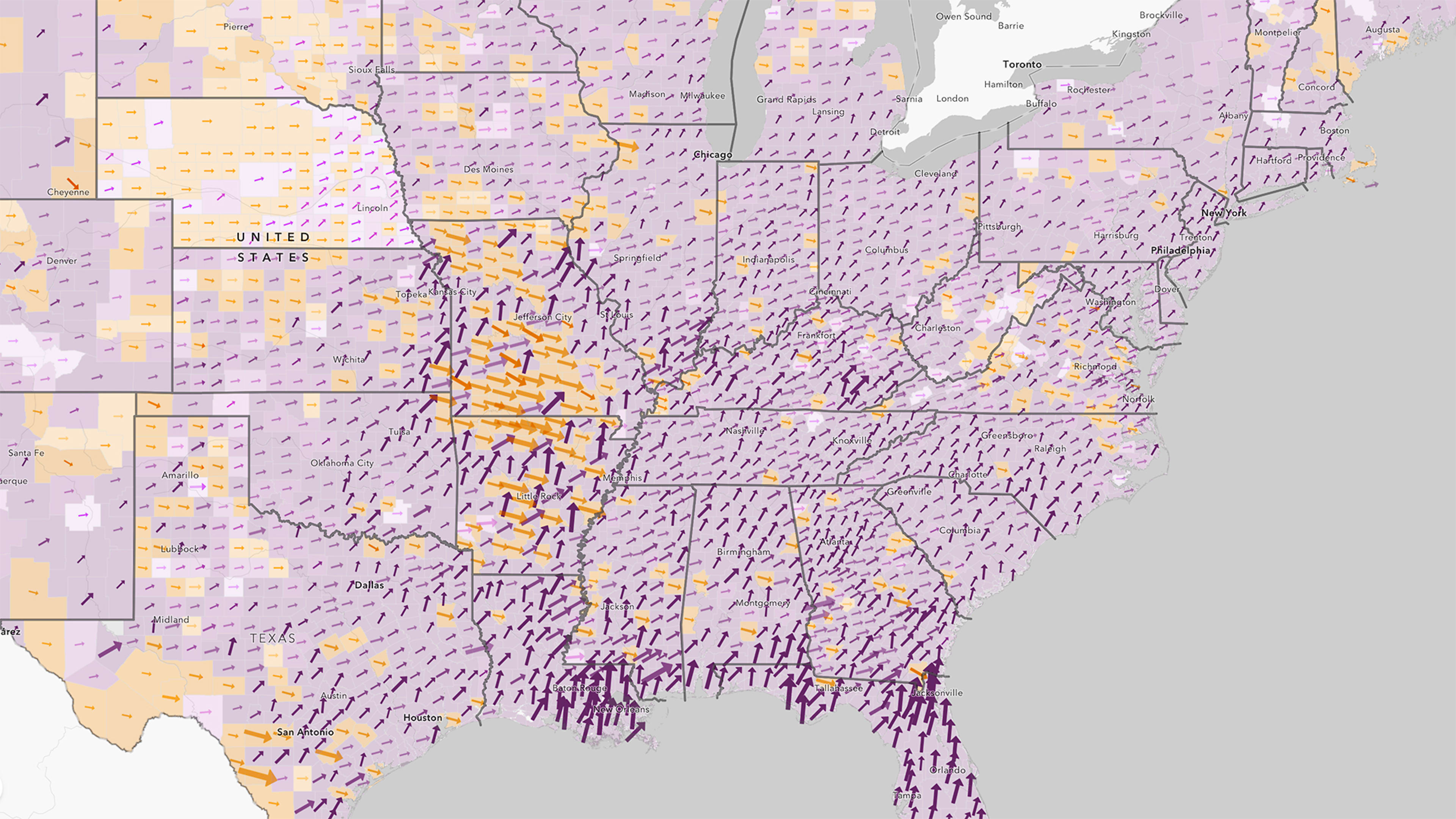
But the spread is not happening evenly across the board. At the state level, Southern states, such as Louisiana, Florida, and Arkansas, are seeing some of the highest current infection rates, while New England states, such as Maine and Vermont, are seeing some of the lowest. However, state-level figures can be deceiving because hotspots can still exist at the local level.
The folks at Esri, a spatial-analytics software company, have created a useful map series that lets you drill down into the latest COVID-19 data at the county level, and even lets you search your neighborhood. This is especially useful right now as the latest guidelines from the Centers for Disease Control and Prevention recommend extra precautions—notably, indoor mask-wearing—for people in areas with high levels of spread.
- Emergent: “New cases for the first time or in counties that have had zero new cases for 60 or more days.”
- Spreading: “Low to moderate rates of new cases each day. Likely controlled by local policies and individuals taking measures, such as wearing masks and curtailing unnecessary activities.”
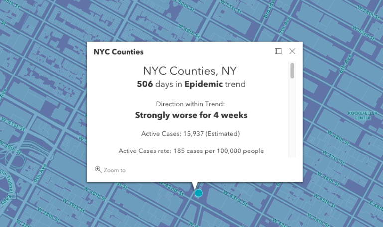
- Epidemic: “Accelerating and uncontrolled rates of new cases.”
- Controlled: “Very low rates of new cases.”
- End Stage: “One or fewer new cases every five days in larger populations and fewer in rural areas.”
Unfortunately, much of the country is in the epidemic trend right now, which is another reason why this map is so useful. The map also shows how long the counties have been stuck in a current trend and whether they’re getting better or worse. In Manhattan (New York County), cases have been “strongly worse” for the last four weeks, according to the data.
Health officials continue to urge people to get vaccinated as the delta variant continues its unwelcome spread, and the good news is, vaccination rates have recently picked up. With luck, we’ll soon get to a point where we’ll never have to write about another COVID-19 dashboard again. Believe me, we’re over it, too.
Recognize your brand’s excellence by applying to this year’s Brands That Matter Awards before the early-rate deadline, May 3.
