Tokyo 2020 may have happened a year late, while many of us were still holding our breath about the ongoing pandemic. The Games came with all sorts of compromises. Empty stadiums! Masks on the podium! Olympians quarantined to the Village!
Would it feel like the Olympics?
As it turned out, yes, yes it did! The Olympics were as big of a spectacle as ever. And a lot of that comes down to their design. Japan put on a stunning event, and corporations stepped up to create new products worthy of the moment. Well, for the most part!
Here is the best and worst in design at Tokyo 2020.
The Best
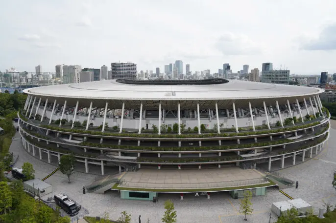
Renowned Japanese architect Kengo Kuma designed the Olympic Stadium, and it’s a masterpiece. Its wooden exterior will win you over, breaking conventions of the giant concrete and steel circles that stadiums always seem to be. But hidden within is the deeper innovation: An unparalleled level of small touches to make the space more accessible.
It has calm rooms for people who are sensitive to too much stimuli and bathrooms designed for people with limited mobility, sight, and hearing. Accessible seats even have outlets for recharging wheelchair batteries.
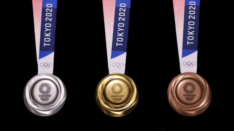
The gold, silver, and bronze medals at the Olympics always take center stage alongside winning athletes. And as they glimmer under the stadium lights, it’s easy to forget: The precious ore inside Tokyo 2020’s medals are sourced from reclaimed materials.
The country of Japan began collecting small electronics from its citizens in 2017, and its citizens stepped up, donating 47,000 tons of devices including 5 million phones as of 2019. That was enough to supply the 66 pounds of gold, 9,000 pounds of silver, and 6,000 pounds of bronze in the thousands of medals used in the Olympic and Paralympic Games.

Cardboard bed frames?!? The mattress supplier Airweave’s recyclable invention was amongst the most controversial decisions of the Olympic Games, especially as Twitter took them viral as “anti-sex beds,” implying they couldn’t hold the weight of two people.
The rumors proved false. The beds were technically rated for 440 pounds, and Tokyo organizers went so far as to clarify that sex was possible as long as the activity was limited to two people. Meanwhile, the Israeli baseball team got nine players jumping on one before it collapsed. Anything else that happened on those beds is nobody’s damn business.
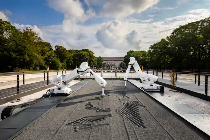
During the Olympics, four robots have taken up residence in Tokyo’s Ueno Park. These giant, mechanical arms have carefully tended to an automated zen garden. They’ve created 150 unique illustrations depicting this year’s Games, all by raking patterns into the small lava pebbles of black basalt. The high tech project, designed by Jason Bruges Studio, sourced the robots from a BMW factory. The robots came out of retirement for the Games to create this novel mix of data visualization, public art, and Japanese tradition.
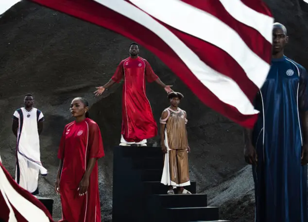
Italy gets Armani. Great Britain gets Adidas and Stella McCartney. But if you’re a small country, you don’t necessarily land a big time designer to create your Olympic wardrobe.
But this year, Liberia—one of the poorest countries in the world with a population of just 5 million people—landed the lauded Liberian American designer Telfar Clemens, known for his inclusive unisex basics. He outfitted Liberian’s three Olympians with avant garde designs, including a combination basketball jersey/royal tunic, palazzo pants, and an asymmetric half tank top.
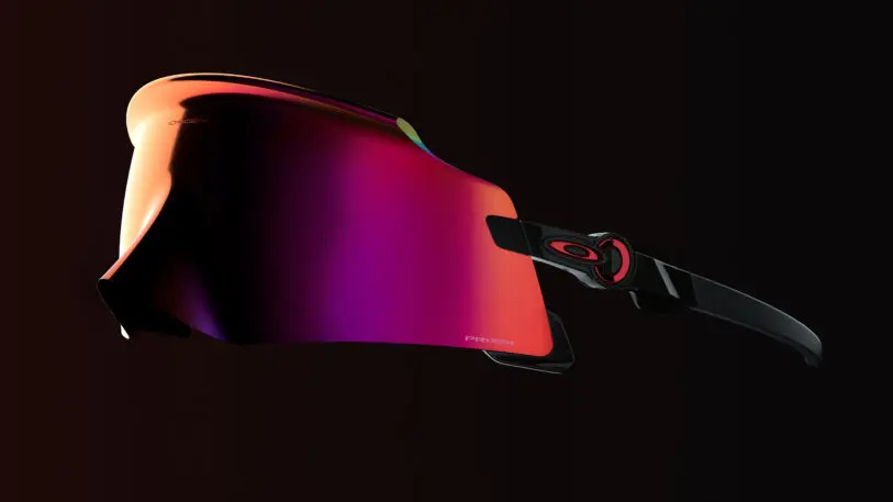
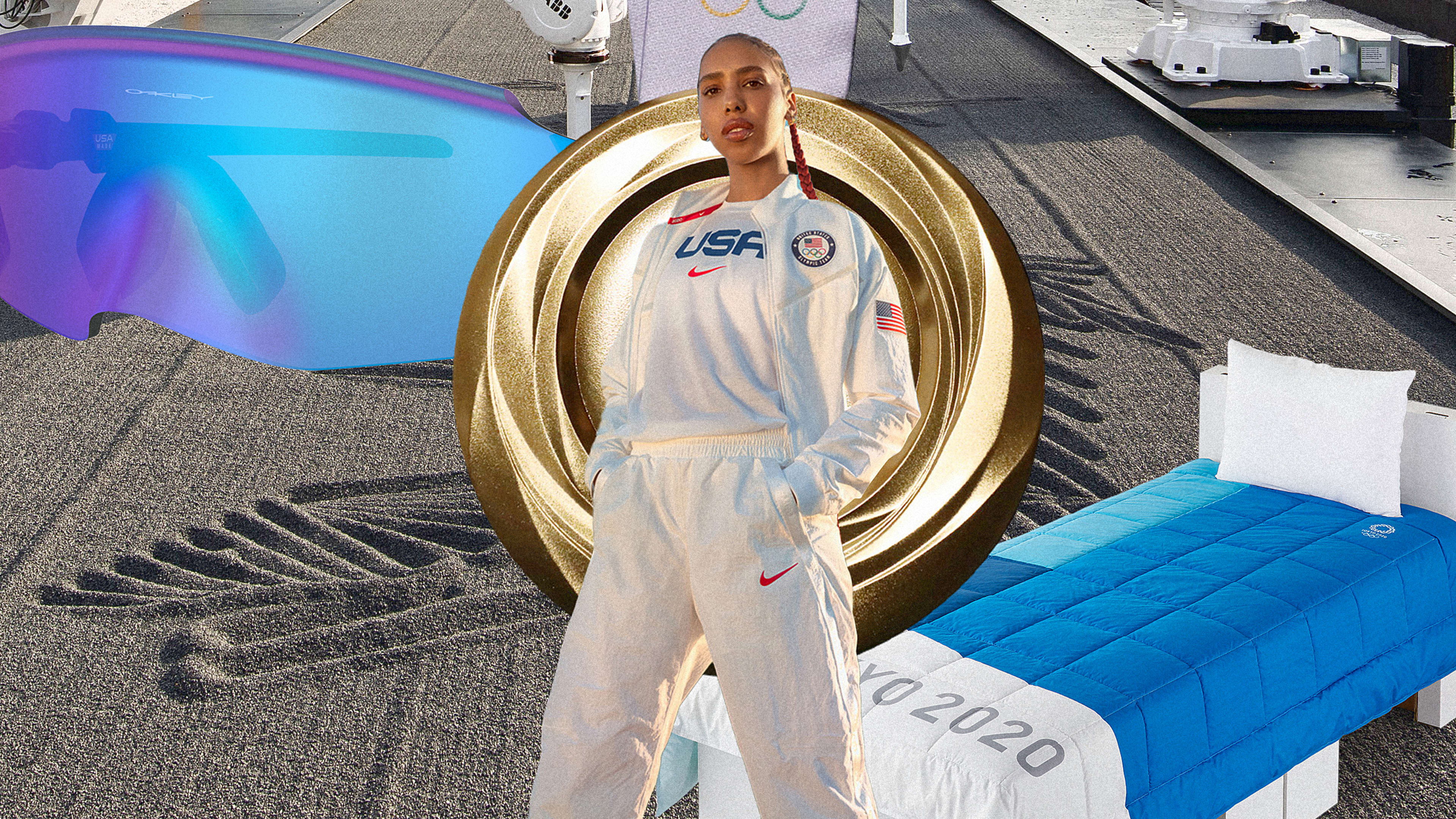
Oakley debuted its latest statement at this year’s Games, and the sunglasses were as jaw dropping as anticipated. The Kato is a remix of high wrap glasses, designed with a single lens that wraps around your face (even your nose). And you can see how they improve your own 100-meter dash for just under $300.
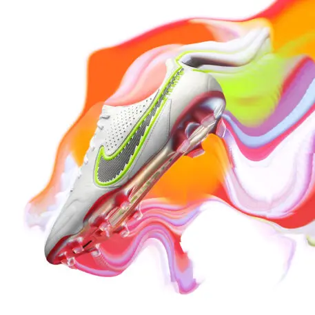
Nike spent years planning its Olympics statement—recycled Space Hippie shoes—and then, Tokyo 2020 got delayed a year. Designers went back to the lab and refined the vision, infusing a bit more color and optimism into the COVID-adjacent event. The design language was dubbed “rawdacious”—earnest materials and minimal color…except for little pieces of innovation on each shoe, which are brightly dyed to catch your eye.
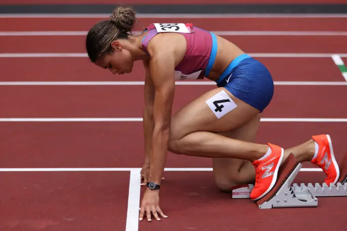
At Olympic Stadium, track and fielders are setting new records. It’s thanks largely to training…and a newly designed track, supplied by a company called Mondo (which has developed 12 Olympic tracks to date).
It’s notably bouncier than typical tracks, returning energy on each stride much like modern sneakers do. And while you can rightly point out that any new innovation in sports makes it harder to compare athletic achievements across different eras, the fact of the matter is, the Olympians chose it through a process of iterative testing. Who woulda thunk, they like running faster.
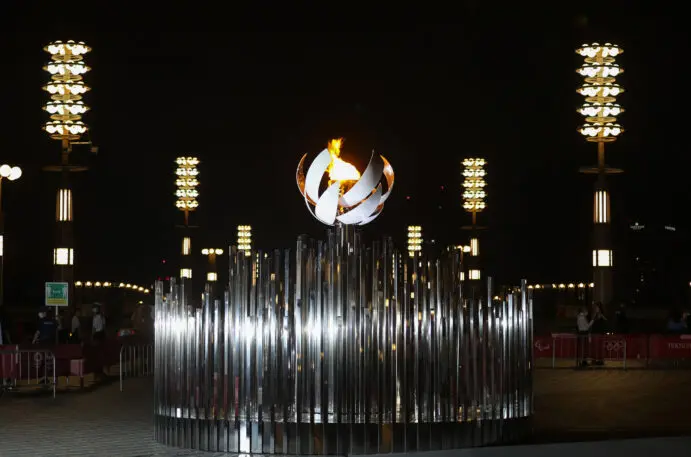
It’s breathtaking. The Olympic caldron, designed by the Japanese design firm Nendo, is a minimal orb that blossoms into a glistening mirror that reflects the flame. As an added bonus, a second, duplicate caldron was set up in a public park alongside the Tokyo waterfront. So while the city couldn’t attend the Olympic events, they were still able to visit the iconic fire.
Pictogram people
Japan was the first country to bring pictograms to the Olympics during the 1964 Tokyo Games. These little icons were a means to clearly depict which sports were being played where to tourists who spoke different languages.
For Tokyo 2020, not only did Japan create a whole new collection of pictograms; the country celebrated their graphic design heritage in the Opening Ceremonies. A team of blue-suited people used all sorts of choreography and ingenuity to act out every one of the 50 different Olympic disciplines. It’s a riot if you haven’t watched yet.
The Worst
Racist swim caps
Before the Olympic Games, a brand called Soul Cap developed a special swim cap that would be more forgiving when worn on natural Black hair (which is more prone to fluff out than lay flat).
View this post on Instagram
Soul Cap has bona-fide competitive credentials; it has previously partnered with Alice Dearing, who became the first Black female swimmer for Great Britain in this year’s Olympics. And yet, the International Swimming Federation rejected the cap for use in the Olympics due to its less streamlined shape than the conventional Speedo cap.
“We believe that it confirms a lack of diversity in [the sport],” Danielle Obe, the founding member of the Black Swimming Association, told the Guardian. “Aquatic swimming must do better.”
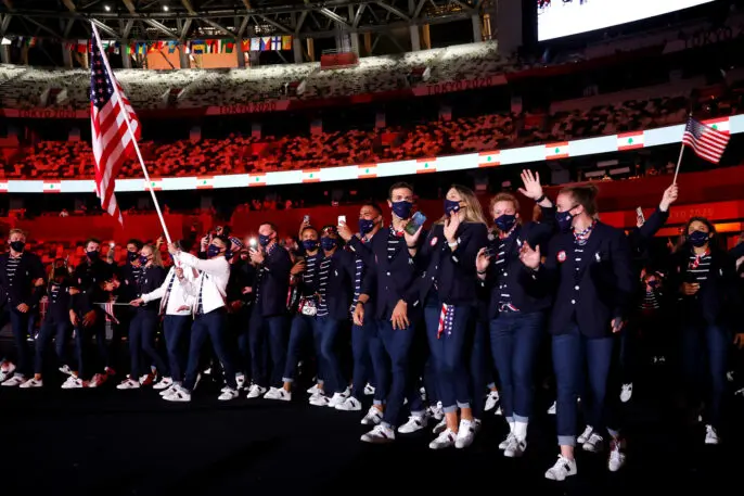
Ralph Lauren
Since 2008, Ralph Lauren has outfitted the U.S. team with its preppy red, white, and blue look. (You may also know Ralph Lauren as the official label of New Englanders whose walls are adorned with oil paintings of their great grandfathers sitting alongside hunting dogs.)
Recognize your brand’s excellence by applying to this year’s Brands That Matter Awards before the early-rate deadline, May 3.
