This year’s Olympics have a confusing logo for a confusing time. After delaying the Games last year to curb the spread of COVID-19, Olympic organizers opted against updating the logo for 2021. The resulting identity, a checkered circle featuring the year 2020, manages to feel both dated and all too relevant—a glaring reminder that COVID-19 remains a clear and present threat.
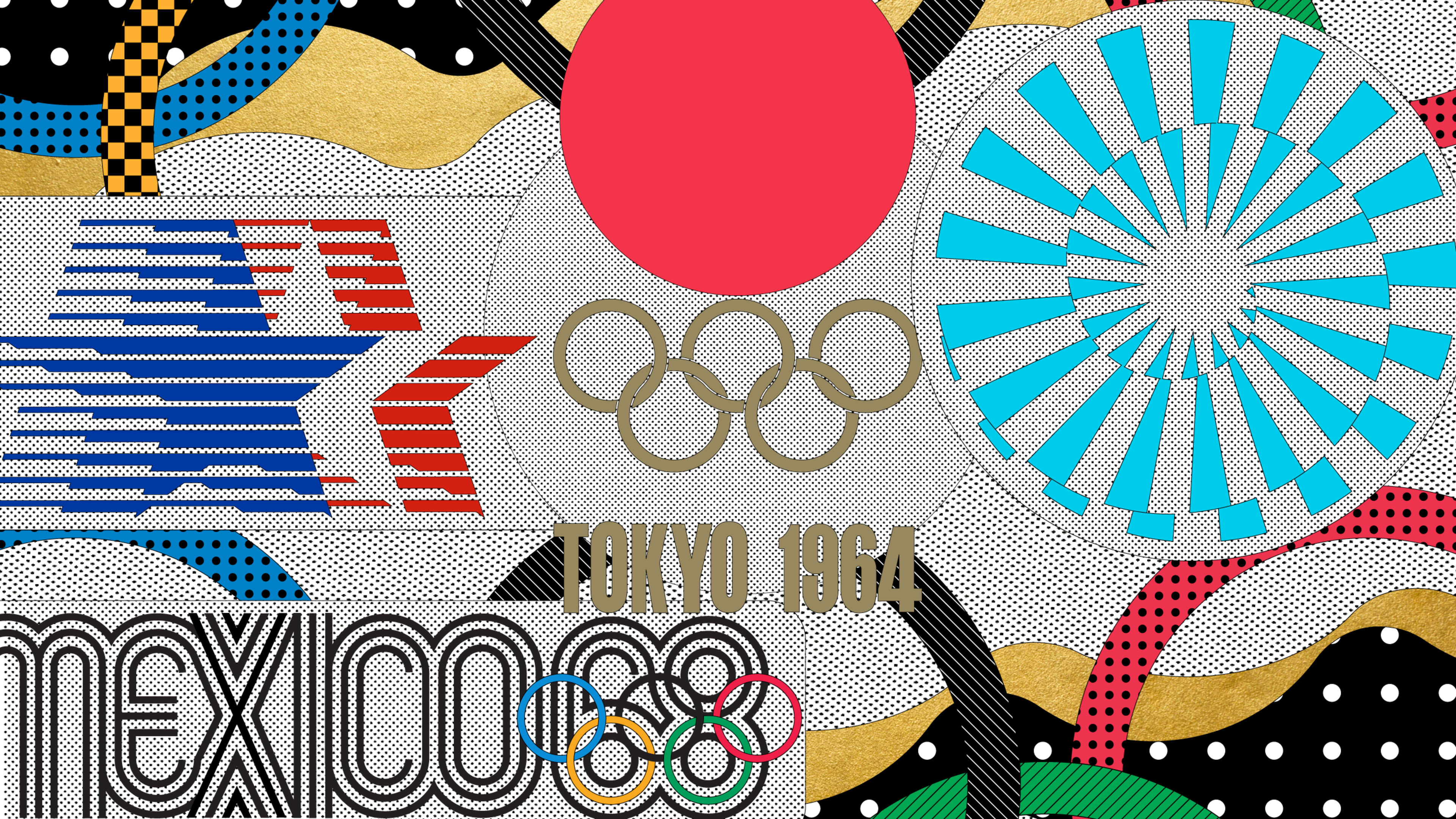
It wasn’t always thus. The Olympics have produced some of the most exciting brand identities of the past century. Take Lance Wyman’s Op Art-inspired branding for the 1968 Mexico City Olympics, which still figures prominently throughout the city more than 50 years after the final gold medal was hung. The Olympics have long enabled host cities to communicate their hopes and ambitions to the world, and the best Olympic logos are like a welcoming committee, enticing viewers to learn more.
We asked six prominent graphic designers to identify the greatest Olympic logos of all time. Their picks range from Wyman’s iconic 1968 branding to Tokyo’s other (decidedly more successful) logo for the 1964 Games.
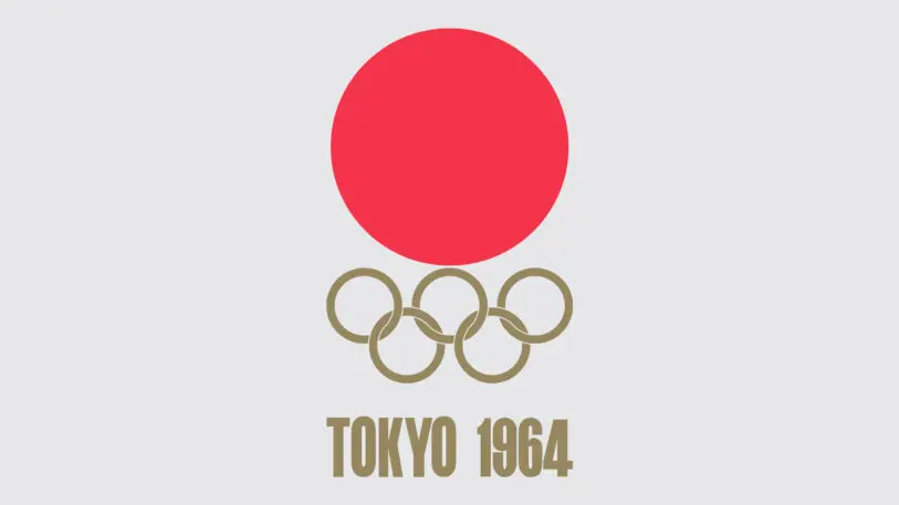
Tokyo 1964
A giant red sun—perhaps symbolic of the rebirth of Japan after World War II—rises above the golden Olympic rings. It’s a symbol of renewal, hope, and the ideals of the Summer Olympics. But it’s also an instantly recognizable and memorable symbol for the Games, which is a key requirement for an international event. Designer Yusaku Kamekura said: “People may have considered that this large red circle represented the hinomaru [Japanese National Flag], but my actual intention was to express the sun. I wanted to create a fresh and vivid image through a balance between the large red circle and the five-ring Olympic mark.” Legend has it that Kamekura created the work only a few hours before the deadline, which I find appropriate for the Olympics, where fast times are rewarded with gold. —Hamish Smyth, partner, Order
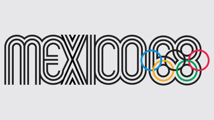
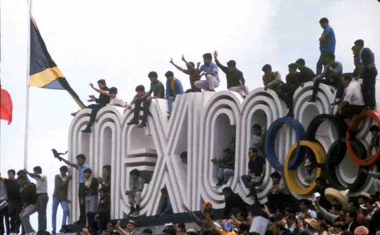
Mexico 1968
The best Olympic logo has got to be Lance Wyman’s design for the 1968 Mexico City Games. Wyman was only 29 when he flew from New York to Mexico on a one-way ticket with his wife Neila and his partner Peter Murdoch to enter a two-week competition for the job. Their hurried entry was a masterwork, with the Olympic rings organically melding into the lower bowls of numerals 6 and 8, and radiant outlines referencing ancient Mexican folk art and ’60s psychedelia. Over 50 years later, you can still see the logo all over Mexico City. And that’s one way you can judge an Olympic logo: Does it outlive the event? The ’68 Games were a huge event for Mexico, and Wyman’s logo captured the moment—and has since become an enduring, patriotic symbol for the country. —Gary Hustwit, filmmaker and founder, Oh You Pretty Things
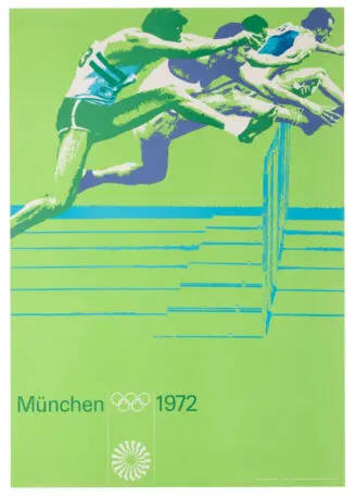
Munich 1972
Though it’s considered superb work today, [Otl] Aicher’s efforts were initially dismissed by much of the German public and media. Not initially part of the overall logo competition to choose the Olympic logo, the creation of the identity for Aichler was a highly personal assignment. Aicher had been an open opponent of the Nazis, he had seen several of his fellow resistors executed, and ultimately spent the last years of World War II in hiding. For both Aicher and Germany, the 1972 Games were a necessary step in moving past the stain of Nazi rule. Hence, the event’s nakedly optimistic theme, ‘The Happy Games.’ This theme was fully personified in Aicher’s creating a startling mark, incredibly abstract, epitomizing expressive modernism. With its dynamic movement and energy, the radiant spiral logo illuminated the new German nation, signifying progress, harmony, and a new beginning. —Eddie Opara, partner, Pentagram
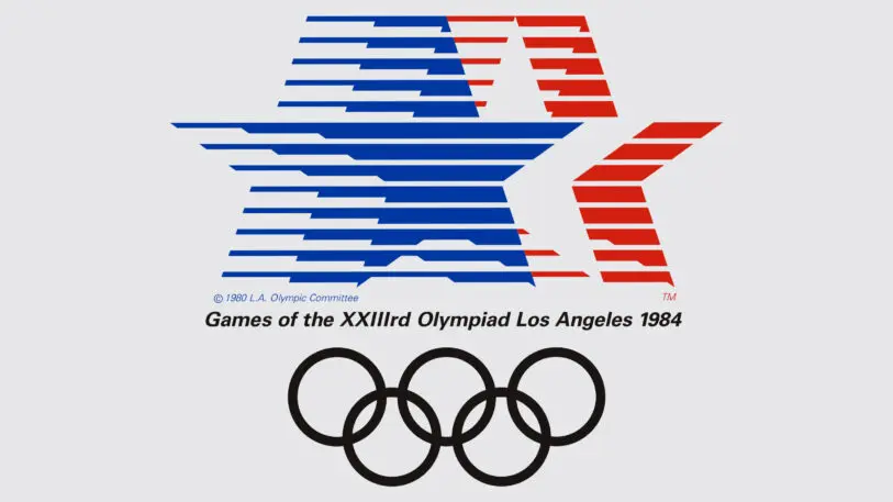
Los Angeles 1984
The Los Angeles 1984 Olympic Games logo somehow embedded as my platonic ideal of design for sport. It evokes nylon track suits, national pride, and the indefatigable power of motion lines. A classic from the Whitney Houston National Anthem era of sport in America. I cannot wait for LA28. —Jennifer Kinon, partner, Champions Design
Recognize your brand’s excellence by applying to this year’s Brands That Matter Awards before the early-rate deadline, May 3.
