It has been nearly 25 years since the Japanese telecom company Softbank released the very first set of 90 emoji, and these tiny pictograms have become one of the most popular forms of creative expression at companies like Google and Apple, as each puts its own unique spin on the shared language of images.
For World Emoji Day on July 17, Google is updating almost 1,000 emoji with new designs, which is about a third of the entire emoji library. Microsoft is updating 1,800. As for Apple: It updates its emoji once a year with the new iOS, and so far, the company has only shared a few new release candidates.
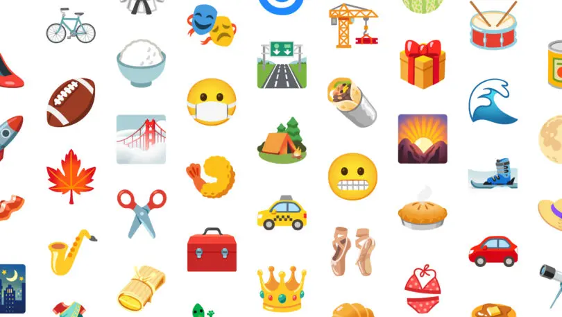
In the two mega releases from Google and Microsoft, you can spot all sorts of individual updates—from Google’s shinier bacon and easier-to-see vehicles to Microsoft’s fluorescent crab and Wallace and Gromit-looking hands—but here are the big moves by Google and Microsoft that are likely to influence how you communicate in the coming months.
At Google: Bikini bods are out, and emoji for the dark
Google’s existing bikini emoji is just a polka dot bikini, but somehow, it is floating in the air. And it has curves. “Does it really need an invisible ghost wearing it?” asks Jennifer Daniel, Google’s creative director of emoji, in a press release.
[Image: Google]The new update deflates the invisible woman inside, and portrays a 2D bikini that appears to be lying on a surface instead. It’s a subtle but important update. While the invisible woman emoji depicted a specific body type, a bikini lying flat is just a generic bikini. It’s whatever you make of a bikini—the exact sort of generalization at the heart of how all emoji are supposed to work.
[Images: Google]Google’s other big update is around Dark Mode—swapping bright white pages with black type for black backgrounds with white type—which is extremely popular on smartphones, and polls show that as many as 82% of Android users have adopted this feature. The mode allows modern phones to burn through less battery, while lowering the lumens pushed on your eyes, which is far more comfortable if you read in bed at night.
[Images: Google]For the most part, background color doesn’t affect emoji because their backgrounds are transparent. But Google is experimenting with some emoji that change their appearance specifically for Dark Mode. The first example Google has shared is its new Camping emoji (the other new Dark Mode emoji include a Rocket, Three Mountains, and a UFO). In regular mode, Google has added a sun over the camping tent. In Dark Mode, you’ll see a moon and stars. It’s a decision that is more playful than functional—reminding us that, while there is a lot of serious, ongoing work around topics of representation and inclusion happening within the emojiverse, its creators are still taking the time to have fun with the medium just for the heck of it.
At Microsoft: 3D office party!
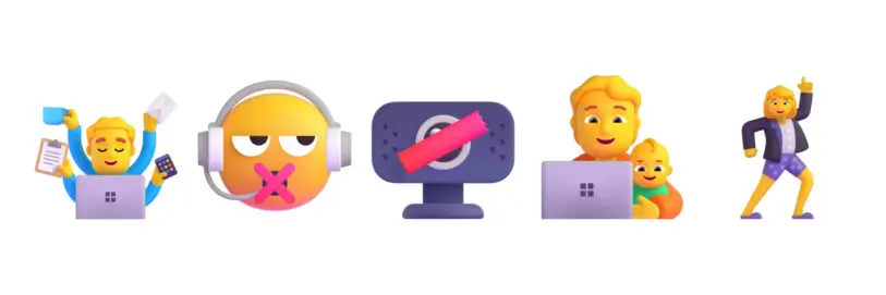
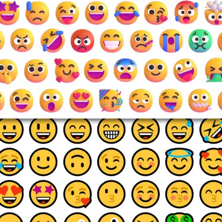
Over at Microsoft, the company is completely overhauling its emoji in a massive update that will arrive later this year. Microsoft is known for having some of the flattest emoji of all, drawn with thick outlines to increase legibility. Now, Microsoft is embracing maximalism and big personality.
Its new emoji are 3D, and most are animated. The face emoji almost look like claymation because all the heads have been purposefully created with an imperfect circle. “People aren’t perfect, so why should our graphical representations be?” writes Claire Anderson, Art Director & Emojiologist at Microsoft, in a press release.
Recognize your brand’s excellence by applying to this year’s Brands That Matter Awards before the early-rate deadline, May 3.
