There is a quote about Los Angeles, often attributed to Dorothy Parker, that says it’s 72 suburbs looking for a city. Whether the legendary American writer actually said it isn’t important, but it does convey a long-standing impression of L.A. as less a unified city than a sprawling collection of locales, including the beach, Hollywood, Koreatown, Silver Lake, Venice, Crenshaw, Echo Park, and on and on. It’s a city with a population of about 4 million people—and tens of millions of others around the world have their own ideas about what the city symbolizes and stands for.
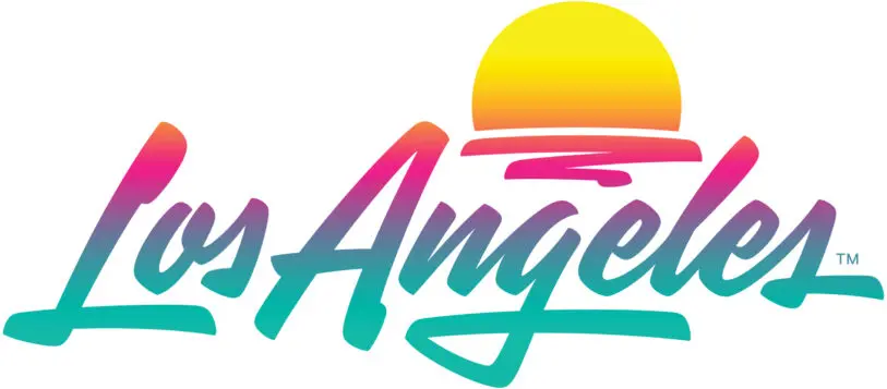
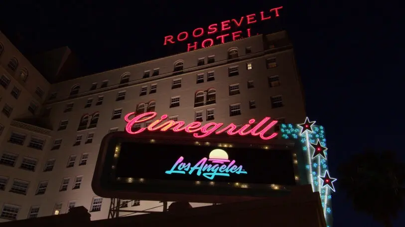
That was the challenge presented to artist Shepard Fairey’s Studio Number One and design firm House Industries when the Los Angeles Tourism & Convention Board tasked them to collaborate on a new logo and brand identity for the city as a destination. It’s a seemingly impossible mission, to not just encapsulate the hopes, dreams, expectations, and aspirations of residents and visitors alike, but to do it in a font. Their solution is an acid-washed word mark that manages to exude SoCal’s sunny optimism with a hint of street-level cool.

People are surrounded by brands: fashion brands, car brands, sports brands. But very rarely do we think about the “brands” of cities and regions. Cities from Chicago to Melbourne have unveiled logos, aiming to communicate their spirit, vibrance, and possibilities enough to convince both tourists and businesses that this is where their money should be spent. But aside from Milton Glaser’s “I Love NY” and maybe Martin and Woltz’s “Virginia Is for Lovers,” tourism slogans and brand identities aren’t typically all that memorable, primarily because these are designs aimed to appeal to quite literally the broadest cross-section of people possible.
The previous logo [Image: courtesy Los Angeles Tourism]That was the problem with L.A. Tourism’s previous branding, a Dodgers-esque script that trademark lawyers deemed too generic to protect—leaving it open to poaching for unlicensed souvenirs and other uses.
The new logo is the first rebrand for L.A. Tourism in a decade, and the organization is looking to appeal to both tourists and business conference and meeting planners from around the world. The design will be used in everything from letterhead and business cards to conference banners and TV ads. Part of the assignment was to appeal to Gen Z and millennial visitors from key markets with means to travel—aka the Cool Kids With Money. It coincides with a new ad campaign, dubbed “Your Comeback Starts Here,” that touches on both L.A.’s reputation as a city of dreams, as well as a post-COVID-19 travel destination.
https://youtu.be/-Cf7orPmV1c
Don Skeoch, L.A. Tourism’s chief marketing officer, says the two biggest challenges were to come up with something that, first, was able to walk the line between appealing to tourists and business audiences, and second, didn’t lean too heavily on the abbreviated L.A., which can be read as la—or “the” in Spanish and French. “The brand identity has to work for everyone, so we had representatives from every aspect internally,” Skeoch says. “There were so many stakeholders. We have airlines, hotels, restaurants, shopping, sports venues, so we ran our research by our marketing committee, which has representatives from all of the major attractions and icons in L.A.”
Shelley Leopold, L.A. Tourism’s creative director, had worked with Fairey before, and suggested the organization look to include his Los Angeles-based firm, given his credentials as a celebrated street artist who has also managed to break through to mainstream culture with his Obey brand and the Obama “Hope” poster. House Industries, meanwhile, is the epitome of cool in the world of words, famous for incorporating pop culture references into the typically highbrow field of type design. A match, Skeoch hoped, made in brand identity heaven.
Originally, L.A. Tourism had reached out to both House Industries and Studio Number One to pitch on this project separately. Meantime, House cofounder Andy Cruz thought it would be cool to get Fairey involved, and called up his old friend.
[Image: courtesy Los Angeles Tourism]“I didn’t realize it was a full logo identity system until I went to my team and said, ‘Hey, check it out, Andy from House hit me up for this really cool project,'” Fairey says. “And my team was like, ‘We’re already bidding on this project!'”

“How do you spell out possibility, aspiration, inclusion, and all these things in a logo?” Fairey muses. “But that feeling of the script, there’s a Rorschach component to it, where each individual is writing their own future, and everyone can project that on a script in a different way than a really clean but potentially sterile and institutional look would’ve had.” They also landed on gradient colors meant to reflect both the city’s diversity and its epic sunsets. The gradients additionally reference the painted gradients of Culver City, California-based artist Ed Ruscha and the airbrushed custom cars of L.A. streets.
Ultimately, L.A. Tourism’s Skeoch relied on focus groups to determine which design the organization chose, but crucially, that was done after the initial design process. “I think that it’s a much better process to work that way than to have the focus group information be what’s driving it from the start, which kills the instinct and makes it all about different boxes to check, and really reduces the creative spark,” Fairey says. The focus groups, as well as L.A. Tourism’s marketing committee, all agreed on the final design.
“It’s got a really strong, ownable personality to it that allows anyone to project something about themselves onto it,” Fairey says. The city where you can transform into anyone you want now has the logo to match.
Recognize your brand’s excellence by applying to this year’s Brands That Matter Awards before the early-rate deadline, May 3.