COVID-19 exposed a huge communication gap in the United States and beyond, as officials struggled to convey important public health messages to the masses. In New York, signs explaining social distancing measures proliferated in Spanish, English, and Mandarin. Later, TV and radio ads were broadcast in different languages. The communication problem was compounded by the fact that city and state government directives surrounding safety measures were changing from week to week. Abroad, in countries with lower literacy rates like India and Nigeria, patients struggled to communicate symptoms with doctors and aid workers via text or email.
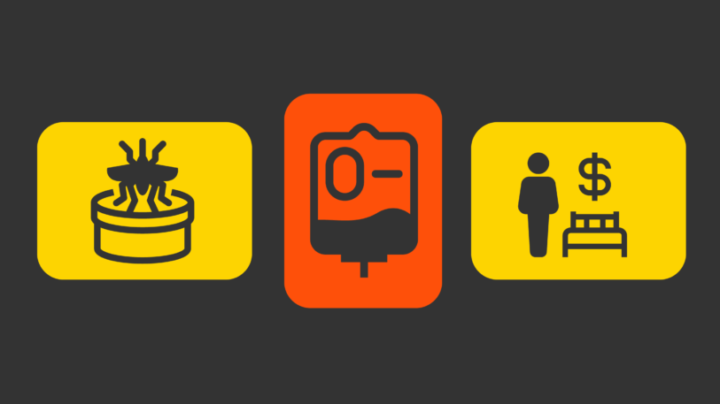
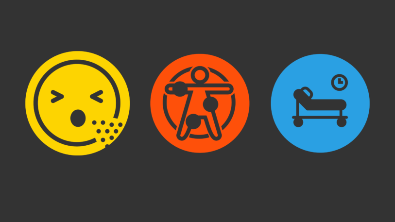
To solve this problem and other communication issues he encounters in his job working in public health, designer Daniel Burka had a simple idea: to develop an open-source set of universal icons that could convey different medical symptoms. The point was to create a comprehensive communication system that transcends language and meets an urgent need in healthcare.
After establishing the first 12 (Burka doesn’t remember the first symbol he created but says an icon of a person bending over and vomiting was among the first), he realized he needed more help and turned to Twitter, putting out a call to other designers.
“Selfishly, I started with icons that were closest to my project in my day job. I needed one for hypertension, a blood monitor, and a pinprick machine—things that are commonly used in India if people have diabetes,” says Burka, who is director of product and design at the health nonprofit Resolve to Save Lives.
Three weeks later, a team of more than 20 contributors including designers Yugandhar Bhamare from Mumbai, India, and Julia Parchimowicz from Poland, as well as Dr. Greg Schmidt, volunteer chief medical officer from Ottawa, created an open-source database of more than 630 icons including symbols for different blood types, sex workers, and diagnostic tests.

Burka, who worked as a creative director for the project and ensured that the icons all looked like they were part of the same family, first came to the idea while using another healthcare platform. “I was using a public health tool recently, and the information it presented was good but I thought the icons were a little suspect [so] I thought about creating a big library of icons to replace them,” he says.

Burka hopes that eventually the icons will be adopted by healthcare systems and nonprofits worldwide. Prior to working at Resolve to Save Lives, Burka was a design partner at GV (formerly Google Ventures) and served as the creative director at news aggregation service Digg. He is also the cofounder of design agency Silverorange with his twin brother, Nick, who led the design of the website.
“A few people from hospital systems told me they are looking into using [the icons],” he says. “My goal is that you walk into a hospital someday and you see some of these icons on the signage, you open a piece of software, whether it’s free software like open-source medical tools or a paid electronic health record, and they’re using these icons. Our main goal is for people to be healthier, so we’re not picky about how [the icons] are used or who’s using them.”
Recognize your brand’s excellence by applying to this year’s Brands That Matter Awards before the early-rate deadline, May 3.