Over the course of the past few decades, Americans have discovered Sriracha, ditched diet pop, and obsessed over chicken sandwiches. These food trends tend to be big stories, and have been relatively easy to track.
But truthfully, each of these stories only captures a tiny snapshot of the bigger picture of what Americans eat. The USDA has followed the consumption of more than 200 different food items since 1970, ranging from veal to grapefruit. And data visualization designer Nathan Yau recently transformed five decades of American eating into a series of delightful timelines that depict a far more nuanced look at our diet.
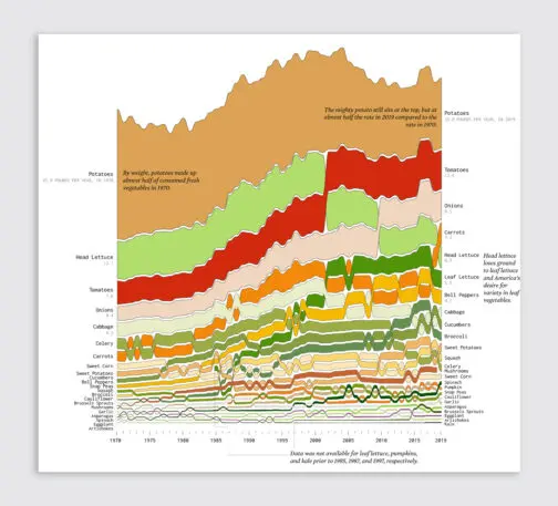
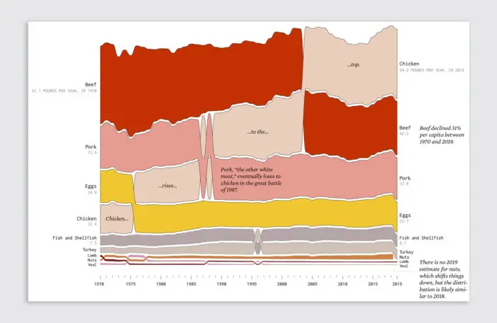
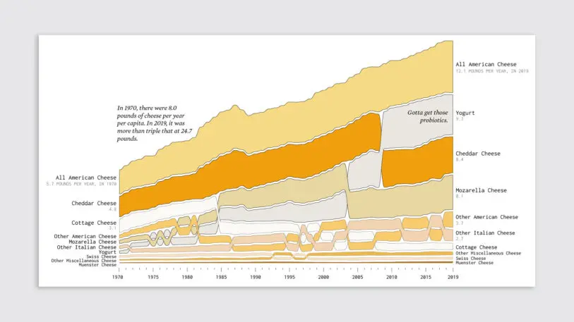
He broke the data into six categories: proteins, vegetables, fruits, dairy, grains, and added fats. The items on top are what we consume the most, and the bottom, what we consume less of. These colorful stacks, which correspond with the real food colors, are piled high like sandwiches filled with data.
Click here for a larger version. [Image: courtesy Nathan Yau/FlowingData]The vegetable stack, in particular, looks something like a cheeseburger. That wasn’t intentional on Yau’s part. But given that tomatoes, onions, and lettuce are some of the most consumed “vegetables” in the U.S., it actually makes perfect sense that the graph would resemble the literal food! (Yes, tomatoes are technically a fruit, but the USDA calls them a veggie.)Click here for a larger version. [Image: courtesy Nathan Yau/FlowingData]As for what these graphics can teach us? Despite the growth of plant-based eating, Americans are still obsessed with meat. We eat more meat than any other category—and we keep eating more meat over time. Our favorite protein is chicken, and the average American now eats 54.6 pounds of chicken a year. It beat out beef as America’s favorite protein in 2004. The average American eats about 20 pounds less beef per year now than they did back in 1970. (Interestingly, we do eat more nuts than lamb or veal—and we consume markedly more nuts than during the low-fat craze of the 1990s.)
Beyond the dominance of chicken, some of our favorite foods are potatoes (22.8 pounds per year), bananas (13.9 pounds per year), and . . . ugh . . . American cheese?!? (12.1 pounds per year). Yet while we eat more cheese than ever, we’ve seen milk consumption plummet since the ’70s.
Click here for a larger version. [Image: courtesy Nathan Yau/FlowingData]All of these big trends aside, my favorite stories are the small ones that you can spot lurking inside these graphs, as various foods swap places back and forth, rising and waning in popularity in response to cultural trends. You can see butter spike in 2004, elbowing out margarine. The two fats duke it out for about five years until butter wins.Popsicleswere very popular for a few years in the early ’90s, during the heyday of Jell-O pudding pops. And, as a millennial, I must point out: In 2010, the avocado surged past its fellow fruits—the pears, tangerines, and pineapples—to become the stuff of memes.
Oranges, you’d better be careful. Avocados are coming for you next.
Recognize your brand’s excellence by applying to this year’s Brands That Matter Awards before the early-rate deadline, May 3.
The latest innovations in design brought to you every weekday.