Florence Nightingale is well known as the founder of modern nursing. But after seeing the terrible conditions facing soldiers she treated during the Crimean War, she became a fierce public health advocate. And she harnessed new ways of showing data to do so.
Nightingale was a lifelong information designer. As a child, she cataloged her seashell collection, and that was just the beginning. According to data designer RJ Andrews, Nightingale was always recording facts and figures. “She was mathematically literate as a foundation,” Andrews explains. Her ability to compose eye-catching, understandable, and persuasive charts that depicted things such as soldier mortality rates grabbed the attention of the queen and Parliament and pushed officials to require more sanitary treatment conditions, saving lives in the process.
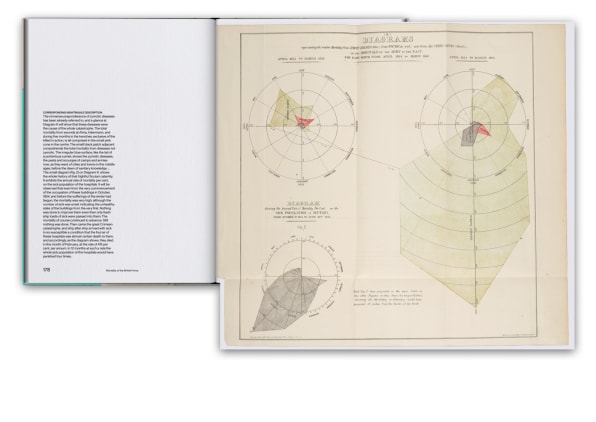
She also used data. Nightingale analyzed government data, cataloged it, and created tables of data as reference points, Andrews says. She found that deaths weren’t being accurately recorded, so she used her own data to establish credible evidence and diagrams to explain them.
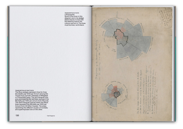
She returned to the U.K. a hero in 1856 and presented her findings to Queen Victoria. Those findings became the basis of one of her most famous charts, anecdotally known as the “Rose Diagram,” which was published in 1858. In it, she displays the data of how many soldiers in Crimea died of diseases, wounds, and other causes as a “coxcomb” chart, which looks like an exploded pie chart around a vortex. The blue wedges represent deaths from preventable or mitigable disease; red represents deaths from wounds. The chart is overwhelmingly blue, so at a glance it tells you how many lives could have been saved with basic hygiene.
Nightingale’s fame helped her secure talented volunteers who wanted to work with her, and the “pace was astounding,” according to Andrews. Now, we have Slack, but in Victorian London, her team relied on couriers who sent letters back and forth throughout the day. Initially, their findings were directly sent privately and confidentially to the queen and military leaders. Later, they were published for public consumption, according to Andrews.
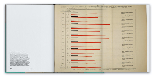
As an example, Andrews compared her style to that of a competitor producing similar charts in the style common to the period. Those charts were dense, with maybe 40 bars of data and sideways text. The format is fine for looking up a value, but it’s not something the average person would want to engage with. Nightingale broke away from the dense bar charts of the time and made small changes such as ensuring all text is horizontal and easy to read, because “she wants to really direct your attention to a specific insight from the data,” Andrews says. Essentially, she created a story by giving the data a focused angle. And stories have the power to persuade.
Did those graphics lead to better sanitary conditions? In part. But Andrews prefers to think of Nightingale and Farr as “systems thinkers.” Together, they enabled better data collection by creating, distributing, and standardizing forms that could be used by anyone. That helped military and healthcare professionals get a better sense of urgent public health crises and which policies to implement. Through their work of documenting, distributing, standardizing, and visualizing data, Nightingale and her team created a whole new way of thinking about healthcare.