
Between 1971 and 1997, a tubular, electric blue tunnel led to an elevator bay at 127 John Street, an office building in Lower Manhattan. The corridor’s rounded rectangular shape and vibrating neon color looked like the future. In a way, it was for designer Richard Poulin. When Poulin was about 12 years old, he walked through the tunnel to meet his mother, who was a legal secretary in the building, for lunch. Though Poulin didn’t realize it at the time, the tunnel and an oversize exterior clock were designed by mid-century modern designer Rudolph de Harak. Poulin would go on to work at de Harak’s studio for nine years. Now, he’s writing the book on him.
Though de Harak left a distinct mark on Poulin, who now runs his own firm, Poulin + Morris, de Harak himself is lesser known among the titans of midcentury modernism, like Saul Bass, Alvin Lustig, Paul Rand, and Lou Danziger. Poulin distills de Harak’s philosophy into a neat, two-word summation: Rational simplicity, which is also the title of Poulin’s new monograph on the designer, which is currently seeking funding. De Harak’s commitment to design purism is evident in everything from the tunnel and oversize clock at 127 John street to album covers for Westminster Records to the smallest of explanatory placards at the Met Museum in New York.

The other factor that contributed to de Harak’s relative unknown compared to his contemporaries is that he didn’t really just do one thing, like graphic design for movies or corporate branding. He worked in book, exhibition, furniture, and industrial design. That expansive portfolio made it harder to pin down his legacy, according to Poulin. Poulin celebrates de Harak’s legacy over six chapters and 400 pages in this new monograph. Here are some of the highlights.
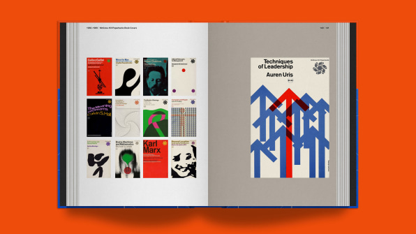
McGraw-Hill Paperback Book Series
De Harak designed an expansive series of books for McGraw-hill Paperbacks in the 1960s. The books covered a range of subjects, including novels, literature, poetry, science, and mathematics. Even as a design purist, the broad subject matter meant his approach could be broad, too, according to Poulin. The grid becomes a skeletal system that he could play with in other ways: making abstract graphic forms with photography, illustration, paper collage, cutouts, and color to get to the story’s essence. Prior to this, book cover design was pretty conventional, according to Poulin. The close to 400 graphic book covers de Harak developed, however, established him as “a force in graphic design” and influenced the paperback industry at large, Poulin says. The only other series of books that are maybe as iconic are Milton Glaser’s Shakespeare covers for Signet Classics.
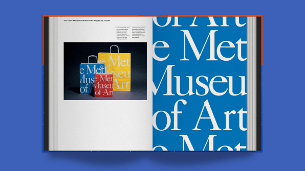
The Metropolitan Museum of Art
In the ’70s, de Harak began one of his most expansive projects with the Metropolitan Museum of Art, in New York City. Colloquially, we all know that museum as the “Met” today. De Harak, who was charged with branding the museum’s first ever shop, turned that into a brand, and made the shopping bags into an iconic piece of the museum you could take with you. He designed the bags so the name wrapped around them; the front of the bag would always read “Met.” Contrast the traditional typeface with three bright, primary colors—a nod to the composition of paint—and you have a bag design that lasted decades.
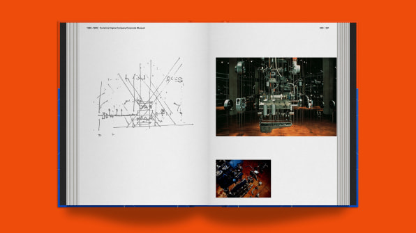
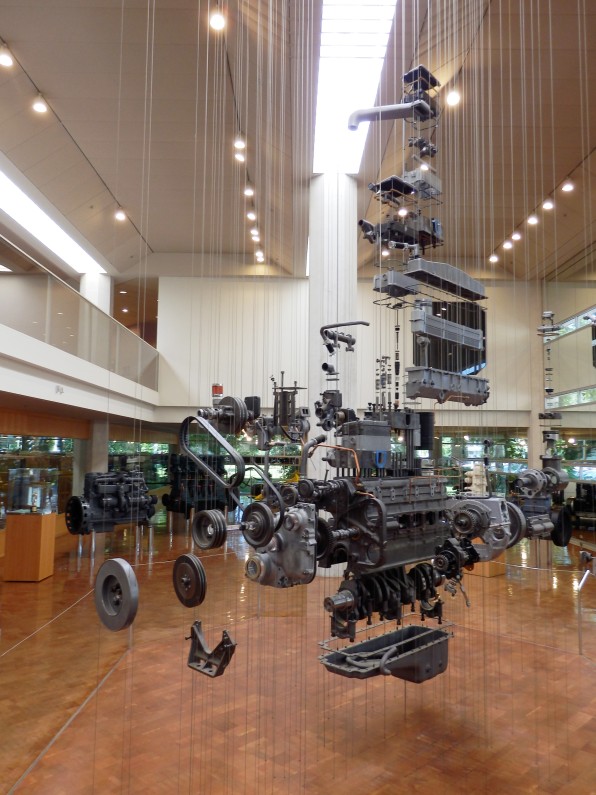
The Cummins Engine Museum
In the 1980s, De Harak designed a museum of a completely different kind: the 4,000-square-foot Cummins Engine Museum in Columbus, Indiana. It was both a corporate museum and marketing center. De Harak made a centerpiece out of the company’s largest diesel engine and exploded it so each of its 440 unique composite parts were suspended in relation to each other as if about to be assembled within the two story space. It was an apt marketing maneuver, giving visitors an eye-opening view of what Cummins produced. And it was in keeping with de Harak’s guiding philosophy: breaking a composition down into its most fundamental pieces.
While all of these designs seem disparate, they’re connected by de Harak’s guiding design principles. “I was always looking for the hidden order, trying to somehow either develop new forms or manipulate existing form,” said de Harak in the Moderns. That foundational philosophy enabled him to jump from one discipline to the next. “Bauhaus and International Style is positioned in a way that the creative process is the creative process, whether I look at a print piece, or a poster, or a car, or an exhibition, or a house, the process and the approach is all the same,” says Poulin. “It’s a shared process and approach. I think that’s one of the main reasons why he was so successful in his multidisciplinary work. He didn’t find it intimidating to cross a line and go from a small book jacket to a 4,000-square-foot museum.” Poulin went on: “Rudy didn’t see the design profession contained within a box. He didn’t feel there were lines you couldn’t cross.”
Make a pledge for your own copy of Rational Simplicity here.