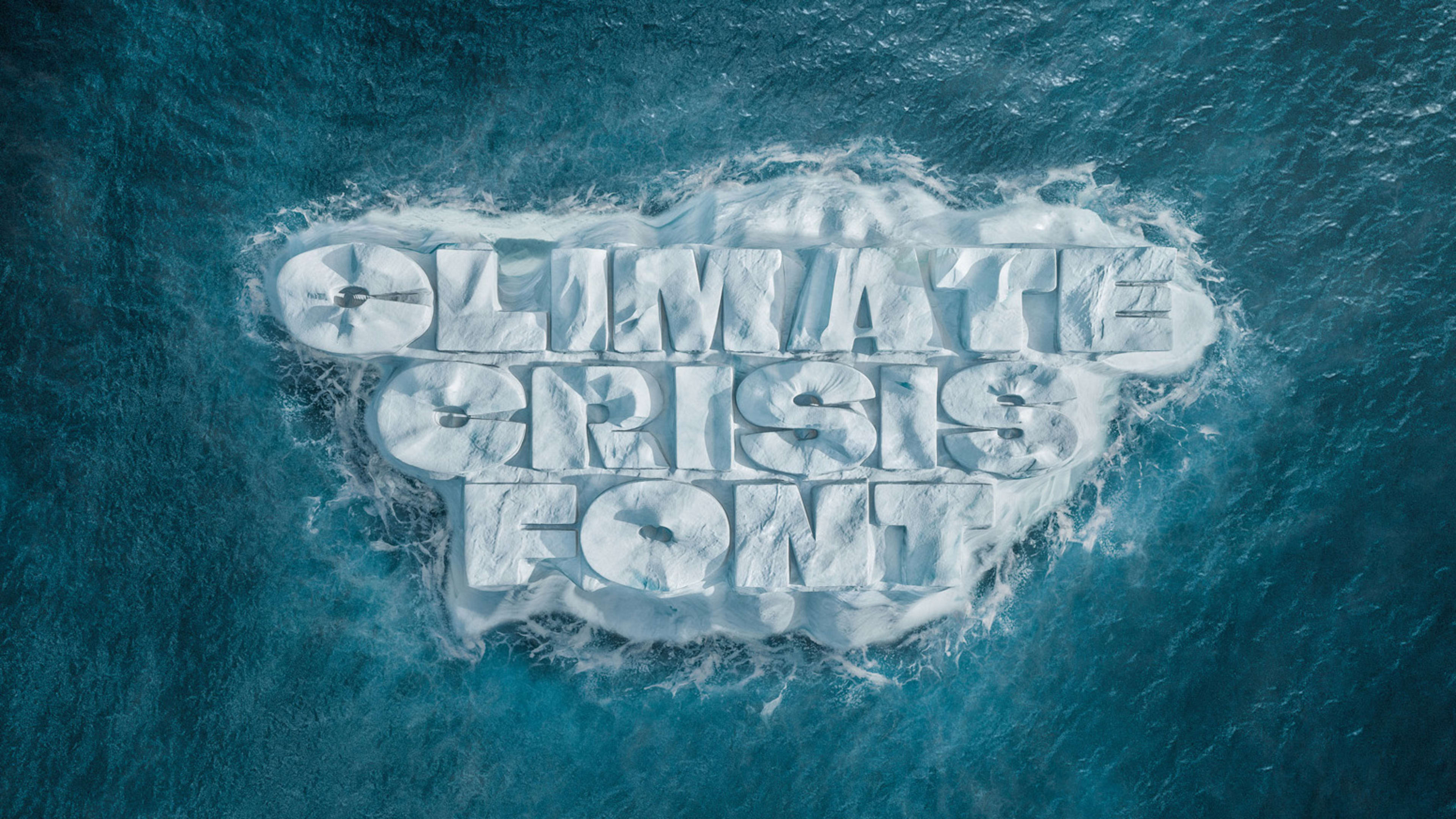
Fonts generally come in different weights: light, medium, bold, black. And now, glacial.
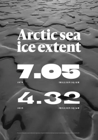
[Image: courtesy Helsingin Sanomat]Finnish newspaperHelsingin Sanomathas created a free variable font calledClimate Crisis. The font has different weights that correlate with Arctic sea ice data, visualizing how ice melt has changed over the decades—and the urgency of the crisis in the present.
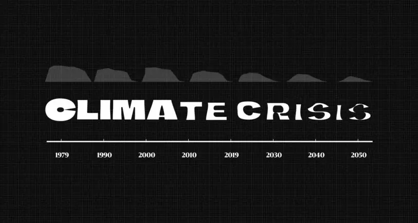
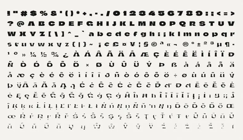
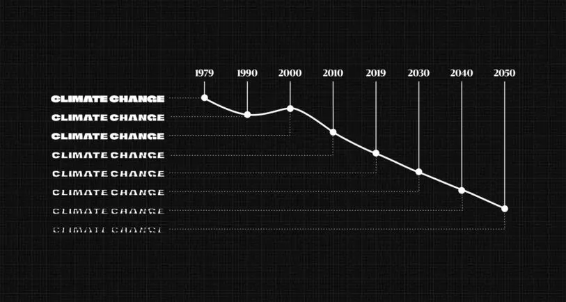
[Image: courtesy Helsingin Sanomat]The font, designed by Finnish typographer Eino Korkala in collaboration with South African type designer Daniel Coull, has eight different weights based on data from the National Snow and Ice Data Center (NSIDC) and predictions from the Intergovernmental Panel on Climate Change. The boldest font represents the year the NSIDC started satellite measurements, in 1979. The thinnest represents the year 2050. By that time, the crossbar in the A has completely melted away, leaving just a shell of the original letterform behind. “Media organizations have a responsibility for their readers to make complex matters more comprehensible,” saysHelsingin Sanomatart director Tuomas Jääskeläinen. “We hope that using the font helps people see the urgency of climate change in a more tangible form.”[Image: courtesy Helsingin Sanomat]Jääskeläinen hopes the font can be a tool for news agencies that want to put additional visual emphasis on environmental stories, and an example of how design can complement the written word. Rather than just evoking the aesthetics of environmentalism, the font itself is also a data visualization.
“Climate crisis is an important theme for us as a news media. It is in our interest to put emphasis on the written word and the images accompanying them,” Jääskeläinen says in an email interview. He adds that Helsingin Sanomat is constantly experimenting with new ways of journalistic story telling, and putting visual emphasis on the font was a fresh approach to the challenge. (See how they applied the font to their climate change coverage in print and onlinehere.)
[Image: courtesy Helsingin Sanomat]According to Jääskeläinen, the newspaper has received widespread interest in the font, from the United States to Japan, and are in talks to make a Cyrillic version for use in Russia. The font is availablefree to download.
Recognize your brand’s excellence by applying to this year’s Brands That Matter Awards before the early-rate deadline, May 3.
The latest innovations in design brought to you every weekday.
Lilly Smith is an associate editor of Co.Design. She was previously the editor of Design Observer, and a contributing writer to AIGA Eye on Design.More